Chapter 3 Interval comparison: Ordered exploitation results
Here we present the results for best performances found by each selection scheme replicate on the exploitation rate diagnostic with our base configurations. For our base configuration, we assume 4 islands and a ring topology. When migrations occur, we swap two individuals (same position on each island) and guarantee that no solution can return to the same island. Best performance found refers to the largest average trait score found in a given population. Note that performance values fall between 0.0 and 100.0.
3.2 Data
base   = filter(base_over_time,   Diagnostic == 'ORDERED_EXPLOITATION' & Structure == 'IS')
mi50   = filter(mi50_over_time,   Diagnostic == 'ORDERED_EXPLOITATION' & Structure == 'IS')
mi5000 = filter(mi5000_over_time, Diagnostic == 'ORDERED_EXPLOITATION' & Structure == 'IS')

base$Interval = '500'
mi50$Interval = '50'
mi5000$Interval = '5000'

df_ot = rbind(base, mi50, mi5000)
df_ot$Interval = factor(df_ot$Interval, levels=c('50','500','5000'))


base = filter(base_ssf, Diagnostic == 'ORDERED_EXPLOITATION' & Structure == 'IS' & Generations < 60000)
mi50 = filter(mi50_ssf, Diagnostic == 'ORDERED_EXPLOITATION' & Structure == 'IS' & Generations < 60000)
mi5000 = filter(mi5000_ssf, Diagnostic == 'ORDERED_EXPLOITATION' & Structure == 'IS' & Generations < 60000)

base$Interval = '500'
mi50$Interval = '50'
mi5000$Interval = '5000'

df_ssf = rbind(mi50,base,mi5000)
df_ssf$Interval = factor(df_ssf$Interval, levels = c('50','500','5000'))

base = filter(base_best, Diagnostic == 'ORDERED_EXPLOITATION' & Structure == 'IS' & Generations < 60000)
mi50 = filter(mi50_best, Diagnostic == 'ORDERED_EXPLOITATION' & Structure == 'IS' & Generations < 60000)
mi5000 = filter(mi5000_best, Diagnostic == 'ORDERED_EXPLOITATION' & Structure == 'IS' & Generations < 60000)

base$Interval = '500'
mi50$Interval = '50'
mi5000$Interval = '5000'

df_best = rbind(mi50,base,mi5000)
df_best$Interval = factor(df_best$Interval, levels = c('50','500','5000'))
3.3 Truncation selection
Here we analyze how the different migration intervals affect truncation selection on the exploitation rate diagnostic.
3.3.1 Performance over time
lines = filter(df_ot, `Selection\nScheme` == 'TRUNCATION') %>%
  group_by(Interval, Generations) %>%
  dplyr::summarise(
    min = min(pop_fit_max) / DIMENSIONALITY,
    mean = mean(pop_fit_max) / DIMENSIONALITY,
    max = max(pop_fit_max) / DIMENSIONALITY
  )
ggplot(lines, aes(x=Generations, y=mean, group = Interval, fill = Interval, color = Interval, shape = Interval)) +
  geom_ribbon(aes(ymin = min, ymax = max), alpha = 0.1) +
  geom_line(size = 0.5) +
  geom_point(data = filter(lines, Generations %% 2000 == 0), size = 2.5, stroke = 2.0, alpha = 1.0) +
  scale_y_continuous(
    name="Average trait score",
    limits=c(0, 100),
    breaks=seq(0,100, 20),
    labels=c("0", "20", "40", "60", "80", "100")
  ) +
  scale_x_continuous(
    name="Generations",
    limits=c(0, 50000),
    breaks=c(0, 10000, 20000, 30000, 40000, 50000),
    labels=c("0e+4", "1e+4", "2e+4", "3e+4", "4e+4", "5e+4")

  ) +
  scale_shape_manual(values=SHAPE)+
  scale_colour_manual(values = cb_palette_mi) +
  scale_fill_manual(values = cb_palette_mi) +
  ggtitle("Best performance over time") +
  p_theme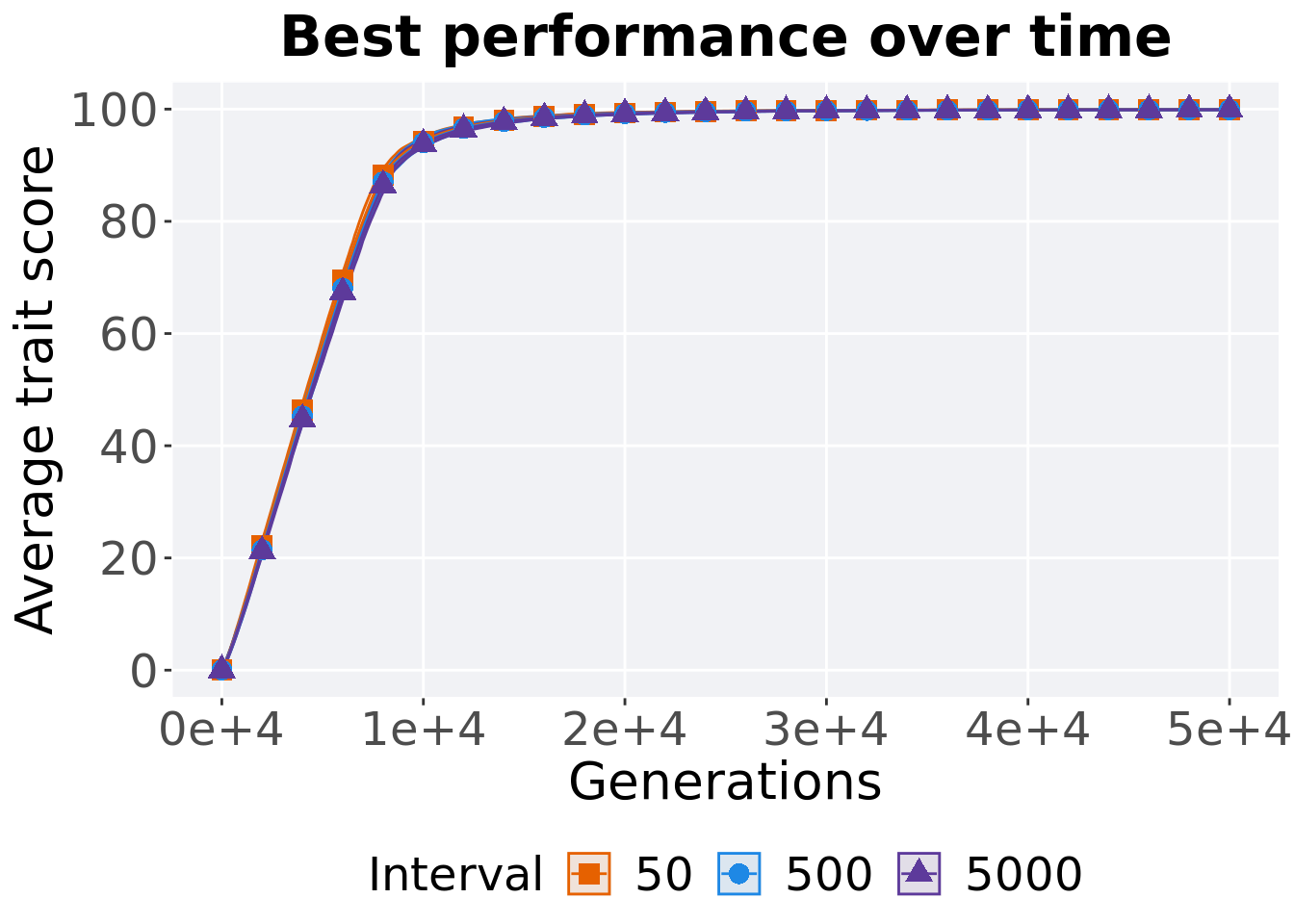
3.3.2 Generation satisfactory solution found
First generation a satisfactory solution is found throughout the 50,000 generations.
filter(df_ssf, `Selection\nScheme` == 'TRUNCATION') %>%
  ggplot(., aes(x = Interval, y = Generations, color = Interval, fill = Interval, shape = Interval)) +
  geom_flat_violin(position = position_nudge(x = .09, y = 0), scale = 'width', alpha = 0.2, width = 1.5) +
  geom_boxplot(color = 'black', width = .07, outlier.shape = NA, alpha = 0.0, size = 1.0, position = position_nudge(x = .15, y = 0)) +
  geom_point(position = position_jitter(width = .02), size = 3.0, alpha = 1.0) +
  scale_shape_manual(values=SHAPE)+
  scale_y_continuous(
    name="Generations"
  ) +
  scale_x_discrete(
    name="Interval"
  ) +
  scale_colour_manual(values = cb_palette_mi) +
  scale_fill_manual(values = cb_palette_mi) +
  p_theme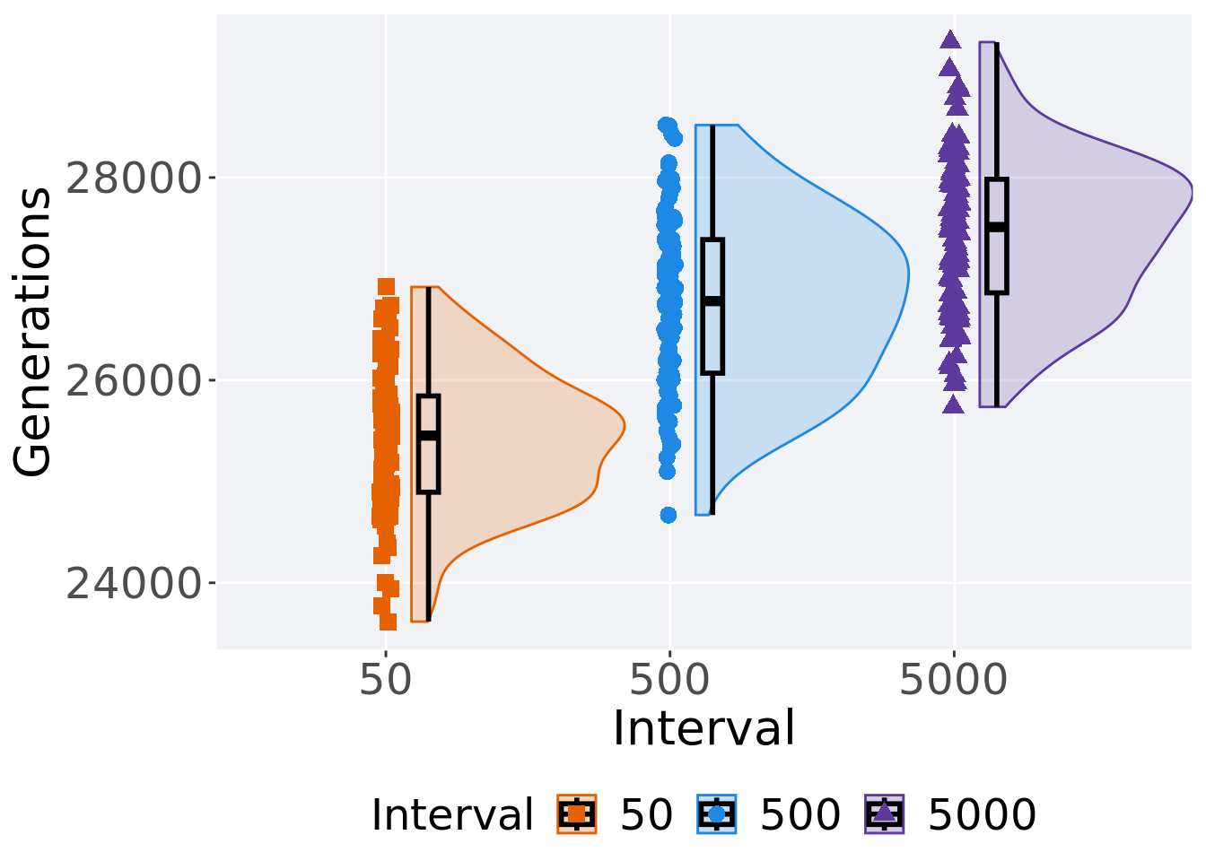
3.3.3 Stats
Summary statistics for the first generation a satisfactory solution is found.
ssf = filter(df_ssf, `Selection\nScheme` == 'TRUNCATION')
ssf %>%
  group_by(Interval) %>%
  dplyr::summarise(
    count = n(),
    na_cnt = sum(is.na(Generations)),
    min = min(Generations, na.rm = TRUE),
    median = median(Generations, na.rm = TRUE),
    mean = mean(Generations, na.rm = TRUE),
    max = max(Generations, na.rm = TRUE),
    IQR = IQR(Generations, na.rm = TRUE)
  )
## # A tibble: 3 x 8
## Interval count na_cnt min median mean max IQR
## <fct> <int> <int> <int> <dbl> <dbl> <int> <dbl>
## 1 50 100 0 23617 25453 25405. 26920 950
## 2 500 100 0 24669 26780. 26767. 28518 1318.
## 3 5000 100 0 25736 27512. 27446. 29337 1121.Kruskal–Wallis test provides evidence of difference among selection schemes.
##
##  Kruskal-Wallis rank sum test
##
## data:  Generations by Interval
## Kruskal-Wallis chi-squared = 168.14, df = 2, p-value < 2.2e-16
Results for post-hoc Wilcoxon rank-sum test with a Bonferroni correction.
pairwise.wilcox.test(x = ssf$Generations, g = ssf$Interval, p.adjust.method = "bonferroni",
                     paired = FALSE, conf.int = FALSE, alternative = 'g')
##
## Pairwise comparisons using Wilcoxon rank sum test with continuity correction
##
## data: ssf$Generations and ssf$Interval
##
## 50 500
## 500 < 2e-16 -
## 5000 < 2e-16 1.8e-07
##
## P value adjustment method: bonferroni3.4 Tournament selection
Here we analyze how the different migration intervals affect tournament selection on the exploitation rate diagnostic.
3.4.1 Performance over time
lines = filter(df_ot, `Selection\nScheme` == 'TOURNAMENT') %>%
  group_by(Interval, Generations) %>%
  dplyr::summarise(
    min = min(pop_fit_max) / DIMENSIONALITY,
    mean = mean(pop_fit_max) / DIMENSIONALITY,
    max = max(pop_fit_max) / DIMENSIONALITY
  )
ggplot(lines, aes(x=Generations, y=mean, group = Interval, fill = Interval, color = Interval, shape = Interval)) +
  geom_ribbon(aes(ymin = min, ymax = max), alpha = 0.1) +
  geom_line(size = 0.5) +
  geom_point(data = filter(lines, Generations %% 2000 == 0), size = 2.5, stroke = 2.0, alpha = 1.0) +
  scale_y_continuous(
    name="Average trait score",
    limits=c(0, 100),
    breaks=seq(0,100, 20),
    labels=c("0", "20", "40", "60", "80", "100")
  ) +
  scale_x_continuous(
    name="Generations",
    limits=c(0, 50000),
    breaks=c(0, 10000, 20000, 30000, 40000, 50000),
    labels=c("0e+4", "1e+4", "2e+4", "3e+4", "4e+4", "5e+4")

  ) +
  scale_shape_manual(values=SHAPE)+
  scale_colour_manual(values = cb_palette_mi) +
  scale_fill_manual(values = cb_palette_mi) +
  ggtitle("Best performance over time") +
  p_theme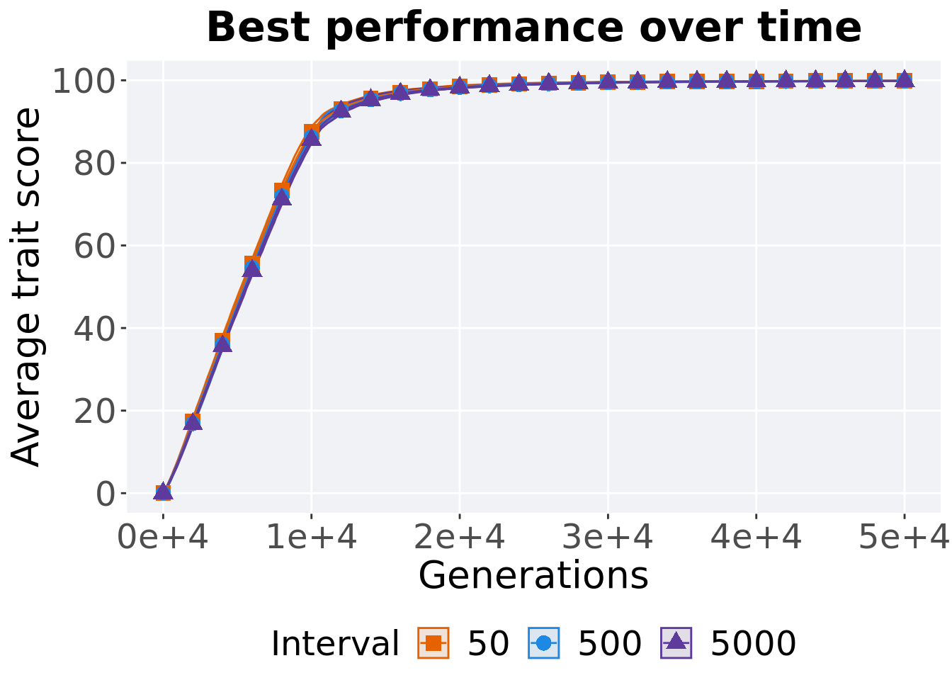
3.4.2 Generation satisfactory solution found
First generation a satisfactory solution is found throughout the 50,000 generations.
filter(df_ssf, `Selection\nScheme` == 'TOURNAMENT') %>%
  ggplot(., aes(x = Interval, y = Generations, color = Interval, fill = Interval, shape = Interval)) +
  geom_flat_violin(position = position_nudge(x = .09, y = 0), scale = 'width', alpha = 0.2, width = 1.5) +
  geom_boxplot(color = 'black', width = .07, outlier.shape = NA, alpha = 0.0, size = 1.0, position = position_nudge(x = .15, y = 0)) +
  geom_point(position = position_jitter(width = .02), size = 3.0, alpha = 1.0) +
  scale_shape_manual(values=SHAPE)+
  scale_y_continuous(
    name="Generations"
  ) +
  scale_x_discrete(
    name="Interval"
  ) +
  scale_colour_manual(values = cb_palette_mi) +
  scale_fill_manual(values = cb_palette_mi) +
  p_theme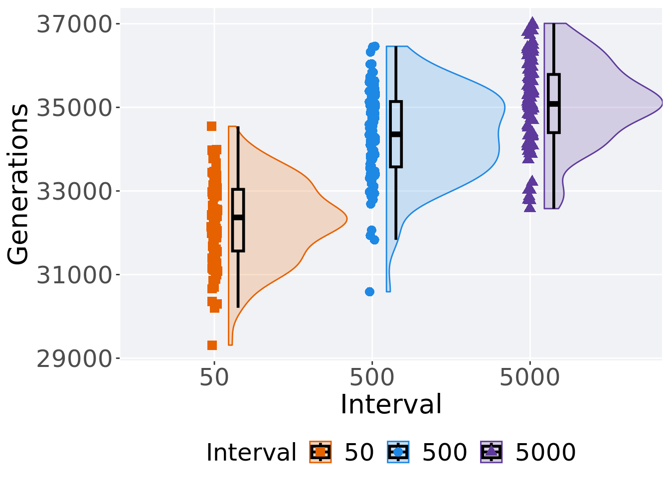
3.4.3 Stats
Summary statistics for the first generation a satisfactory solution is found.
ssf = filter(df_ssf, `Selection\nScheme` == 'TOURNAMENT')
ssf %>%
  group_by(Interval) %>%
  dplyr::summarise(
    count = n(),
    na_cnt = sum(is.na(Generations)),
    min = min(Generations, na.rm = TRUE),
    median = median(Generations, na.rm = TRUE),
    mean = mean(Generations, na.rm = TRUE),
    max = max(Generations, na.rm = TRUE),
    IQR = IQR(Generations, na.rm = TRUE)
  )
## # A tibble: 3 x 8
## Interval count na_cnt min median mean max IQR
## <fct> <int> <int> <int> <dbl> <dbl> <int> <dbl>
## 1 50 100 0 29313 32368. 32281. 34547 1474
## 2 500 100 0 30589 34356. 34349. 36461 1564.
## 3 5000 100 0 32578 35082 35088. 37009 1392Kruskal–Wallis test provides evidence of difference among selection schemes.
##
##  Kruskal-Wallis rank sum test
##
## data:  Generations by Interval
## Kruskal-Wallis chi-squared = 172.97, df = 2, p-value < 2.2e-16
Results for post-hoc Wilcoxon rank-sum test with a Bonferroni correction.
pairwise.wilcox.test(x = ssf$Generations, g = ssf$Interval, p.adjust.method = "bonferroni",
                     paired = FALSE, conf.int = FALSE, alternative = 'g')
##
## Pairwise comparisons using Wilcoxon rank sum test with continuity correction
##
## data: ssf$Generations and ssf$Interval
##
## 50 500
## 500 < 2e-16 -
## 5000 < 2e-16 5.9e-06
##
## P value adjustment method: bonferroni3.5 Lexicase selection
Here we analyze how the different migration intervals affect tournament selection on the exploitation rate diagnostic.
3.5.1 Performance over time
lines = filter(df_ot, `Selection\nScheme` == 'LEXICASE') %>%
  group_by(Interval, Generations) %>%
  dplyr::summarise(
    min = min(pop_fit_max) / DIMENSIONALITY,
    mean = mean(pop_fit_max) / DIMENSIONALITY,
    max = max(pop_fit_max) / DIMENSIONALITY
  )
ggplot(lines, aes(x=Generations, y=mean, group = Interval, fill = Interval, color = Interval, shape = Interval)) +
  geom_ribbon(aes(ymin = min, ymax = max), alpha = 0.1) +
  geom_line(size = 0.5) +
  geom_point(data = filter(lines, Generations %% 2000 == 0), size = 2.5, stroke = 2.0, alpha = 1.0) +
  scale_y_continuous(
    name="Average trait score",
    limits=c(0, 100),
    breaks=seq(0,100, 20),
    labels=c("0", "20", "40", "60", "80", "100")
  ) +
  scale_x_continuous(
    name="Generations",
    limits=c(0, 50000),
    breaks=c(0, 10000, 20000, 30000, 40000, 50000),
    labels=c("0e+4", "1e+4", "2e+4", "3e+4", "4e+4", "5e+4")

  ) +
  scale_shape_manual(values=SHAPE)+
  scale_colour_manual(values = cb_palette_mi) +
  scale_fill_manual(values = cb_palette_mi) +
  ggtitle("Best performance over time") +
  p_theme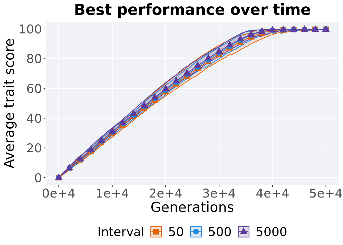
3.5.2 Generation satisfactory solution found
First generation a satisfactory solution is found throughout the 50,000 generations.
filter(df_ssf, `Selection\nScheme` == 'LEXICASE') %>%
  ggplot(., aes(x = Interval, y = Generations, color = Interval, fill = Interval, shape = Interval)) +
  geom_flat_violin(position = position_nudge(x = .09, y = 0), scale = 'width', alpha = 0.2, width = 1.5) +
  geom_boxplot(color = 'black', width = .07, outlier.shape = NA, alpha = 0.0, size = 1.0, position = position_nudge(x = .15, y = 0)) +
  geom_point(position = position_jitter(width = .02), size = 3.0, alpha = 1.0) +
  scale_shape_manual(values=SHAPE)+
  scale_y_continuous(
    name="Generations"
  ) +
  scale_x_discrete(
    name="Interval"
  ) +
  scale_colour_manual(values = cb_palette_mi) +
  scale_fill_manual(values = cb_palette_mi) +
  p_theme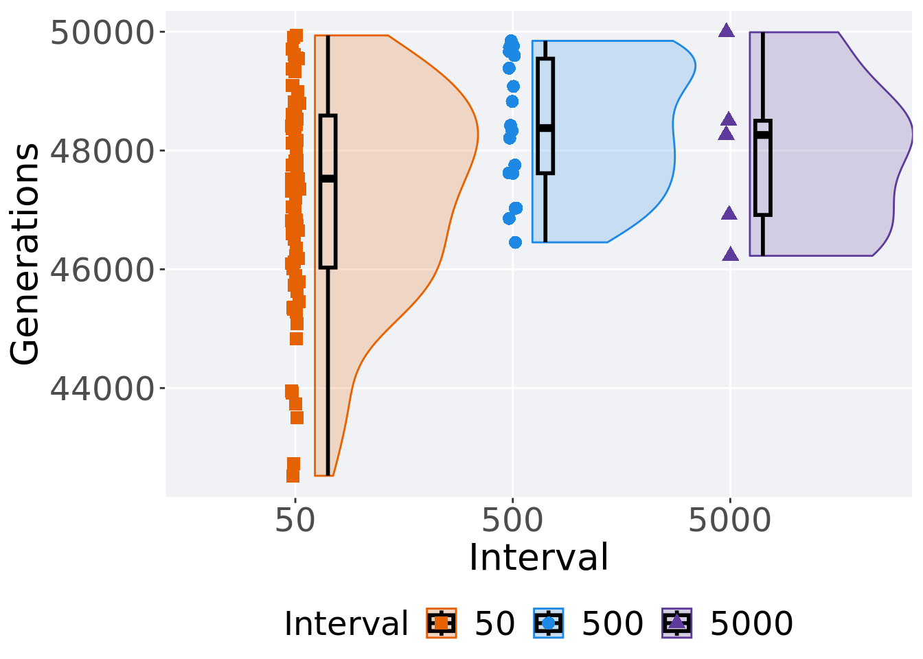
3.5.3 Stats
Summary statistics for the first generation a satisfactory solution is found.
ssf = filter(df_ssf, `Selection\nScheme` == 'LEXICASE')
ssf %>%
  group_by(Interval) %>%
  dplyr::summarise(
    count = n(),
    na_cnt = sum(is.na(Generations)),
    min = min(Generations, na.rm = TRUE),
    median = median(Generations, na.rm = TRUE),
    mean = mean(Generations, na.rm = TRUE),
    max = max(Generations, na.rm = TRUE),
    IQR = IQR(Generations, na.rm = TRUE)
  )
## # A tibble: 3 x 8
## Interval count na_cnt min median mean max IQR
## <fct> <int> <int> <int> <dbl> <dbl> <int> <dbl>
## 1 50 70 0 42523 47526. 47195. 49938 2560.
## 2 500 18 0 46454 48378. 48402. 49847 1929
## 3 5000 5 0 46227 48262 47980. 49992 1587Kruskal–Wallis test provides evidence of difference among selection schemes.
##
##  Kruskal-Wallis rank sum test
##
## data:  Generations by Interval
## Kruskal-Wallis chi-squared = 7.1725, df = 2, p-value = 0.0277
Results for post-hoc Wilcoxon rank-sum test with a Bonferroni correction.
pairwise.wilcox.test(x = ssf$Generations, g = ssf$Interval, p.adjust.method = "bonferroni",
                     paired = FALSE, conf.int = FALSE, alternative = 't')
##
## Pairwise comparisons using Wilcoxon rank sum test with continuity correction
##
## data: ssf$Generations and ssf$Interval
##
## 50 500
## 500 0.027 -
## 5000 1.000 1.000
##
## P value adjustment method: bonferroni3.5.4 Best performance thorughout run
filter(df_best, Diagnostic == 'ORDERED_EXPLOITATION' & `Selection\nScheme` == 'LEXICASE' & VAR == 'pop_fit_max') %>%
  ggplot(., aes(x = Interval, y = VAL / DIMENSIONALITY, color = Interval, fill = Interval, shape = Interval)) +
  geom_flat_violin(position = position_nudge(x = .2, y = 0), scale = 'width', alpha = 0.2) +
  geom_point(position = position_jitter(width = .1), size = 1.5, alpha = 1.0) +
  geom_boxplot(color = 'black', width = .2, outlier.shape = NA, alpha = 0.0) +
  scale_y_continuous(
    name="Average trait score"
  ) +
  scale_x_discrete(
    name="Interval"
  )+
  scale_shape_manual(values=SHAPE)+
  scale_colour_manual(values = cb_palette, ) +
  scale_fill_manual(values = cb_palette) +
  ggtitle('Best performance')+
  p_theme + coord_flip()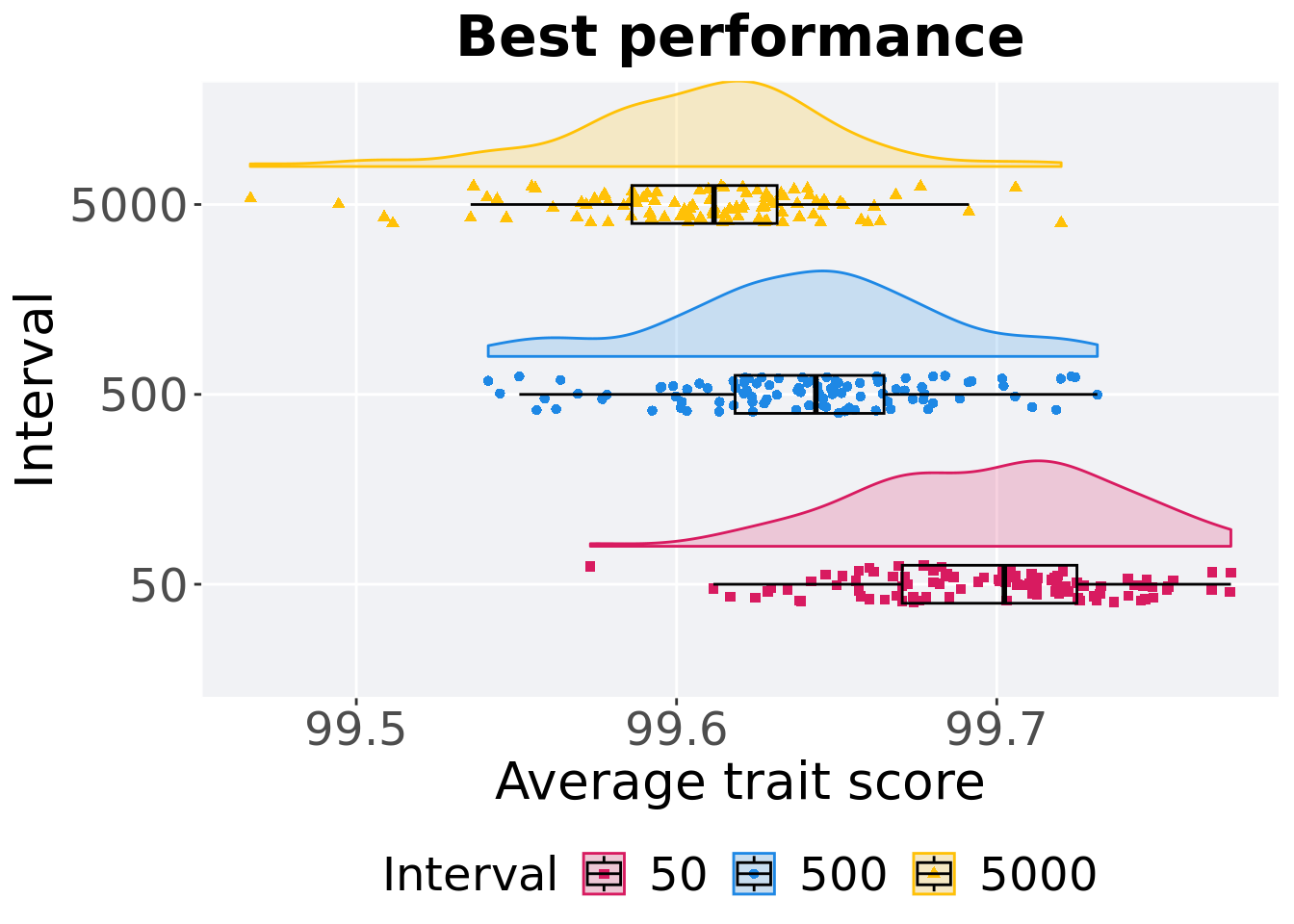
3.5.5 Stats
Summary statistics for the first generation a satisfactory solution is found.
best = filter(df_best, Diagnostic == 'ORDERED_EXPLOITATION' & `Selection\nScheme` == 'LEXICASE' & VAR == 'pop_fit_max')
best %>%
  group_by(Interval) %>%
  dplyr::summarise(
    count = n(),
    na_cnt = sum(is.na(VAL)) / DIMENSIONALITY,
    min = min(VAL, na.rm = TRUE) / DIMENSIONALITY,
    median = median(VAL, na.rm = TRUE) / DIMENSIONALITY,
    mean = mean(VAL, na.rm = TRUE) / DIMENSIONALITY,
    max = max(VAL, na.rm = TRUE) / DIMENSIONALITY,
    IQR = IQR(VAL, na.rm = TRUE) / DIMENSIONALITY
  )
## # A tibble: 3 x 8
## Interval count na_cnt min median mean max IQR
## <fct> <int> <dbl> <dbl> <dbl> <dbl> <dbl> <dbl>
## 1 50 100 0 99.6 99.7 99.7 99.8 0.0545
## 2 500 100 0 99.5 99.6 99.6 99.7 0.0465
## 3 5000 100 0 99.5 99.6 99.6 99.7 0.0454Kruskal–Wallis test provides evidence of difference among selection schemes.
##
##  Kruskal-Wallis rank sum test
##
## data:  VAL by Interval
## Kruskal-Wallis chi-squared = 143.15, df = 2, p-value < 2.2e-16
Results for post-hoc Wilcoxon rank-sum test with a Bonferroni correction.
pairwise.wilcox.test(x = best$VAL, g = best$Interval, p.adjust.method = "bonferroni",
                     paired = FALSE, conf.int = FALSE, alternative = 'l')
##
## Pairwise comparisons using Wilcoxon rank sum test with continuity correction
##
## data: best$VAL and best$Interval
##
## 50 500
## 500 < 2e-16 -
## 5000 < 2e-16 6.4e-08
##
## P value adjustment method: bonferroni