Chapter 5 Interval comparison: Multi-path exploration results
Here we present the results for the best performances and activation gene coverage generated by each selection scheme replicate on the multi-path exploration diagnostic. Best performance found refers to the largest average trait score found in a given population. Note that activation gene coverage values are gathered at the population-level. Activation gene coverage refers to the count of unique activation genes in a given population; this gives us a range of integers between 0 and 100.
5.2 Data
base   = filter(base_over_time,   Diagnostic == 'MULTIPATH_EXPLORATION' & Structure == 'IS')
mi50   = filter(mi50_over_time,   Diagnostic == 'MULTIPATH_EXPLORATION' & Structure == 'IS')
mi5000 = filter(mi5000_over_time, Diagnostic == 'MULTIPATH_EXPLORATION' & Structure == 'IS')

base$Interval = '500'
mi50$Interval = '50'
mi5000$Interval = '5000'

df_ot = rbind(base, mi50, mi5000)
df_ot$Interval = factor(df_ot$Interval, levels=c('50','500','5000'))

base = filter(base_best,     Diagnostic == 'MULTIPATH_EXPLORATION' & Structure == 'IS')
mi50 = filter(mi50_best,     Diagnostic == 'MULTIPATH_EXPLORATION' & Structure == 'IS')
mi5000 = filter(mi5000_best, Diagnostic == 'MULTIPATH_EXPLORATION' & Structure == 'IS')

base$Interval = '500'
mi50$Interval = '50'
mi5000$Interval = '5000'

df_best = rbind(mi50,base,mi5000)
df_best$Interval = factor(df_best$Interval, levels = c('50','500','5000'))
5.3 Truncation selection
Here we analyze how the different population structures affect truncation selection (size 8) on the contradictory objectives diagnostic.
5.3.1 Performance
5.3.1.1 Performance over time
lines = filter(df_ot, Diagnostic == 'MULTIPATH_EXPLORATION' & `Selection\nScheme` == 'TRUNCATION') %>%
  group_by(Interval, Generations) %>%
  dplyr::summarise(
    min = min(pop_fit_max) / DIMENSIONALITY,
    mean = mean(pop_fit_max) / DIMENSIONALITY,
    max = max(pop_fit_max) / DIMENSIONALITY
  )
ggplot(lines, aes(x=Generations, y=mean, group = Interval, fill = Interval, color = Interval, shape = Interval)) +
  geom_ribbon(aes(ymin = min, ymax = max), alpha = 0.1) +
  geom_line(size = 0.5) +
  geom_point(data = filter(lines, Generations %% 2000 == 0), size = 2.5, stroke = 2.0, alpha = 1.0) +
  scale_y_continuous(
    name="Average trait score"
  ) +
  scale_x_continuous(
    name="Generations",
    limits=c(0, 50000),
    breaks=c(0, 10000, 20000, 30000, 40000, 50000),
    labels=c("0e+4", "1e+4", "2e+4", "3e+4", "4e+4", "5e+4")

  ) +
  scale_shape_manual(values=SHAPE)+
  scale_colour_manual(values = cb_palette_mi) +
  scale_fill_manual(values = cb_palette_mi) +
  ggtitle("Performance over time") +
  p_theme
5.3.1.2 Best performance
Best performancefound throughout the 50,000 generations.
filter(df_best, Diagnostic == 'MULTIPATH_EXPLORATION' & `Selection\nScheme` == 'TRUNCATION' & VAR == 'pop_fit_max') %>%
  ggplot(., aes(x = Interval, y = VAL / DIMENSIONALITY, color = Interval, fill = Interval, shape = Interval)) +
  geom_flat_violin(position = position_nudge(x = .2, y = 0), scale = 'width', alpha = 0.2) +
  geom_point(position = position_jitter(width = .1), size = 1.5, alpha = 1.0) +
  geom_boxplot(color = 'black', width = .2, outlier.shape = NA, alpha = 0.0) +
  scale_y_continuous(
    name="Average trait score"
  ) +
  scale_x_discrete(
    name="Interval"
  )+
  scale_shape_manual(values=SHAPE)+
  scale_colour_manual(values = cb_palette_mi, ) +
  scale_fill_manual(values = cb_palette_mi) +
  ggtitle('Best performance')+
  p_theme + coord_flip()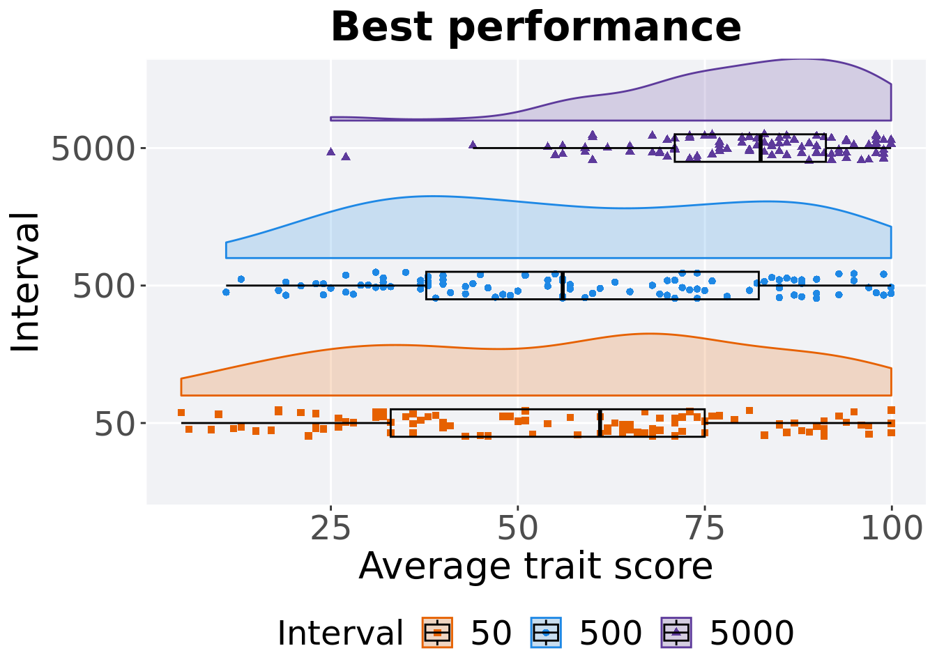
5.3.1.2.1 Stats
Summary statistics for the first generation a best performance found.
performance = filter(df_best, Diagnostic == 'MULTIPATH_EXPLORATION' & `Selection\nScheme` == 'TRUNCATION' & VAR == 'pop_fit_max')
performance %>%
  group_by(Interval) %>%
  dplyr::summarise(
    count = n(),
    na_cnt = sum(is.na(VAL)),
    min = min(VAL, na.rm = TRUE) / DIMENSIONALITY,
    median = median(VAL, na.rm = TRUE) / DIMENSIONALITY,
    mean = mean(VAL, na.rm = TRUE) / DIMENSIONALITY,
    max = max(VAL, na.rm = TRUE) / DIMENSIONALITY,
    IQR = IQR(VAL, na.rm = TRUE) / DIMENSIONALITY
  )
## # A tibble: 3 x 8
## Interval count na_cnt min median mean max IQR
## <fct> <int> <int> <dbl> <dbl> <dbl> <dbl> <dbl>
## 1 50 100 0 5 61.0 55.6 99.9 42.0
## 2 500 100 0 11 56.0 58.3 99.9 44.5
## 3 5000 100 0 25.0 82.5 79.7 99.9 20.2Kruskal–Wallis test provides evidence of difference among selection schemes.
##
##  Kruskal-Wallis rank sum test
##
## data:  VAL by Interval
## Kruskal-Wallis chi-squared = 51.085, df = 2, p-value = 8.073e-12
Results for post-hoc Wilcoxon rank-sum test with a Bonferroni correction.
pairwise.wilcox.test(x = performance$VAL, g = performance$Interval, p.adjust.method = "bonferroni",
                     paired = FALSE, conf.int = FALSE, alternative = 'g')
##
## Pairwise comparisons using Wilcoxon rank sum test with continuity correction
##
## data: performance$VAL and performance$Interval
##
## 50 500
## 500 0.87 -
## 5000 1.9e-10 5.5e-09
##
## P value adjustment method: bonferroni5.3.1.3 Final performance
Best performance is found throughout in final generation.
filter(df_ot, Diagnostic == 'MULTIPATH_EXPLORATION' & `Selection\nScheme` == 'TRUNCATION' & Generations == 50000) %>%
  ggplot(., aes(x = Interval, y = pop_fit_max / DIMENSIONALITY, color = Interval, fill = Interval, shape = Interval)) +
  geom_flat_violin(position = position_nudge(x = .2, y = 0), scale = 'width', alpha = 0.2) +
  geom_point(position = position_jitter(width = .1), size = 1.5, alpha = 1.0) +
  geom_boxplot(color = 'black', width = .2, outlier.shape = NA, alpha = 0.0) +
  scale_y_continuous(
    name="Average trait score"
  ) +
  scale_x_discrete(
    name="Interval"
  )+
  scale_shape_manual(values=SHAPE)+
  scale_colour_manual(values = cb_palette_mi, ) +
  scale_fill_manual(values = cb_palette_mi) +
  ggtitle('Final performance')+
  p_theme + coord_flip()
5.3.1.3.1 Stats
Summary statistics for the best performance is found in final generation.
performance = filter(df_ot, Diagnostic == 'MULTIPATH_EXPLORATION' & `Selection\nScheme` == 'TRUNCATION' & Generations == 50000)
performance %>%
  group_by(Interval) %>%
  dplyr::summarise(
    count = n(),
    na_cnt = sum(is.na(pop_fit_max)),
    min = min(pop_fit_max / DIMENSIONALITY, na.rm = TRUE),
    median = median(pop_fit_max / DIMENSIONALITY, na.rm = TRUE),
    mean = mean(pop_fit_max / DIMENSIONALITY, na.rm = TRUE),
    max = max(pop_fit_max / DIMENSIONALITY, na.rm = TRUE),
    IQR = IQR(pop_fit_max / DIMENSIONALITY, na.rm = TRUE)
  )
## # A tibble: 3 x 8
## Interval count na_cnt min median mean max IQR
## <fct> <int> <int> <dbl> <dbl> <dbl> <dbl> <dbl>
## 1 50 100 0 5 61.0 55.6 99.9 42.0
## 2 500 100 0 11 56.0 58.3 99.9 44.5
## 3 5000 100 0 25.0 82.5 79.7 99.9 20.2Kruskal–Wallis test provides evidence of difference among selection schemes.
##
##  Kruskal-Wallis rank sum test
##
## data:  pop_fit_max by Interval
## Kruskal-Wallis chi-squared = 51.085, df = 2, p-value = 8.073e-12
Results for post-hoc Wilcoxon rank-sum test with a Bonferroni correction.
pairwise.wilcox.test(x = performance$pop_fit_max, g = performance$Interval, p.adjust.method = "bonferroni",
                     paired = FALSE, conf.int = FALSE, alternative = 'g')
##
## Pairwise comparisons using Wilcoxon rank sum test with continuity correction
##
## data: performance$pop_fit_max and performance$Interval
##
## 50 500
## 500 0.87 -
## 5000 1.9e-10 5.5e-09
##
## P value adjustment method: bonferroni5.3.2 Activation gene coverage
Activation gene coverage analysis.
5.3.2.1 Coverage over time
Activation gene coverage over time.
# data for lines and shading on plots
lines = filter(df_ot, Diagnostic == 'MULTIPATH_EXPLORATION' & `Selection\nScheme` == 'TRUNCATION') %>%
  group_by(Interval, Generations) %>%
  dplyr::summarise(
    min = min(pop_act_cov),
    mean = mean(pop_act_cov),
    max = max(pop_act_cov)
  )
## `summarise()` has grouped output by 'Interval'. You can override using the
## `.groups` argument.ggplot(lines, aes(x=Generations, y=mean, group = Interval, fill = Interval, color = Interval, shape = Interval)) +
geom_ribbon(aes(ymin = min, ymax = max), alpha = 0.1) +
geom_line(size = 0.5) +
geom_point(data = filter(lines, Generations %% 2000 == 0), size = 1.5, stroke = 2.0, alpha = 1.0) +
scale_y_continuous(
name="Coverage"
) +
scale_x_continuous(
name="Generations",
limits=c(0, 50000),
breaks=c(0, 10000, 20000, 30000, 40000, 50000),
labels=c("0e+4", "1e+4", "2e+4", "3e+4", "4e+4", "5e+4")
) +
scale_shape_manual(values=SHAPE)+
scale_colour_manual(values = cb_palette_mi) +
scale_fill_manual(values = cb_palette_mi) +
ggtitle('Activation gene coverage over time')+
p_theme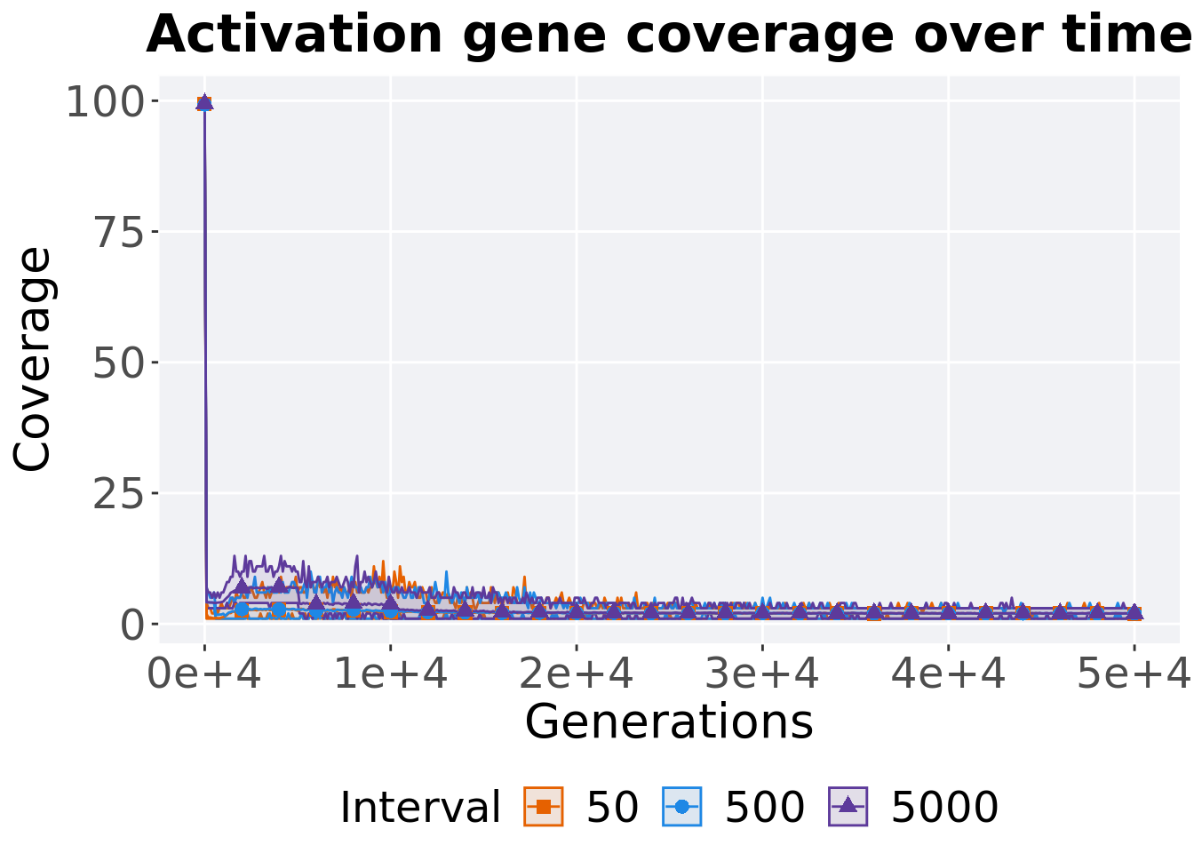
5.3.2.2 End of 50,000 generations
Activation gene coverage in the population at the end of 50,000 generations.
### end of run
filter(df_ot, Diagnostic == 'MULTIPATH_EXPLORATION' & `Selection\nScheme` == 'TRUNCATION' & Generations == 50000) %>%
  ggplot(., aes(x = Interval, y = pop_act_cov, color = Interval, fill = Interval, shape = Interval)) +
  geom_flat_violin(position = position_nudge(x = .2, y = 0), scale = 'width', alpha = 0.3) +
  geom_point(position = position_jitter(height = .05, width = .05), size = 1.5, alpha = 0.5) +
  geom_boxplot(color = 'black', width = .2, outlier.shape = NA, alpha = 0.0) +
  scale_shape_manual(values=SHAPE)+
  scale_y_continuous(
    name="Coverage"
  ) +
  scale_x_discrete(
    name="Interval"
  ) +
  scale_colour_manual(values = cb_palette_mi) +
  scale_fill_manual(values = cb_palette_mi) +
  ggtitle('Final activation gene coverage')+
  p_theme + coord_flip()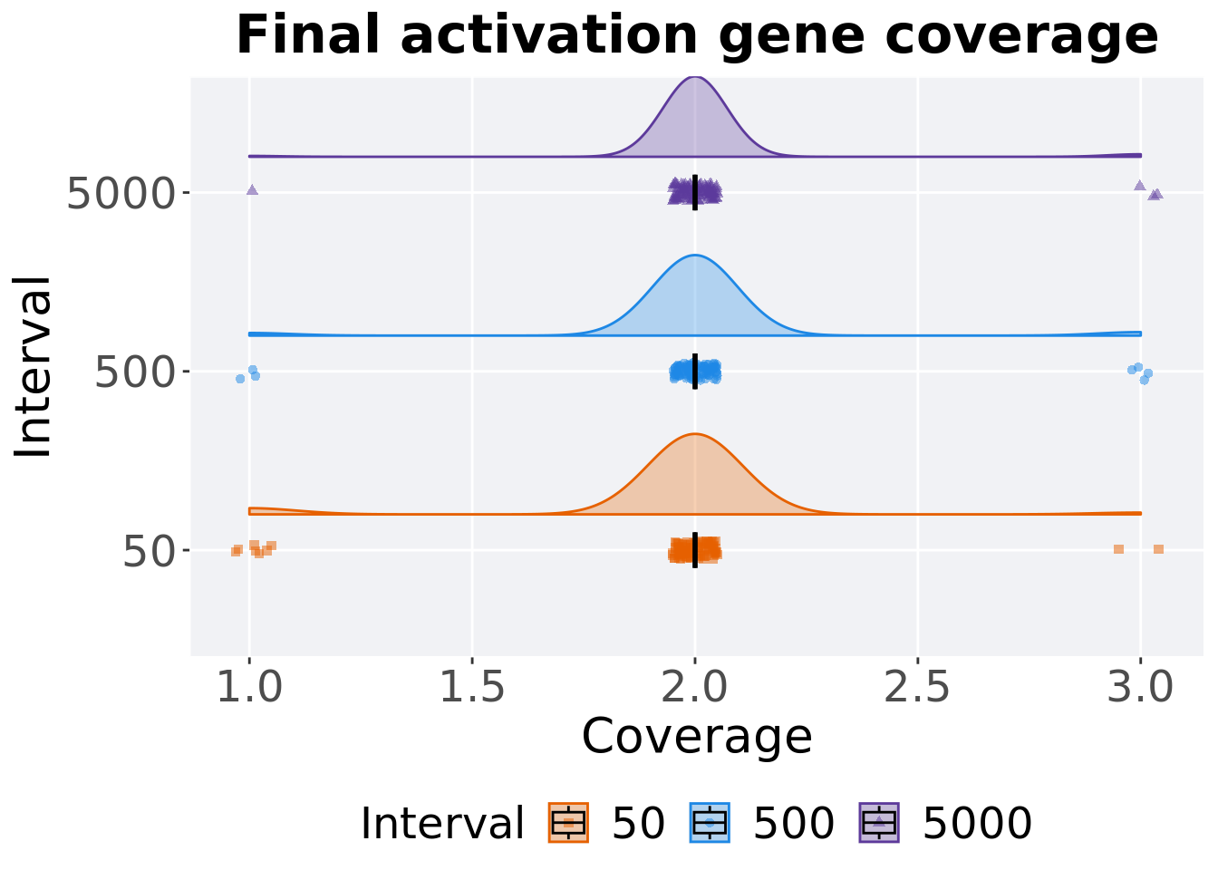
5.3.2.2.1 Stats
Summary statistics for activation gene coverage.
coverage = filter(df_ot, Diagnostic == 'MULTIPATH_EXPLORATION' & `Selection\nScheme` == 'TRUNCATION' & Generations == 50000)
coverage %>%
  group_by(Interval) %>%
  dplyr::summarise(
    count = n(),
    na_cnt = sum(is.na(pop_act_cov)),
    min = min(pop_act_cov, na.rm = TRUE),
    median = median(pop_act_cov, na.rm = TRUE),
    mean = mean(pop_act_cov, na.rm = TRUE),
    max = max(pop_act_cov, na.rm = TRUE),
    IQR = IQR(pop_act_cov, na.rm = TRUE)
  )
## # A tibble: 3 x 8
## Interval count na_cnt min median mean max IQR
## <fct> <int> <int> <int> <dbl> <dbl> <int> <dbl>
## 1 50 100 0 1 2 1.95 3 0
## 2 500 100 0 1 2 2.01 3 0
## 3 5000 100 0 1 2 2.02 3 0Kruskal–Wallis test provides evidence of no difference among activation gene coverage.
##
##  Kruskal-Wallis rank sum test
##
## data:  pop_act_cov by Interval
## Kruskal-Wallis chi-squared = 4.3029, df = 2, p-value = 0.1163
5.4 Tournament selection
Here we analyze how the different population structures affect tournament selection (size 8) on the contradictory objectives diagnostic.
5.4.1 Performance
5.4.1.1 Performance over time
lines = filter(df_ot, Diagnostic == 'MULTIPATH_EXPLORATION' & `Selection\nScheme` == 'TOURNAMENT') %>%
  group_by(Interval, Generations) %>%
  dplyr::summarise(
    min = min(pop_fit_max) / DIMENSIONALITY,
    mean = mean(pop_fit_max) / DIMENSIONALITY,
    max = max(pop_fit_max) / DIMENSIONALITY
  )
ggplot(lines, aes(x=Generations, y=mean, group = Interval, fill = Interval, color = Interval, shape = Interval)) +
  geom_ribbon(aes(ymin = min, ymax = max), alpha = 0.1) +
  geom_line(size = 0.5) +
  geom_point(data = filter(lines, Generations %% 2000 == 0), size = 2.5, stroke = 2.0, alpha = 1.0) +
  scale_y_continuous(
    name="Average trait score"
  ) +
  scale_x_continuous(
    name="Generations",
    limits=c(0, 50000),
    breaks=c(0, 10000, 20000, 30000, 40000, 50000),
    labels=c("0e+4", "1e+4", "2e+4", "3e+4", "4e+4", "5e+4")

  ) +
  scale_shape_manual(values=SHAPE)+
  scale_colour_manual(values = cb_palette_mi) +
  scale_fill_manual(values = cb_palette_mi) +
  ggtitle("Performance over time") +
  p_theme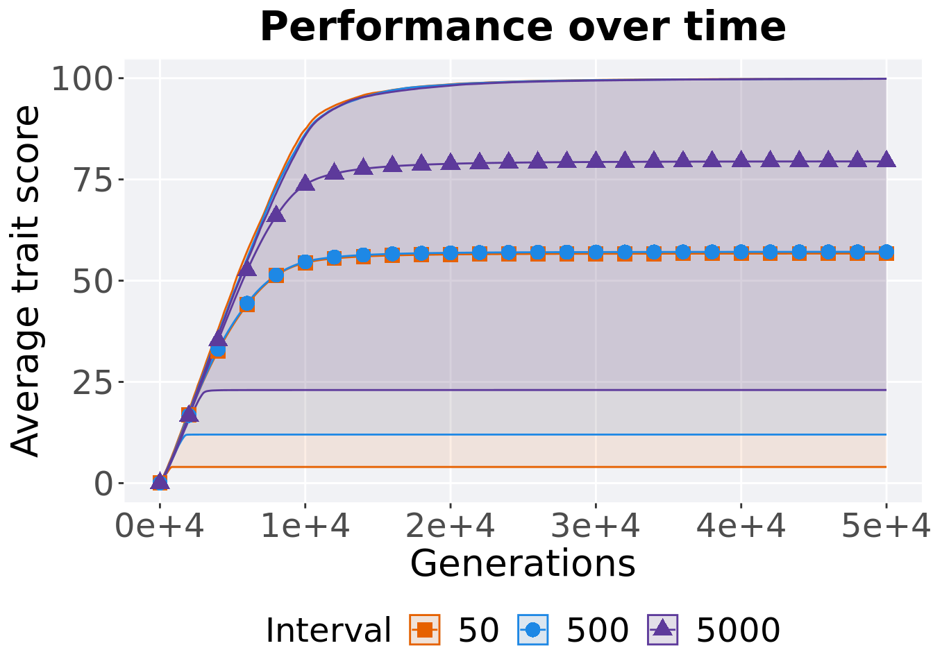
5.4.1.2 Best performance
Best performance is found throughout the 50,000 generations.
filter(df_best, Diagnostic == 'MULTIPATH_EXPLORATION' & `Selection\nScheme` == 'TOURNAMENT' & VAR == 'pop_fit_max') %>%
  ggplot(., aes(x = Interval, y = VAL / DIMENSIONALITY, color = Interval, fill = Interval, shape = Interval)) +
  geom_flat_violin(position = position_nudge(x = .2, y = 0), scale = 'width', alpha = 0.2) +
  geom_point(position = position_jitter(width = .1), size = 1.5, alpha = 1.0) +
  geom_boxplot(color = 'black', width = .2, outlier.shape = NA, alpha = 0.0) +
  scale_y_continuous(
    name="Average trait score"
  ) +
  scale_x_discrete(
    name="Interval"
  )+
  scale_shape_manual(values=SHAPE)+
  scale_colour_manual(values = cb_palette_mi, ) +
  scale_fill_manual(values = cb_palette_mi) +
  ggtitle('Best performance')+
  p_theme + coord_flip()
5.4.1.2.1 Stats
Summary statistics for the best performance found.
performance = filter(df_best, Diagnostic == 'MULTIPATH_EXPLORATION' & `Selection\nScheme` == 'TOURNAMENT' & VAR == 'pop_fit_max')
performance %>%
  group_by(Interval) %>%
  dplyr::summarise(
    count = n(),
    na_cnt = sum(is.na(VAL)),
    min = min(VAL, na.rm = TRUE) / DIMENSIONALITY,
    median = median(VAL, na.rm = TRUE) / DIMENSIONALITY,
    mean = mean(VAL, na.rm = TRUE) / DIMENSIONALITY,
    max = max(VAL, na.rm = TRUE) / DIMENSIONALITY,
    IQR = IQR(VAL, na.rm = TRUE) / DIMENSIONALITY
  )
## # A tibble: 3 x 8
## Interval count na_cnt min median mean max IQR
## <fct> <int> <int> <dbl> <dbl> <dbl> <dbl> <dbl>
## 1 50 100 0 4 58.5 56.7 99.9 45.5
## 2 500 100 0 12 59.0 57.1 99.9 43.5
## 3 5000 100 0 23.0 82.9 79.5 99.8 23.2Kruskal–Wallis test provides evidence of difference among selection schemes.
##
##  Kruskal-Wallis rank sum test
##
## data:  VAL by Interval
## Kruskal-Wallis chi-squared = 50.052, df = 2, p-value = 1.353e-11
Results for post-hoc Wilcoxon rank-sum test with a Bonferroni correction.
pairwise.wilcox.test(x = performance$VAL, g = performance$Interval, p.adjust.method = "bonferroni",
                     paired = FALSE, conf.int = FALSE, alternative = 'g')
##
## Pairwise comparisons using Wilcoxon rank sum test with continuity correction
##
## data: performance$VAL and performance$Interval
##
## 50 500
## 500 1 -
## 5000 2.6e-09 7.4e-10
##
## P value adjustment method: bonferroni5.4.1.3 Final performance
Best performance is found in final generation.
filter(df_ot, Diagnostic == 'MULTIPATH_EXPLORATION' & `Selection\nScheme` == 'TOURNAMENT' & Generations == 50000) %>%
  ggplot(., aes(x = Interval, y = pop_fit_max / DIMENSIONALITY, color = Interval, fill = Interval, shape = Interval)) +
  geom_flat_violin(position = position_nudge(x = .2, y = 0), scale = 'width', alpha = 0.2) +
  geom_point(position = position_jitter(width = .1), size = 1.5, alpha = 1.0) +
  geom_boxplot(color = 'black', width = .2, outlier.shape = NA, alpha = 0.0) +
  scale_y_continuous(
    name="Average trait score"
  ) +
  scale_x_discrete(
    name="Interval"
  )+
  scale_shape_manual(values=SHAPE)+
  scale_colour_manual(values = cb_palette_mi, ) +
  scale_fill_manual(values = cb_palette_mi) +
  ggtitle('Final performance')+
  p_theme + coord_flip()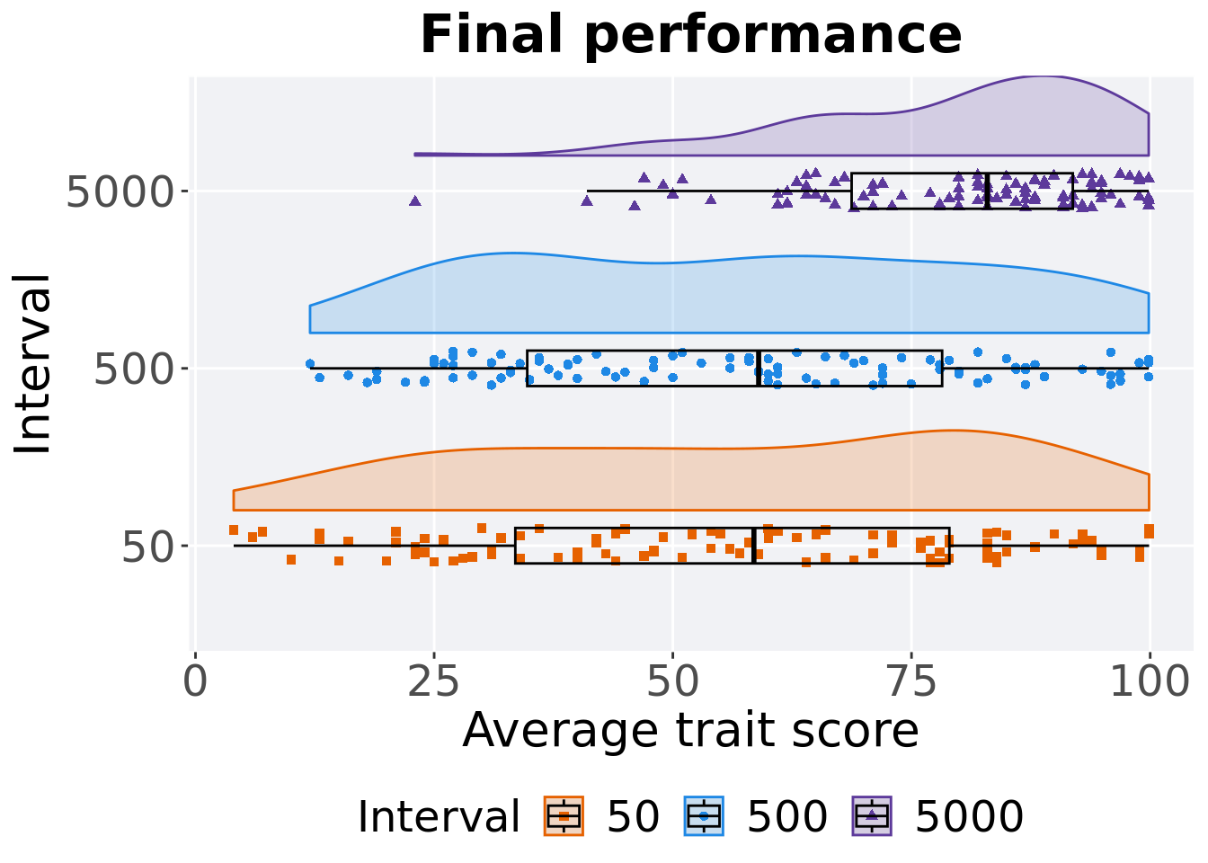
5.4.1.3.1 Stats
Summary statistics for best performance is found in final generation.
performance = filter(df_ot, Diagnostic == 'MULTIPATH_EXPLORATION' & `Selection\nScheme` == 'TOURNAMENT' & Generations == 50000)
performance %>%
  group_by(Interval) %>%
  dplyr::summarise(
    count = n(),
    na_cnt = sum(is.na(pop_fit_max)),
    min = min(pop_fit_max / DIMENSIONALITY, na.rm = TRUE),
    median = median(pop_fit_max / DIMENSIONALITY, na.rm = TRUE),
    mean = mean(pop_fit_max / DIMENSIONALITY, na.rm = TRUE),
    max = max(pop_fit_max / DIMENSIONALITY, na.rm = TRUE),
    IQR = IQR(pop_fit_max / DIMENSIONALITY, na.rm = TRUE)
  )
## # A tibble: 3 x 8
## Interval count na_cnt min median mean max IQR
## <fct> <int> <int> <dbl> <dbl> <dbl> <dbl> <dbl>
## 1 50 100 0 4 58.5 56.7 99.9 45.5
## 2 500 100 0 12 59.0 57.1 99.9 43.5
## 3 5000 100 0 23.0 82.9 79.5 99.8 23.2Kruskal–Wallis test provides evidence of difference among selection schemes.
##
##  Kruskal-Wallis rank sum test
##
## data:  pop_fit_max by Interval
## Kruskal-Wallis chi-squared = 50.052, df = 2, p-value = 1.353e-11
Results for post-hoc Wilcoxon rank-sum test with a Bonferroni correction.
pairwise.wilcox.test(x = performance$pop_fit_max, g = performance$Interval, p.adjust.method = "bonferroni",
                     paired = FALSE, conf.int = FALSE, alternative = 'g')
##
## Pairwise comparisons using Wilcoxon rank sum test with continuity correction
##
## data: performance$pop_fit_max and performance$Interval
##
## 50 500
## 500 1 -
## 5000 2.6e-09 7.4e-10
##
## P value adjustment method: bonferroni5.4.2 Activation gene coverage
Activation gene coverage analysis.
5.4.2.1 Coverage over time
Activation gene coverage over time.
# data for lines and shading on plots
lines = filter(df_ot, Diagnostic == 'MULTIPATH_EXPLORATION' & `Selection\nScheme` == 'TOURNAMENT') %>%
  group_by(Interval, Generations) %>%
  dplyr::summarise(
    min = min(pop_act_cov),
    mean = mean(pop_act_cov),
    max = max(pop_act_cov)
  )
## `summarise()` has grouped output by 'Interval'. You can override using the
## `.groups` argument.ggplot(lines, aes(x=Generations, y=mean, group = Interval, fill = Interval, color = Interval, shape = Interval)) +
geom_ribbon(aes(ymin = min, ymax = max), alpha = 0.1) +
geom_line(size = 0.5) +
geom_point(data = filter(lines, Generations %% 2000 == 0), size = 1.5, stroke = 2.0, alpha = 1.0) +
scale_y_continuous(
name="Coverage"
) +
scale_x_continuous(
name="Generations",
limits=c(0, 50000),
breaks=c(0, 10000, 20000, 30000, 40000, 50000),
labels=c("0e+4", "1e+4", "2e+4", "3e+4", "4e+4", "5e+4")
) +
scale_shape_manual(values=SHAPE)+
scale_colour_manual(values = cb_palette_mi) +
scale_fill_manual(values = cb_palette_mi) +
ggtitle('Activation gene coverage over time')+
p_theme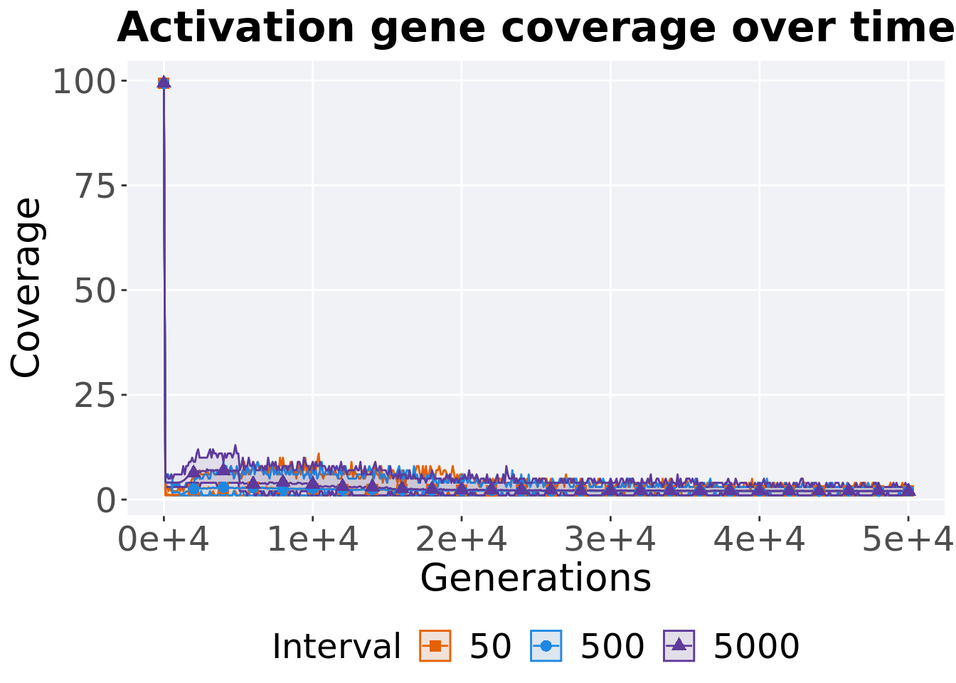
5.4.2.2 End of 50,000 generations
Activation gene coverage in the population at the end of 50,000 generations.
### end of run
filter(df_ot, Diagnostic == 'MULTIPATH_EXPLORATION' & `Selection\nScheme` == 'TOURNAMENT' & Generations == 50000) %>%
  ggplot(., aes(x = Interval, y = pop_act_cov, color = Interval, fill = Interval, shape = Interval)) +
  geom_flat_violin(position = position_nudge(x = .2, y = 0), scale = 'width', alpha = 0.3) +
  geom_point(position = position_jitter(height = .05, width = .05), size = 1.5, alpha = 0.5) +
  geom_boxplot(color = 'black', width = .2, outlier.shape = NA, alpha = 0.0) +
  scale_shape_manual(values=SHAPE)+
  scale_y_continuous(
    name="Coverage"
  ) +
  scale_x_discrete(
    name="Interval"
  ) +
  scale_colour_manual(values = cb_palette_mi) +
  scale_fill_manual(values = cb_palette_mi) +
  ggtitle('Final activation gene coverage')+
  p_theme + coord_flip()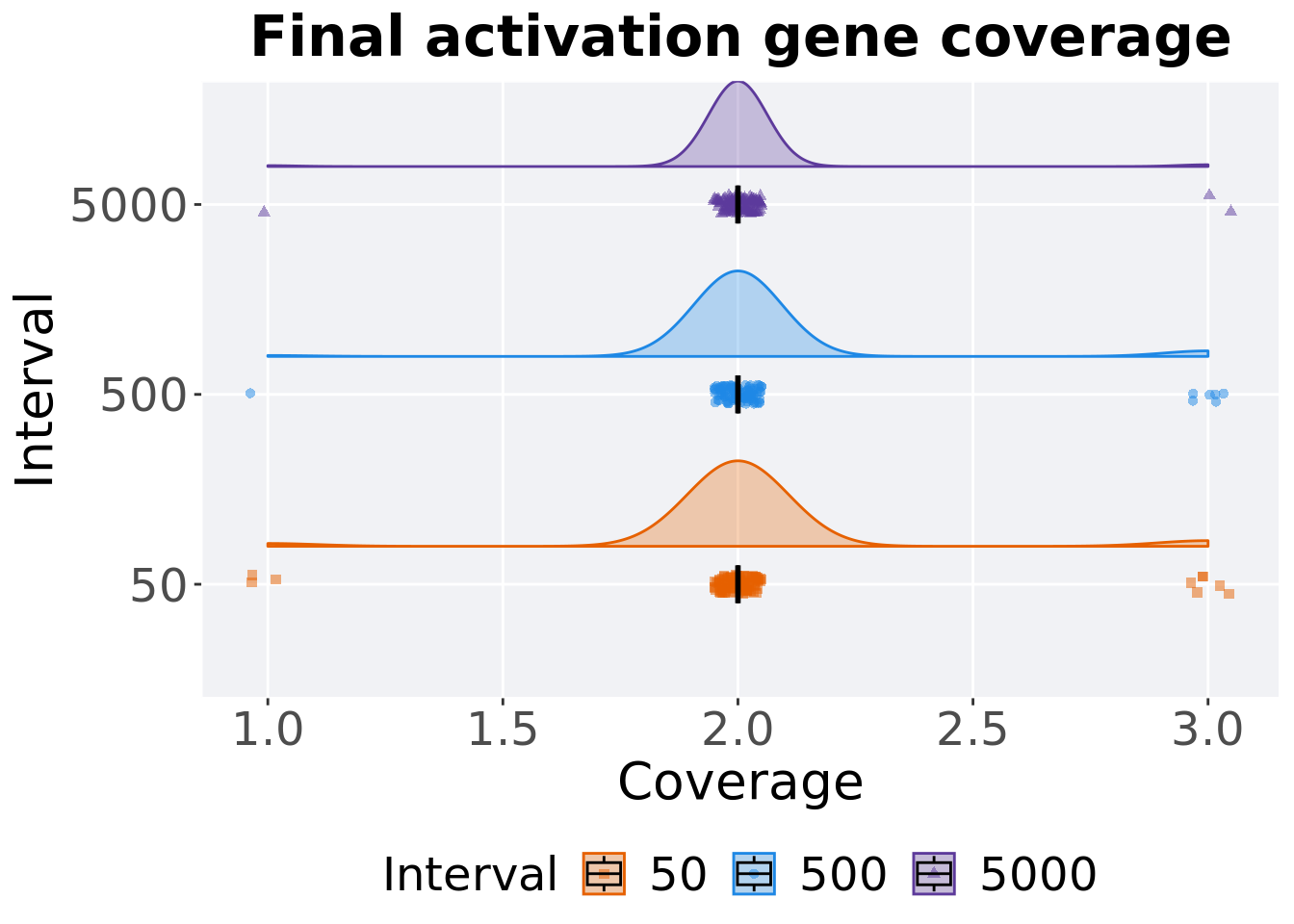
5.4.2.2.1 Stats
Summary statistics for activation gene coverage.
coverage = filter(df_ot, Diagnostic == 'MULTIPATH_EXPLORATION' & `Selection\nScheme` == 'TOURNAMENT' & Generations == 50000)
coverage %>%
  group_by(Interval) %>%
  dplyr::summarise(
    count = n(),
    na_cnt = sum(is.na(pop_act_cov)),
    min = min(pop_act_cov, na.rm = TRUE),
    median = median(pop_act_cov, na.rm = TRUE),
    mean = mean(pop_act_cov, na.rm = TRUE),
    max = max(pop_act_cov, na.rm = TRUE),
    IQR = IQR(pop_act_cov, na.rm = TRUE)
  )
## # A tibble: 3 x 8
## Interval count na_cnt min median mean max IQR
## <fct> <int> <int> <int> <dbl> <dbl> <int> <dbl>
## 1 50 100 0 1 2 2.03 3 0
## 2 500 100 0 1 2 2.05 3 0
## 3 5000 100 0 1 2 2.01 3 0Kruskal–Wallis test provides evidence of no difference among activation gene coverage.
##
##  Kruskal-Wallis rank sum test
##
## data:  pop_act_cov by Interval
## Kruskal-Wallis chi-squared = 1.299, df = 2, p-value = 0.5223
5.5 Lexicase selection
Here we analyze how the different population structures affect standard lexicase selection on the contradictory objectives diagnostic.
5.5.1 Performance
5.5.1.1 Performance over time
lines = filter(df_ot, Diagnostic == 'MULTIPATH_EXPLORATION' & `Selection\nScheme` == 'LEXICASE') %>%
  group_by(Interval, Generations) %>%
  dplyr::summarise(
    min = min(pop_fit_max) / DIMENSIONALITY,
    mean = mean(pop_fit_max) / DIMENSIONALITY,
    max = max(pop_fit_max) / DIMENSIONALITY
  )
ggplot(lines, aes(x=Generations, y=mean, group = Interval, fill = Interval, color = Interval, shape = Interval)) +
  geom_ribbon(aes(ymin = min, ymax = max), alpha = 0.1) +
  geom_line(size = 0.5) +
  geom_point(data = filter(lines, Generations %% 2000 == 0), size = 2.5, stroke = 2.0, alpha = 1.0) +
  scale_y_continuous(
    name="Average trait score"
  ) +
  scale_x_continuous(
    name="Generations",
    limits=c(0, 50000),
    breaks=c(0, 10000, 20000, 30000, 40000, 50000),
    labels=c("0e+4", "1e+4", "2e+4", "3e+4", "4e+4", "5e+4")

  ) +
  scale_shape_manual(values=SHAPE)+
  scale_colour_manual(values = cb_palette_mi) +
  scale_fill_manual(values = cb_palette_mi) +
  ggtitle("Performance over time") +
  p_theme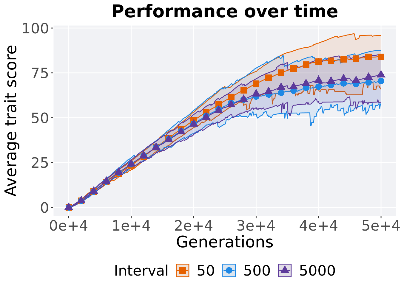
5.5.1.2 Best performance
Best performance is found throughout in final generation.
filter(df_best, Diagnostic == 'MULTIPATH_EXPLORATION' & `Selection\nScheme` == 'LEXICASE' & VAR == 'pop_fit_max') %>%
  ggplot(., aes(x = Interval, y = VAL / DIMENSIONALITY, color = Interval, fill = Interval, shape = Interval)) +
  geom_flat_violin(position = position_nudge(x = .2, y = 0), scale = 'width', alpha = 0.2) +
  geom_point(position = position_jitter(width = .1), size = 1.5, alpha = 1.0) +
  geom_boxplot(color = 'black', width = .2, outlier.shape = NA, alpha = 0.0) +
  scale_y_continuous(
    name="Average trait score"
  ) +
  scale_x_discrete(
    name="Interval"
  )+
  scale_shape_manual(values=SHAPE)+
  scale_colour_manual(values = cb_palette_mi, ) +
  scale_fill_manual(values = cb_palette_mi) +
  ggtitle('Best performance')+
  p_theme + coord_flip()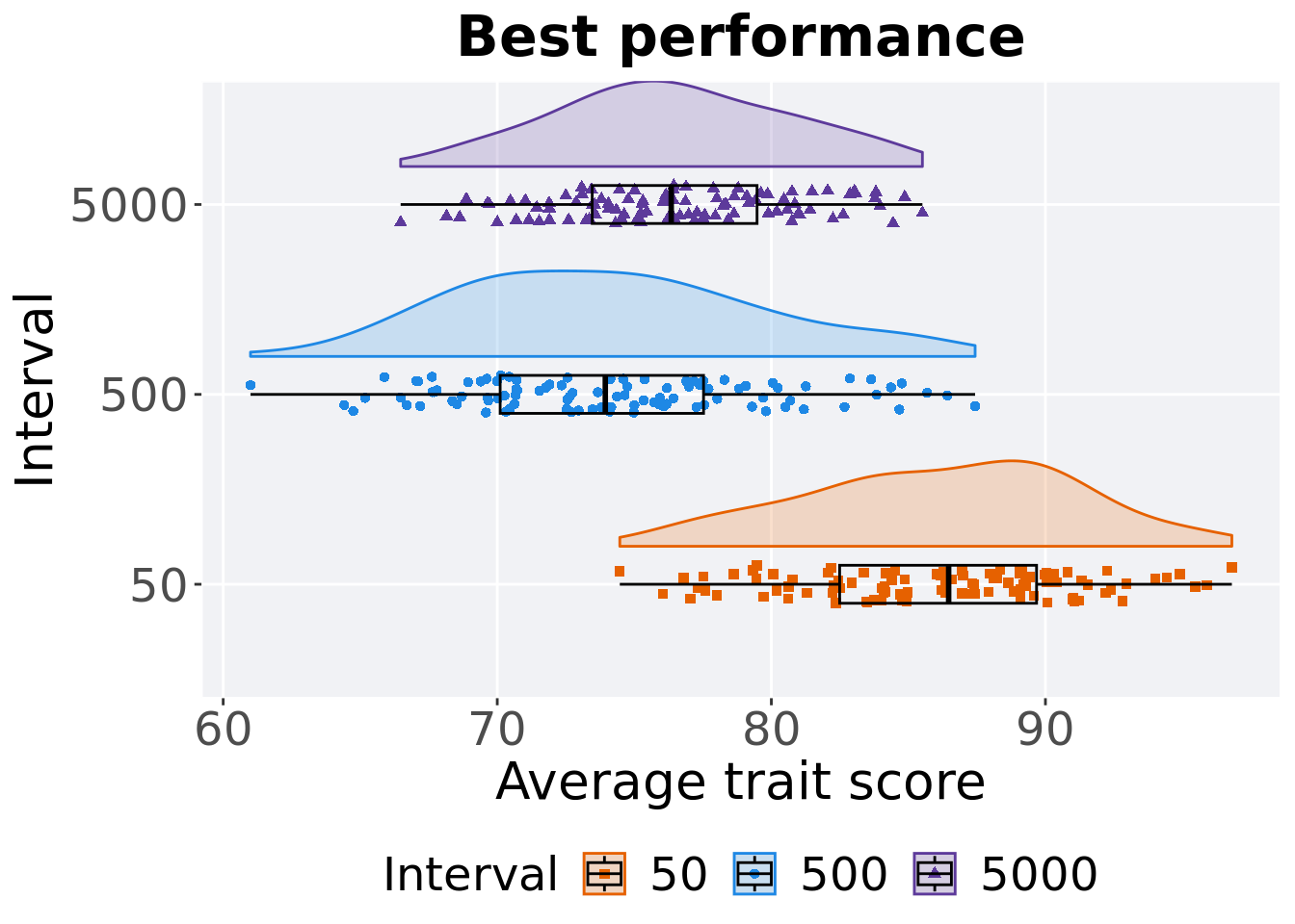
5.5.1.2.1 Stats
Summary statistics for the best performance found.
performance = filter(df_best, Diagnostic == 'MULTIPATH_EXPLORATION' & `Selection\nScheme` == 'LEXICASE' & VAR == 'pop_fit_max')
performance$Interval = factor(performance$Interval, levels = c('50','5000','500'))
performance %>%
  group_by(Interval) %>%
  dplyr::summarise(
    count = n(),
    na_cnt = sum(is.na(VAL)),
    min = min(VAL, na.rm = TRUE) / DIMENSIONALITY,
    median = median(VAL, na.rm = TRUE) / DIMENSIONALITY,
    mean = mean(VAL, na.rm = TRUE) / DIMENSIONALITY,
    max = max(VAL, na.rm = TRUE) / DIMENSIONALITY,
    IQR = IQR(VAL, na.rm = TRUE) / DIMENSIONALITY
  )
## # A tibble: 3 x 8
## Interval count na_cnt min median mean max IQR
## <fct> <int> <int> <dbl> <dbl> <dbl> <dbl> <dbl>
## 1 50 100 0 74.5 86.5 86.1 96.8 7.18
## 2 5000 100 0 66.5 76.3 76.4 85.5 6.01
## 3 500 100 0 61.0 73.9 74.1 87.4 7.42Kruskal–Wallis test provides evidence of difference among selection schemes.
##
##  Kruskal-Wallis rank sum test
##
## data:  VAL by Interval
## Kruskal-Wallis chi-squared = 155.15, df = 2, p-value < 2.2e-16
Results for post-hoc Wilcoxon rank-sum test with a Bonferroni correction.
pairwise.wilcox.test(x = performance$VAL, g = performance$Interval, p.adjust.method = "bonferroni",
                     paired = FALSE, conf.int = FALSE, alternative = 'l')
##
## Pairwise comparisons using Wilcoxon rank sum test with continuity correction
##
## data: performance$VAL and performance$Interval
##
## 50 5000
## 5000 <2e-16 -
## 500 <2e-16 0.0013
##
## P value adjustment method: bonferroni5.5.1.3 Final performance
Best performance is found throughout in final generation.
filter(df_ot, Diagnostic == 'MULTIPATH_EXPLORATION' & `Selection\nScheme` == 'LEXICASE' & Generations == 50000) %>%
  ggplot(., aes(x = Interval, y = pop_fit_max / DIMENSIONALITY, color = Interval, fill = Interval, shape = Interval)) +
  geom_flat_violin(position = position_nudge(x = .2, y = 0), scale = 'width', alpha = 0.2) +
  geom_point(position = position_jitter(width = .1), size = 1.5, alpha = 1.0) +
  geom_boxplot(color = 'black', width = .2, outlier.shape = NA, alpha = 0.0) +
  scale_y_continuous(
    name="Average trait score"
  ) +
  scale_x_discrete(
    name="Interval"
  )+
  scale_shape_manual(values=SHAPE)+
  scale_colour_manual(values = cb_palette_mi, ) +
  scale_fill_manual(values = cb_palette_mi) +
  ggtitle('Final performance')+
  p_theme + coord_flip()
5.5.1.3.1 Stats
Summary statistics for the best performance is found throughout in final generation..
performance = filter(df_ot, Diagnostic == 'MULTIPATH_EXPLORATION' & `Selection\nScheme` == 'LEXICASE' & Generations == 50000)
performance$Interval = factor(performance$Interval, levels = c('50','5000','500'))
performance %>%
  group_by(Interval) %>%
  dplyr::summarise(
    count = n(),
    na_cnt = sum(is.na(pop_fit_max)),
    min = min(pop_fit_max / DIMENSIONALITY, na.rm = TRUE),
    median = median(pop_fit_max / DIMENSIONALITY, na.rm = TRUE),
    mean = mean(pop_fit_max / DIMENSIONALITY, na.rm = TRUE),
    max = max(pop_fit_max / DIMENSIONALITY, na.rm = TRUE),
    IQR = IQR(pop_fit_max / DIMENSIONALITY, na.rm = TRUE)
  )
## # A tibble: 3 x 8
## Interval count na_cnt min median mean max IQR
## <fct> <int> <int> <dbl> <dbl> <dbl> <dbl> <dbl>
## 1 50 100 0 65.8 84.4 83.9 95.9 8.35
## 2 5000 100 0 58.6 73.4 73.9 85.5 6.47
## 3 500 100 0 57.7 69.5 70.6 87.4 8.30Kruskal–Wallis test provides evidence of difference among selection schemes.
##
##  Kruskal-Wallis rank sum test
##
## data:  pop_fit_max by Interval
## Kruskal-Wallis chi-squared = 140.97, df = 2, p-value < 2.2e-16
Results for post-hoc Wilcoxon rank-sum test with a Bonferroni correction.
pairwise.wilcox.test(x = performance$pop_fit_max, g = performance$Interval, p.adjust.method = "bonferroni",
                     paired = FALSE, conf.int = FALSE, alternative = 'l')
##
## Pairwise comparisons using Wilcoxon rank sum test with continuity correction
##
## data: performance$pop_fit_max and performance$Interval
##
## 50 5000
## 5000 < 2e-16 -
## 500 < 2e-16 3.8e-05
##
## P value adjustment method: bonferroni5.5.2 Activation gene coverage
Activation gene coverage analysis.
5.5.2.1 Coverage over time
Activation gene coverage over time.
# data for lines and shading on plots
lines = filter(df_ot, Diagnostic == 'MULTIPATH_EXPLORATION' & `Selection\nScheme` == 'LEXICASE') %>%
  group_by(Interval, Generations) %>%
  dplyr::summarise(
    min = min(pop_act_cov),
    mean = mean(pop_act_cov),
    max = max(pop_act_cov)
  )
## `summarise()` has grouped output by 'Interval'. You can override using the
## `.groups` argument.ggplot(lines, aes(x=Generations, y=mean, group = Interval, fill = Interval, color = Interval, shape = Interval)) +
geom_ribbon(aes(ymin = min, ymax = max), alpha = 0.1) +
geom_line(size = 0.5) +
geom_point(data = filter(lines, Generations %% 2000 == 0), size = 1.5, stroke = 2.0, alpha = 1.0) +
scale_y_continuous(
name="Coverage"
) +
scale_x_continuous(
name="Generations",
limits=c(0, 50000),
breaks=c(0, 10000, 20000, 30000, 40000, 50000),
labels=c("0e+4", "1e+4", "2e+4", "3e+4", "4e+4", "5e+4")
) +
scale_shape_manual(values=SHAPE)+
scale_colour_manual(values = cb_palette_mi) +
scale_fill_manual(values = cb_palette_mi) +
ggtitle('Activation gene coverage over time')+
p_theme
5.5.2.2 End of 50,000 generations
Activation gene coverage in the population at the end of 50,000 generations.
### end of run
filter(df_ot, Diagnostic == 'MULTIPATH_EXPLORATION' & `Selection\nScheme` == 'LEXICASE' & Generations == 50000) %>%
  ggplot(., aes(x = Interval, y = pop_act_cov, color = Interval, fill = Interval, shape = Interval)) +
  geom_flat_violin(position = position_nudge(x = .2, y = 0), scale = 'width', alpha = 0.3) +
  geom_point(position = position_jitter(height = .05, width = .05), size = 1.5, alpha = 0.5) +
  geom_boxplot(color = 'black', width = .2, outlier.shape = NA, alpha = 0.0) +
  scale_shape_manual(values=SHAPE)+
  scale_y_continuous(
    name="Coverage"
  ) +
  scale_x_discrete(
    name="Interval"
  ) +
  scale_colour_manual(values = cb_palette_mi) +
  scale_fill_manual(values = cb_palette_mi) +
  ggtitle('Final activation gene coverage')+
  p_theme + coord_flip()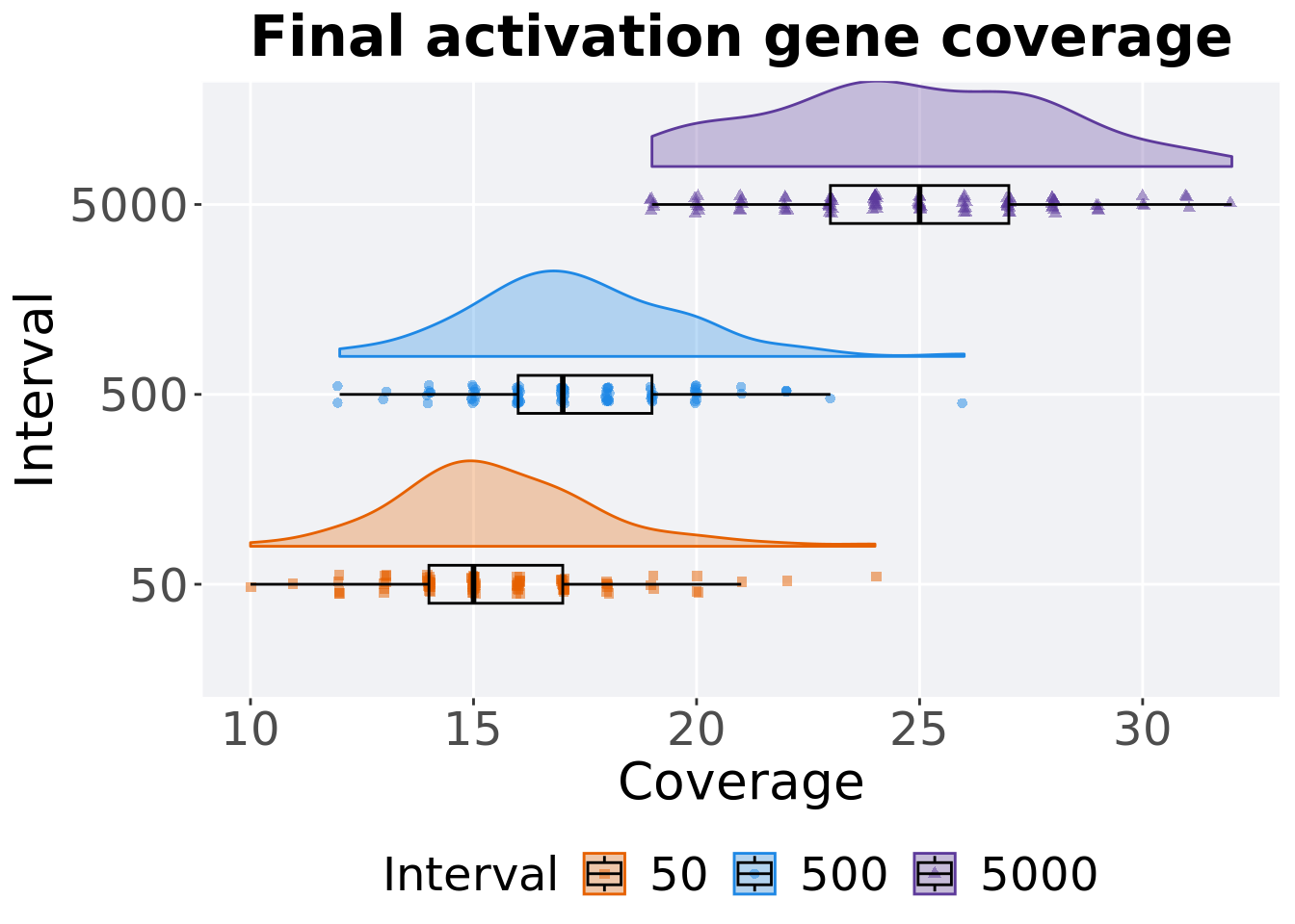
5.5.2.2.1 Stats
Summary statistics for activation gene coverage.
coverage = filter(df_ot, Diagnostic == 'MULTIPATH_EXPLORATION' & `Selection\nScheme` == 'LEXICASE' & Generations == 50000)
coverage$Interval = factor(coverage$Interval, levels = c('50','500','5000'))
coverage %>%
  group_by(Interval) %>%
  dplyr::summarise(
    count = n(),
    na_cnt = sum(is.na(pop_act_cov)),
    min = min(pop_act_cov, na.rm = TRUE),
    median = median(pop_act_cov, na.rm = TRUE),
    mean = mean(pop_act_cov, na.rm = TRUE),
    max = max(pop_act_cov, na.rm = TRUE),
    IQR = IQR(pop_act_cov, na.rm = TRUE)
  )
## # A tibble: 3 x 8
## Interval count na_cnt min median mean max IQR
## <fct> <int> <int> <int> <dbl> <dbl> <int> <dbl>
## 1 50 100 0 10 15 15.6 24 3
## 2 500 100 0 12 17 17.3 26 3
## 3 5000 100 0 19 25 24.8 32 4Kruskal–Wallis test provides evidence of difference among activation gene coverage.
##
##  Kruskal-Wallis rank sum test
##
## data:  pop_act_cov by Interval
## Kruskal-Wallis chi-squared = 198.08, df = 2, p-value < 2.2e-16
Results for post-hoc Wilcoxon rank-sum test with a Bonferroni correction on activation gene coverage.
pairwise.wilcox.test(x = coverage$pop_act_cov, g = coverage$Interval, p.adjust.method = "bonferroni",
                     paired = FALSE, conf.int = FALSE, alternative = 'g')
##
## Pairwise comparisons using Wilcoxon rank sum test with continuity correction
##
## data: coverage$pop_act_cov and coverage$Interval
##
## 50 500
## 500 1.3e-07 -
## 5000 < 2e-16 < 2e-16
##
## P value adjustment method: bonferroni