Chapter 2 Interval comparison: Exploitation rate results
Here we present the results for best performances found by each selection scheme replicate on the exploitation rate diagnostic with our base configurations. For our base configuration, we assume 4 islands and a ring topology. When migrations occur, we swap two individuals (same position on each island) and guarantee that no solution can return to the same island. Best performance found refers to the largest average trait score found in a given population. Note that performance values fall between 0.0 and 100.0.
2.2 Data
base   = filter(base_over_time,   Diagnostic == 'EXPLOITATION_RATE' & Structure == 'IS')
mi50   = filter(mi50_over_time,   Diagnostic == 'EXPLOITATION_RATE' & Structure == 'IS')
mi5000 = filter(mi5000_over_time, Diagnostic == 'EXPLOITATION_RATE' & Structure == 'IS')

base$Interval = '500'
mi50$Interval = '50'
mi5000$Interval = '5000'

df_ot = rbind(base, mi50, mi5000)
df_ot$Interval = factor(df_ot$Interval, levels=c('50','500','5000'))


base = filter(base_ssf, Diagnostic == 'EXPLOITATION_RATE' & Structure == 'IS' & Generations < 60000)
mi50 = filter(mi50_ssf, Diagnostic == 'EXPLOITATION_RATE' & Structure == 'IS' & Generations < 60000)
mi5000 = filter(mi5000_ssf, Diagnostic == 'EXPLOITATION_RATE' & Structure == 'IS' & Generations < 60000)

base$Interval = '500'
mi50$Interval = '50'
mi5000$Interval = '5000'

df_ssf = rbind(mi50,base,mi5000)
df_ssf$Interval = factor(df_ssf$Interval, levels = c('50','500','5000'))
2.3 Truncation selection
Here we analyze how the different migration intervals affect truncation selection on the exploitation rate diagnostic.
2.3.1 Performance over time
lines = filter(df_ot, `Selection\nScheme` == 'TRUNCATION') %>%
  group_by(Interval, Generations) %>%
  dplyr::summarise(
    min = min(pop_fit_max) / DIMENSIONALITY,
    mean = mean(pop_fit_max) / DIMENSIONALITY,
    max = max(pop_fit_max) / DIMENSIONALITY
  )
ggplot(lines, aes(x=Generations, y=mean, group = Interval, fill = Interval, color = Interval, shape = Interval)) +
  geom_ribbon(aes(ymin = min, ymax = max), alpha = 0.1) +
  geom_line(size = 0.5) +
  geom_point(data = filter(lines, Generations %% 2000 == 0), size = 2.5, stroke = 2.0, alpha = 1.0) +
  scale_y_continuous(
    name="Average trait score",
    limits=c(0, 100),
    breaks=seq(0,100, 20),
    labels=c("0", "20", "40", "60", "80", "100")
  ) +
  scale_x_continuous(
    name="Generations",
    limits=c(0, 50000),
    breaks=c(0, 10000, 20000, 30000, 40000, 50000),
    labels=c("0e+4", "1e+4", "2e+4", "3e+4", "4e+4", "5e+4")

  ) +
  scale_shape_manual(values=SHAPE)+
  scale_colour_manual(values = cb_palette_mi) +
  scale_fill_manual(values = cb_palette_mi) +
  ggtitle("Best performance over time") +
  p_theme
## Warning: Using `size` aesthetic for lines was deprecated in ggplot2 3.4.0.
## i Please use `linewidth` instead.
## This warning is displayed once every 8 hours.
## Call `lifecycle::last_lifecycle_warnings()` to see where this warning was
## generated.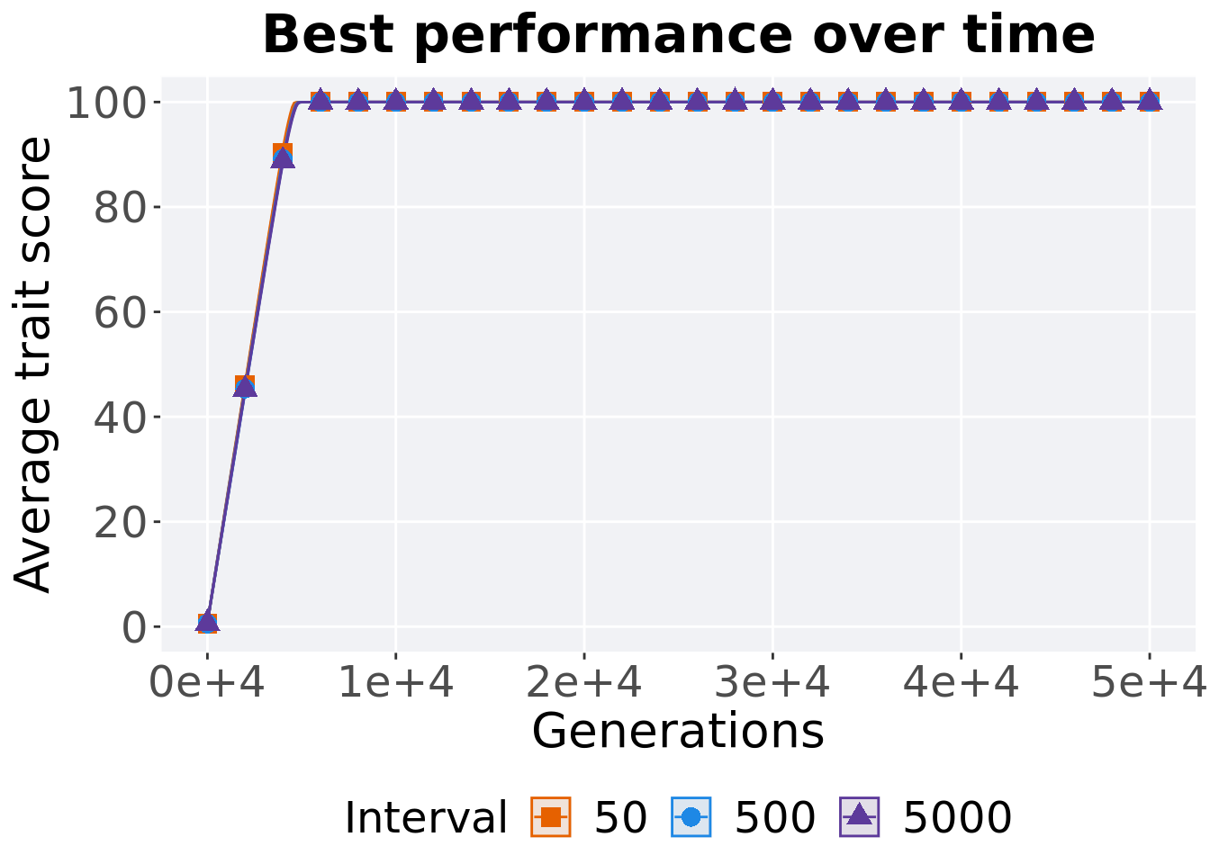
2.3.2 Generation satisfactory solution found
First generation a satisfactory solution is found throughout the 50,000 generations.
filter(df_ssf, `Selection\nScheme` == 'TRUNCATION') %>%
  ggplot(., aes(x = Interval, y = Generations, color = Interval, fill = Interval, shape = Interval)) +
  geom_flat_violin(position = position_nudge(x = .09, y = 0), scale = 'width', alpha = 0.2, width = 1.5) +
  geom_boxplot(color = 'black', width = .07, outlier.shape = NA, alpha = 0.0, size = 1.0, position = position_nudge(x = .15, y = 0)) +
  geom_point(position = position_jitter(width = .02), size = 3.0, alpha = 1.0) +
  scale_shape_manual(values=SHAPE)+
  scale_y_continuous(
    name="Generations"
  ) +
  scale_x_discrete(
    name="Interval"
  ) +
  scale_colour_manual(values = cb_palette_mi) +
  scale_fill_manual(values = cb_palette_mi) +
  p_theme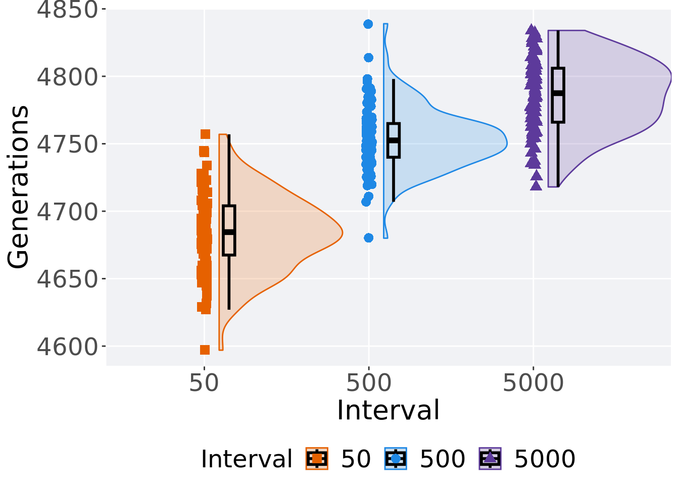
2.3.3 Stats
Summary statistics for the first generation a satisfactory solution is found.
ssf = filter(df_ssf, `Selection\nScheme` == 'TRUNCATION')
ssf %>%
  group_by(Interval) %>%
  dplyr::summarise(
    count = n(),
    na_cnt = sum(is.na(Generations)),
    min = min(Generations, na.rm = TRUE),
    median = median(Generations, na.rm = TRUE),
    mean = mean(Generations, na.rm = TRUE),
    max = max(Generations, na.rm = TRUE),
    IQR = IQR(Generations, na.rm = TRUE)
  )
## # A tibble: 3 x 8
## Interval count na_cnt min median mean max IQR
## <fct> <int> <int> <int> <dbl> <dbl> <int> <dbl>
## 1 50 100 0 4597 4684. 4684. 4757 36.5
## 2 500 100 0 4680 4752. 4754. 4839 25
## 3 5000 100 0 4718 4788. 4786. 4834 40Kruskal–Wallis test provides evidence of difference among selection schemes.
##
##  Kruskal-Wallis rank sum test
##
## data:  Generations by Interval
## Kruskal-Wallis chi-squared = 216.76, df = 2, p-value < 2.2e-16
Results for post-hoc Wilcoxon rank-sum test with a Bonferroni correction.
pairwise.wilcox.test(x = ssf$Generations, g = ssf$Interval, p.adjust.method = "bonferroni",
                     paired = FALSE, conf.int = FALSE, alternative = 'g')
##
## Pairwise comparisons using Wilcoxon rank sum test with continuity correction
##
## data: ssf$Generations and ssf$Interval
##
## 50 500
## 500 < 2e-16 -
## 5000 < 2e-16 7.6e-15
##
## P value adjustment method: bonferroni2.4 Tournament selection
Here we analyze how the different migration intervals affect tournament selection on the exploitation rate diagnostic.
2.4.1 Performance over time
lines = filter(df_ot, `Selection\nScheme` == 'TOURNAMENT') %>%
  group_by(Interval, Generations) %>%
  dplyr::summarise(
    min = min(pop_fit_max) / DIMENSIONALITY,
    mean = mean(pop_fit_max) / DIMENSIONALITY,
    max = max(pop_fit_max) / DIMENSIONALITY
  )
ggplot(lines, aes(x=Generations, y=mean, group = Interval, fill = Interval, color = Interval, shape = Interval)) +
  geom_ribbon(aes(ymin = min, ymax = max), alpha = 0.1) +
  geom_line(size = 0.5) +
  geom_point(data = filter(lines, Generations %% 2000 == 0), size = 2.5, stroke = 2.0, alpha = 1.0) +
  scale_y_continuous(
    name="Average trait score",
    limits=c(0, 100),
    breaks=seq(0,100, 20),
    labels=c("0", "20", "40", "60", "80", "100")
  ) +
  scale_x_continuous(
    name="Generations",
    limits=c(0, 50000),
    breaks=c(0, 10000, 20000, 30000, 40000, 50000),
    labels=c("0e+4", "1e+4", "2e+4", "3e+4", "4e+4", "5e+4")

  ) +
  scale_shape_manual(values=SHAPE)+
  scale_colour_manual(values = cb_palette_mi) +
  scale_fill_manual(values = cb_palette_mi) +
  ggtitle("Best performance over time") +
  p_theme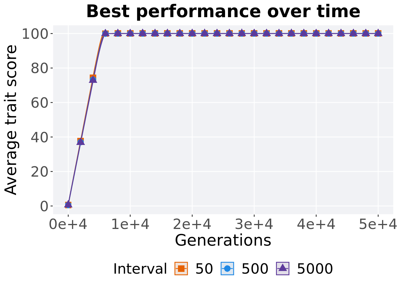
2.4.2 Generation satisfactory solution found
First generation a satisfactory solution is found throughout the 50,000 generations.
filter(df_ssf, `Selection\nScheme` == 'TOURNAMENT') %>%
  ggplot(., aes(x = Interval, y = Generations, color = Interval, fill = Interval, shape = Interval)) +
  geom_flat_violin(position = position_nudge(x = .09, y = 0), scale = 'width', alpha = 0.2, width = 1.5) +
  geom_boxplot(color = 'black', width = .07, outlier.shape = NA, alpha = 0.0, size = 1.0, position = position_nudge(x = .15, y = 0)) +
  geom_point(position = position_jitter(width = .02), size = 3.0, alpha = 1.0) +
  scale_shape_manual(values=SHAPE)+
  scale_y_continuous(
    name="Generations"
  ) +
  scale_x_discrete(
    name="Interval"
  ) +
  scale_colour_manual(values = cb_palette_mi) +
  scale_fill_manual(values = cb_palette_mi) +
  p_theme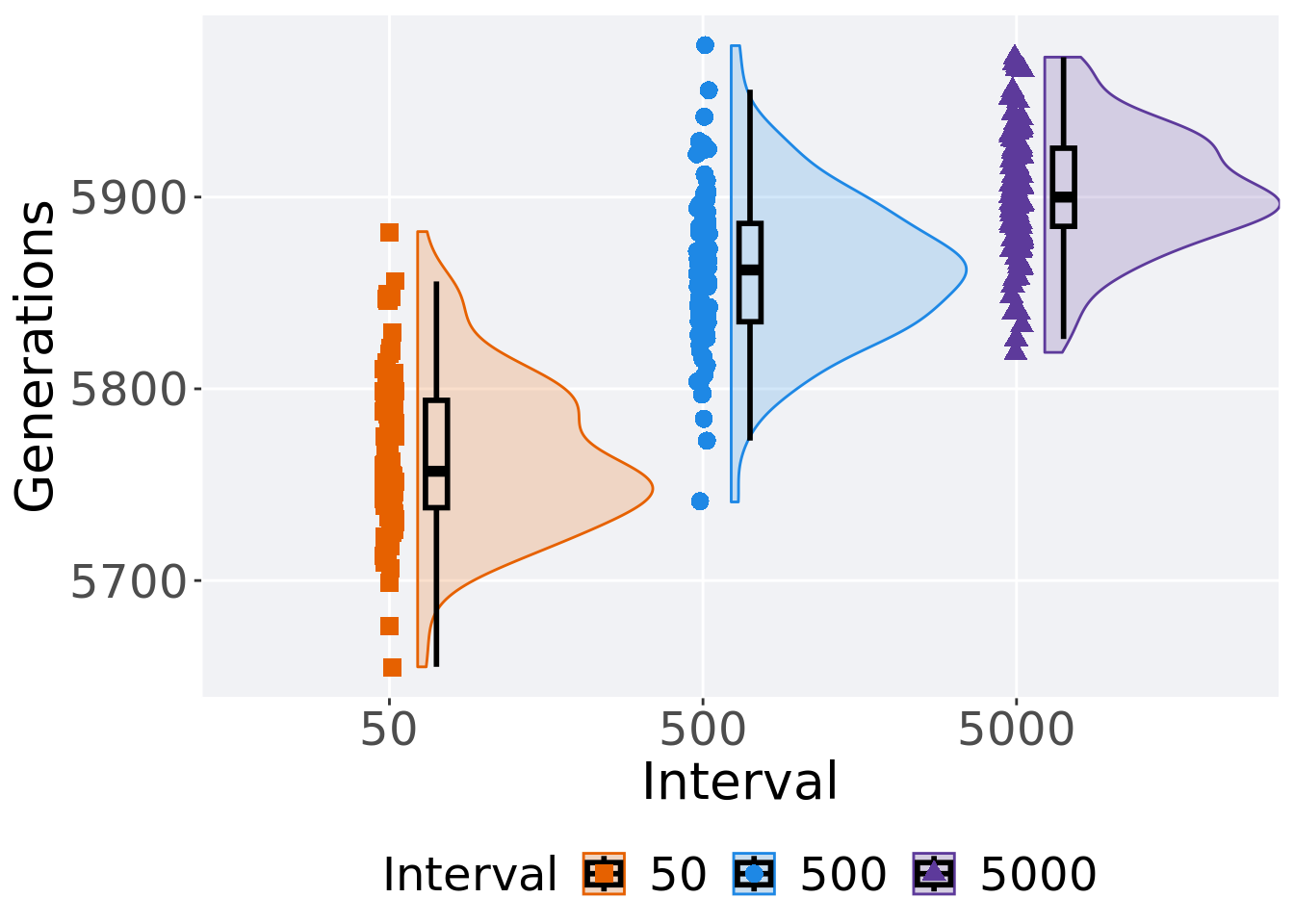
2.4.3 Stats
Summary statistics for the first generation a satisfactory solution is found.
ssf = filter(df_ssf, `Selection\nScheme` == 'TOURNAMENT')
ssf %>%
  group_by(Interval) %>%
  dplyr::summarise(
    count = n(),
    na_cnt = sum(is.na(Generations)),
    min = min(Generations, na.rm = TRUE),
    median = median(Generations, na.rm = TRUE),
    mean = mean(Generations, na.rm = TRUE),
    max = max(Generations, na.rm = TRUE),
    IQR = IQR(Generations, na.rm = TRUE)
  )
## # A tibble: 3 x 8
## Interval count na_cnt min median mean max IQR
## <fct> <int> <int> <int> <dbl> <dbl> <int> <dbl>
## 1 50 100 0 5655 5757 5765. 5882 56
## 2 500 100 0 5741 5862 5862. 5979 51.2
## 3 5000 100 0 5819 5900 5903. 5973 40.8Kruskal–Wallis test provides evidence of difference among selection schemes.
##
##  Kruskal-Wallis rank sum test
##
## data:  Generations by Interval
## Kruskal-Wallis chi-squared = 203.85, df = 2, p-value < 2.2e-16
Results for post-hoc Wilcoxon rank-sum test with a Bonferroni correction.
pairwise.wilcox.test(x = ssf$Generations, g = ssf$Interval, p.adjust.method = "bonferroni",
                     paired = FALSE, conf.int = FALSE, alternative = 'g')
##
## Pairwise comparisons using Wilcoxon rank sum test with continuity correction
##
## data: ssf$Generations and ssf$Interval
##
## 50 500
## 500 <2e-16 -
## 5000 <2e-16 1e-12
##
## P value adjustment method: bonferroni2.5 Lexicase selection
Here we analyze how the different migration intervals affect tournament selection on the exploitation rate diagnostic.
2.5.1 Performance over time
lines = filter(df_ot, `Selection\nScheme` == 'LEXICASE') %>%
  group_by(Interval, Generations) %>%
  dplyr::summarise(
    min = min(pop_fit_max) / DIMENSIONALITY,
    mean = mean(pop_fit_max) / DIMENSIONALITY,
    max = max(pop_fit_max) / DIMENSIONALITY
  )
ggplot(lines, aes(x=Generations, y=mean, group = Interval, fill = Interval, color = Interval, shape = Interval)) +
  geom_ribbon(aes(ymin = min, ymax = max), alpha = 0.1) +
  geom_line(size = 0.5) +
  geom_point(data = filter(lines, Generations %% 2000 == 0), size = 2.5, stroke = 2.0, alpha = 1.0) +
  scale_y_continuous(
    name="Average trait score",
    limits=c(0, 100),
    breaks=seq(0,100, 20),
    labels=c("0", "20", "40", "60", "80", "100")
  ) +
  scale_x_continuous(
    name="Generations",
    limits=c(0, 50000),
    breaks=c(0, 10000, 20000, 30000, 40000, 50000),
    labels=c("0e+4", "1e+4", "2e+4", "3e+4", "4e+4", "5e+4")

  ) +
  scale_shape_manual(values=SHAPE)+
  scale_colour_manual(values = cb_palette_mi) +
  scale_fill_manual(values = cb_palette_mi) +
  ggtitle("Best performance over time") +
  p_theme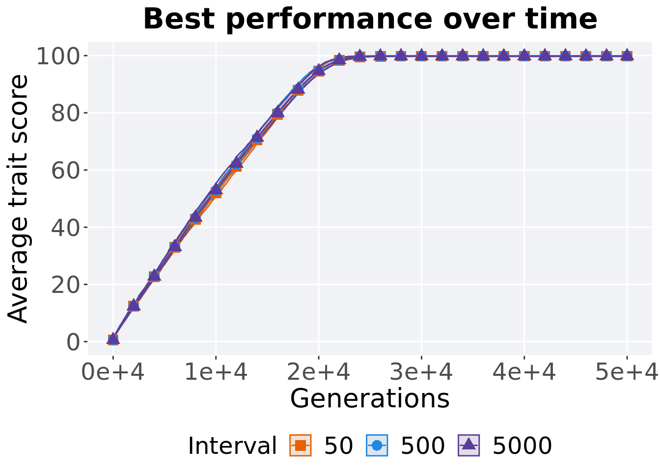
2.5.2 Generation satisfactory solution found
First generation a satisfactory solution is found throughout the 50,000 generations.
filter(df_ssf, `Selection\nScheme` == 'LEXICASE') %>%
  ggplot(., aes(x = Interval, y = Generations, color = Interval, fill = Interval, shape = Interval)) +
  geom_flat_violin(position = position_nudge(x = .09, y = 0), scale = 'width', alpha = 0.2, width = 1.5) +
  geom_boxplot(color = 'black', width = .07, outlier.shape = NA, alpha = 0.0, size = 1.0, position = position_nudge(x = .15, y = 0)) +
  geom_point(position = position_jitter(width = .02), size = 3.0, alpha = 1.0) +
  scale_shape_manual(values=SHAPE)+
  scale_y_continuous(
    name="Generations"
  ) +
  scale_x_discrete(
    name="Interval"
  ) +
  scale_colour_manual(values = cb_palette_mi) +
  scale_fill_manual(values = cb_palette_mi) +
  p_theme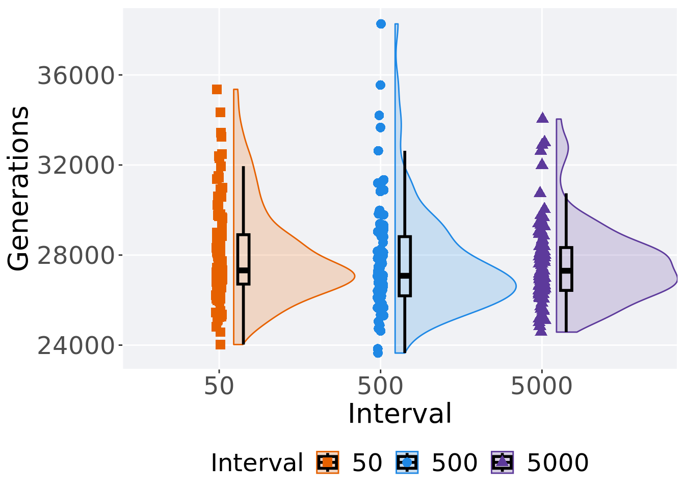
2.5.3 Stats
Summary statistics for the first generation a satisfactory solution is found.
ssf = filter(df_ssf, `Selection\nScheme` == 'LEXICASE')
ssf %>%
  group_by(Interval) %>%
  dplyr::summarise(
    count = n(),
    na_cnt = sum(is.na(Generations)),
    min = min(Generations, na.rm = TRUE),
    median = median(Generations, na.rm = TRUE),
    mean = mean(Generations, na.rm = TRUE),
    max = max(Generations, na.rm = TRUE),
    IQR = IQR(Generations, na.rm = TRUE)
  )
## # A tibble: 3 x 8
## Interval count na_cnt min median mean max IQR
## <fct> <int> <int> <int> <dbl> <dbl> <int> <dbl>
## 1 50 100 0 24027 27320 28031. 35360 2194.
## 2 500 100 0 23649 27080. 27635. 38266 2628.
## 3 5000 100 0 24579 27304. 27591. 34039 1903.Kruskal–Wallis test provides evidence of difference among selection schemes.
##
##  Kruskal-Wallis rank sum test
##
## data:  Generations by Interval
## Kruskal-Wallis chi-squared = 3.1203, df = 2, p-value = 0.2101
Results for post-hoc Wilcoxon rank-sum test with a Bonferroni correction.
pairwise.wilcox.test(x = ssf$Generations, g = ssf$Interval, p.adjust.method = "bonferroni",
                     paired = FALSE, conf.int = FALSE, alternative = 't')
##
## Pairwise comparisons using Wilcoxon rank sum test with continuity correction
##
## data: ssf$Generations and ssf$Interval
##
## 50 500
## 500 0.27 -
## 5000 0.73 1.00
##
## P value adjustment method: bonferroni