Chapter 2 Truncation selection
Results for the truncation selection parameter sweep on the diagnostics with no valleys.
2.1 Data setup
over_time_df <- read.csv(paste(DATA_DIR,'OVER-TIME/tru.csv', sep = "", collapse = NULL), header = TRUE, stringsAsFactors = FALSE)
over_time_df$T <- factor(over_time_df$T, levels = TR_LIST)

best_df <- read.csv(paste(DATA_DIR,'BEST/tru.csv', sep = "", collapse = NULL), header = TRUE, stringsAsFactors = FALSE)
best_df$T <- factor(best_df$T, levels = TR_LIST)

sati_df <- read.csv(paste(DATA_DIR,'SOL-FND/tru.csv', sep = "", collapse = NULL), header = TRUE, stringsAsFactors = FALSE)
sati_df$T <- factor(sati_df$T, levels = TR_LIST)
2.2 Exploitation rate results
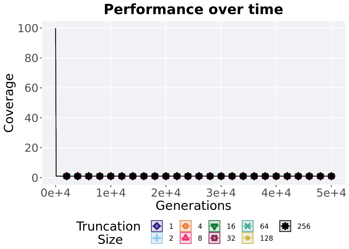
Here we present the results for best performances found by each selection scheme parameter on the exploitation rate diagnostic. 50 replicates are conducted for each scheme explored.
2.2.1 Performance over time
Best performance in a population over time. Data points on the graph is the average performance across 50 replicates every 2000 generations. Shading comes from the best and worse performance across 50 replicates.
lines = filter(over_time_df, acro == 'exp') %>%
  group_by(T, gen) %>%
  dplyr::summarise(
    min = min(pop_fit_max) / DIMENSIONALITY,
    mean = mean(pop_fit_max) / DIMENSIONALITY,
    max = max(pop_fit_max) / DIMENSIONALITY
  )
## `summarise()` has grouped output by 'T'. You can override using the `.groups`
## argument.over_time_plot = ggplot(lines, aes(x=gen, y=mean, group = T, fill = T, color = T, shape = T)) +
geom_ribbon(aes(ymin = min, ymax = max), alpha = 0.1) +
geom_line(size = 0.5) +
geom_point(data = filter(lines, gen %% 2000 == 0 & gen != 0), size = 1.5, stroke = 2.0, alpha = 1.0) +
scale_y_continuous(
name="Average trait score",
limits=c(0, 100),
breaks=seq(0,100, 20),
labels=c("0", "20", "40", "60", "80", "100")
) +
scale_x_continuous(
name="Generations",
limits=c(0, 50000),
breaks=c(0, 10000, 20000, 30000, 40000, 50000),
labels=c("0e+4", "1e+4", "2e+4", "3e+4", "4e+4", "5e+4")
) +
scale_shape_manual(values=SHAPE)+
scale_colour_manual(values = cb_palette) +
scale_fill_manual(values = cb_palette) +
ggtitle('Performance over time')+
p_theme +
guides(
shape=guide_legend(nrow=2, title.position = "left", title = 'Truncation \nSize'),
color=guide_legend(nrow=2, title.position = "left", title = 'Truncation \nSize'),
fill=guide_legend(nrow=2, title.position = "left", title = 'Truncation \nSize')
)
over_time_plot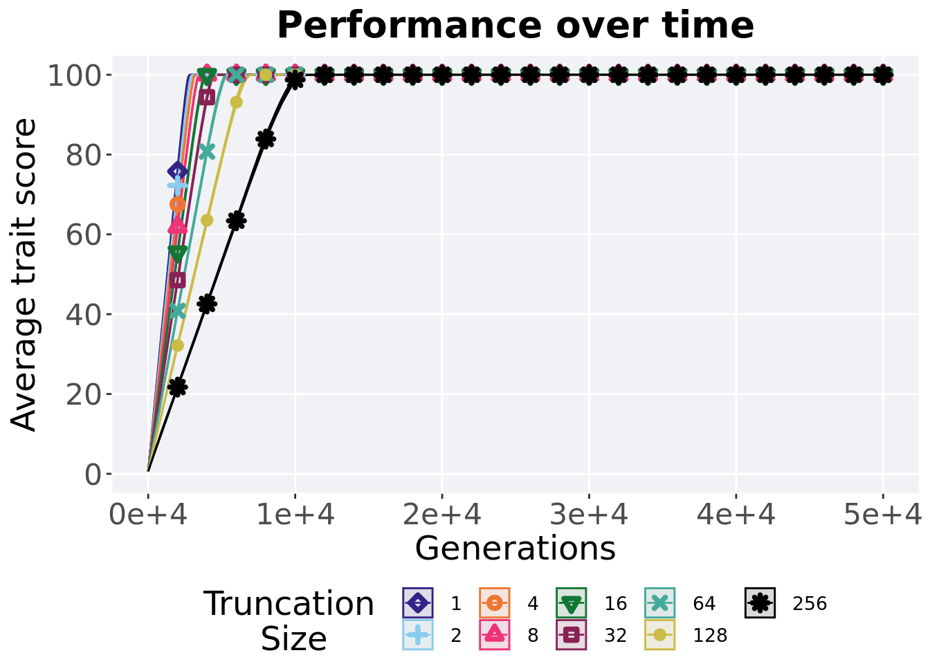
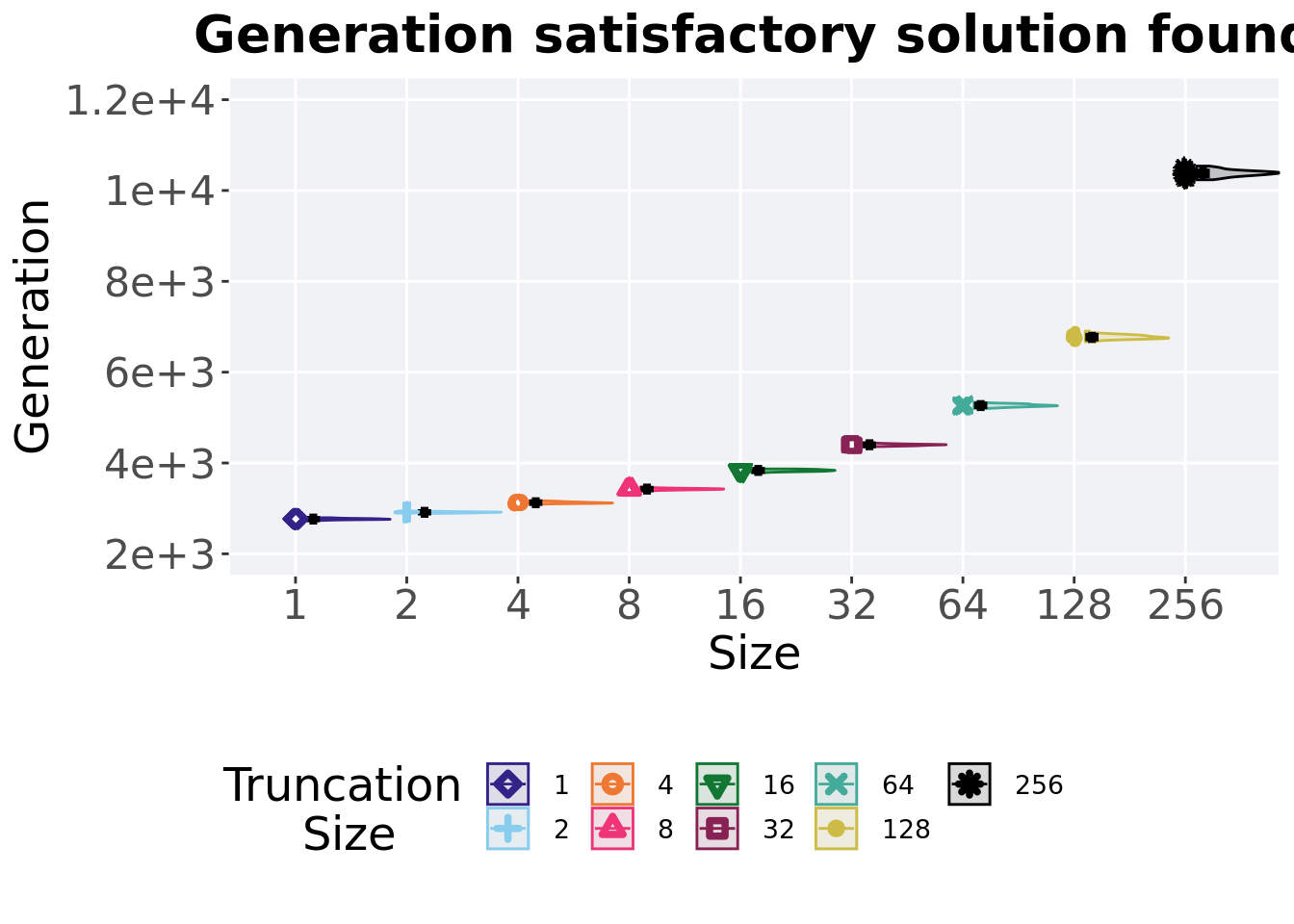
2.2.2 Generation satisfactory solution found
First generation a satisfactory solution is found throughout the 50,000 generations.
plot = filter(sati_df, acro == 'exp') %>%
  ggplot(., aes(x = T, y = gen , color = T, fill = T, shape = T)) +
  geom_flat_violin(position = position_nudge(x = .1, y = 0), scale = 'width', alpha = 0.2, width = 1.5) +
  geom_boxplot(color = 'black', width = .07, outlier.shape = NA, alpha = 0.0, size = 1.0, position = position_nudge(x = .16, y = 0)) +
  geom_point(position = position_jitter(width = 0.03, height = 0.02), size = 2.0, alpha = 1.0) +
  scale_y_continuous(
    name="Generation",
    limits=c(2000, 12000),
    breaks=c(2000, 4000, 6000, 8000, 10000, 12000),
    labels=c("2e+3", "4e+3", "6e+3", "8e+3", "1e+4", "1.2e+4")
  ) +
  scale_x_discrete(
    name='Size'
  )+
  scale_shape_manual(values=SHAPE)+
  scale_colour_manual(values = cb_palette, ) +
  scale_fill_manual(values = cb_palette) +
  ggtitle('Generation satisfactory solution found')+
  p_theme

plot_grid(
  plot +
    theme(legend.position="none"),
  legend,
  nrow=2,
  rel_heights = c(3,1)
)
2.2.2.1 Stats
Summary statistics for the generation a satisfactory solution is found.
ssf = filter(sati_df, gen <= GENERATIONS & acro == 'exp')
ssf$acro = factor(ssf$acro, levels = TR_LIST)
ssf %>%
  group_by(T) %>%
  dplyr::summarise(
    count = n(),
    na_cnt = sum(is.na(gen)),
    min = min(gen, na.rm = TRUE),
    median = median(gen, na.rm = TRUE),
    mean = mean(gen, na.rm = TRUE),
    max = max(gen, na.rm = TRUE),
    IQR = IQR(gen, na.rm = TRUE)
  )
## # A tibble: 9 x 8
## T count na_cnt min median mean max IQR
## <fct> <int> <int> <int> <dbl> <dbl> <int> <dbl>
## 1 1 50 0 2734 2765 2766. 2795 17.8
## 2 2 50 0 2889 2914. 2914. 2952 18.5
## 3 4 50 0 3093 3124. 3127. 3167 24
## 4 8 50 0 3385 3426. 3425. 3473 21.2
## 5 16 50 0 3786 3836 3835. 3869 34
## 6 32 50 0 4361 4402. 4400. 4450 26.5
## 7 64 50 0 5201 5264 5266. 5337 44.5
## 8 128 50 0 6667 6766. 6772. 6905 64.2
## 9 256 50 0 10236 10387 10382. 10538 86.8Kruskal–Wallis test illustrates evidence of statistical differences.
##
##  Kruskal-Wallis rank sum test
##
## data:  gen by T
## Kruskal-Wallis chi-squared = 443.46, df = 8, p-value < 2.2e-16
Results for post-hoc Wilcoxon rank-sum test with a Bonferroni correction.
pairwise.wilcox.test(x = ssf$gen, g = ssf$T, p.adjust.method = "bonferroni",
                     paired = FALSE, conf.int = FALSE, alternative = 'g')
##
## Pairwise comparisons using Wilcoxon rank sum test with continuity correction
##
## data: ssf$gen and ssf$T
##
## 1 2 4 8 16 32 64 128
## 2 <2e-16 - - - - - - -
## 4 <2e-16 <2e-16 - - - - - -
## 8 <2e-16 <2e-16 <2e-16 - - - - -
## 16 <2e-16 <2e-16 <2e-16 <2e-16 - - - -
## 32 <2e-16 <2e-16 <2e-16 <2e-16 <2e-16 - - -
## 64 <2e-16 <2e-16 <2e-16 <2e-16 <2e-16 <2e-16 - -
## 128 <2e-16 <2e-16 <2e-16 <2e-16 <2e-16 <2e-16 <2e-16 -
## 256 <2e-16 <2e-16 <2e-16 <2e-16 <2e-16 <2e-16 <2e-16 <2e-16
##
## P value adjustment method: bonferroni2.3 Ordered exploitation results
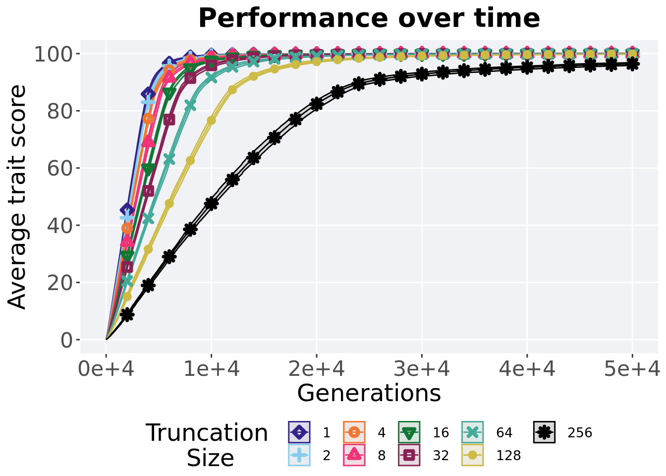
Here we present the results for best performances found by each selection scheme parameter on the exploitation rate diagnostic. 50 replicates are conducted for each scheme explored.
2.3.1 Performance over time
Best performance in a population over time. Data points on the graph is the average performance across 50 replicates every 2000 generations. Shading comes from the best and worse performance across 50 replicates.
lines = filter(over_time_df, acro == 'ord') %>%
  group_by(T, gen) %>%
  dplyr::summarise(
    min = min(pop_fit_max) / DIMENSIONALITY,
    mean = mean(pop_fit_max) / DIMENSIONALITY,
    max = max(pop_fit_max) / DIMENSIONALITY
  )
## `summarise()` has grouped output by 'T'. You can override using the `.groups`
## argument.ggplot(lines, aes(x=gen, y=mean, group = T, fill = T, color = T, shape = T)) +
geom_ribbon(aes(ymin = min, ymax = max), alpha = 0.1) +
geom_line(size = 0.5) +
geom_point(data = filter(lines, gen %% 2000 == 0 & gen != 0), size = 1.5, stroke = 2.0, alpha = 1.0) +
scale_y_continuous(
name="Average trait score",
limits=c(0, 100),
breaks=seq(0,100, 20),
labels=c("0", "20", "40", "60", "80", "100")
) +
scale_x_continuous(
name="Generations",
limits=c(0, 50000),
breaks=c(0, 10000, 20000, 30000, 40000, 50000),
labels=c("0e+4", "1e+4", "2e+4", "3e+4", "4e+4", "5e+4")
) +
scale_shape_manual(values=SHAPE)+
scale_colour_manual(values = cb_palette) +
scale_fill_manual(values = cb_palette) +
ggtitle('Performance over time')+
p_theme +
guides(
shape=guide_legend(nrow=2, title.position = "left", title = 'Truncation \nSize'),
color=guide_legend(nrow=2, title.position = "left", title = 'Truncation \nSize'),
fill=guide_legend(nrow=2, title.position = "left", title = 'Truncation \nSize')
)
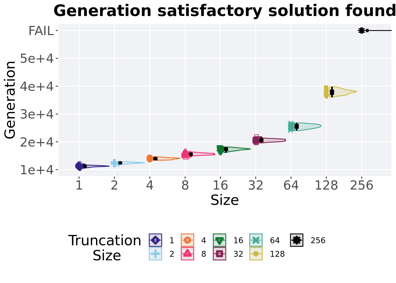
2.3.2 Generation satisfactory solution found
First generation a satisfactory solution is found throughout the 50,000 generations.
plot = filter(sati_df, acro == 'ord') %>%
  ggplot(., aes(x = T, y = gen , color = T, fill = T, shape = T)) +
  geom_flat_violin(position = position_nudge(x = .1, y = 0), scale = 'width', alpha = 0.2, width = 1.5) +
  geom_boxplot(color = 'black', width = .07, outlier.shape = NA, alpha = 0.0, size = 1.0, position = position_nudge(x = .16, y = 0)) +
  geom_point(position = position_jitter(width = 0.03, height = 0.02), size = 2.0, alpha = 1.0) +
  scale_y_continuous(
    name="Generation",
    limits=c(10000, 60000),
    breaks=c(10000, 20000, 30000, 40000,50000,60000),
    labels=c("1e+4","2e+4","3e+4","4e+4","5e+4","FAIL")
  ) +
  scale_x_discrete(
    name='Size'
  )+
  scale_shape_manual(values=SHAPE)+
  scale_colour_manual(values = cb_palette) +
  scale_fill_manual(values = cb_palette) +
  ggtitle('Generation satisfactory solution found')+
  p_theme

plot_grid(
  plot +
    theme(legend.position="none"),
  legend,
  nrow=2,
  rel_heights = c(3,1)
)
2.3.2.1 Stats
Summary statistics for the generation a satisfactory solution is found.
ssf = filter(sati_df, gen <= GENERATIONS & acro == 'ord')
ssf$acro = factor(ssf$acro, levels = TR_LIST)
ssf %>%
  group_by(T) %>%
  dplyr::summarise(
    count = n(),
    na_cnt = sum(is.na(gen)),
    min = min(gen, na.rm = TRUE),
    median = median(gen, na.rm = TRUE),
    mean = mean(gen, na.rm = TRUE),
    max = max(gen, na.rm = TRUE),
    IQR = IQR(gen, na.rm = TRUE)
  )
## # A tibble: 8 x 8
## T count na_cnt min median mean max IQR
## <fct> <int> <int> <int> <dbl> <dbl> <int> <dbl>
## 1 1 50 0 10494 11246. 11226. 12014 316
## 2 2 50 0 11332 12438 12389. 12862 320.
## 3 4 50 0 13379 13941 13950. 14630 529.
## 4 8 50 0 14261 15563 15567. 16591 476.
## 5 16 50 0 16147 17385 17307. 18144 620.
## 6 32 50 0 19612 20528. 20543. 21845 715
## 7 64 50 0 24048 25548. 25513. 26807 1075
## 8 128 50 0 36034 37956 37965. 39783 1251.Kruskal–Wallis test illustrates evidence of statistical differences.
##
##  Kruskal-Wallis rank sum test
##
## data:  gen by T
## Kruskal-Wallis chi-squared = 392.52, df = 7, p-value < 2.2e-16
Results for post-hoc Wilcoxon rank-sum test with a Bonferroni correction.
pairwise.wilcox.test(x = ssf$gen, g = ssf$T, p.adjust.method = "bonferroni",
                     paired = FALSE, conf.int = FALSE, alternative = 'g')
##
## Pairwise comparisons using Wilcoxon rank sum test with continuity correction
##
## data: ssf$gen and ssf$T
##
## 1 2 4 8 16 32 64
## 2 3.1e-16 - - - - - -
## 4 < 2e-16 < 2e-16 - - - - -
## 8 < 2e-16 < 2e-16 < 2e-16 - - - -
## 16 < 2e-16 < 2e-16 < 2e-16 < 2e-16 - - -
## 32 < 2e-16 < 2e-16 < 2e-16 < 2e-16 < 2e-16 - -
## 64 < 2e-16 < 2e-16 < 2e-16 < 2e-16 < 2e-16 < 2e-16 -
## 128 < 2e-16 < 2e-16 < 2e-16 < 2e-16 < 2e-16 < 2e-16 < 2e-16
##
## P value adjustment method: bonferroni2.4 Contradictory objectives results
Here we present the results for activation gene coverage and satisfactory trait coverage found by each selection scheme parameter on the contradictory objectives diagnostic. 50 replicates are conducted for each scheme parameters explored.
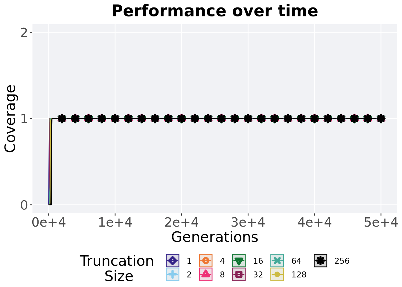
2.4.1 Activation gene coverage over time
Activation gene coverage in a population over time. Data points on the graph is the average activation gene coverage across 50 replicates every 2000 generations. Shading comes from the best and worse coverage across 50 replicates.
lines = filter(over_time_df, acro == 'con')  %>%
  group_by(T, gen) %>%
  dplyr::summarise(
    min = min(uni_str_pos),
    mean = mean(uni_str_pos),
    max = max(uni_str_pos)
  )
## `summarise()` has grouped output by 'T'. You can override using the `.groups`
## argument.ggplot(lines, aes(x=gen, y=mean, group = T, fill = T, color = T, shape = T)) +
geom_ribbon(aes(ymin = min, ymax = max), alpha = 0.1) +
geom_line(size = 0.5) +
geom_point(data = filter(lines, gen %% 2000 == 0 & gen != 0), size = 1.5, stroke = 2.0, alpha = 1.0) +
scale_y_continuous(
name="Coverage",
limits=c(0, 100),
breaks=seq(0,100, 20),
labels=c("0", "20", "40", "60", "80", "100")
) +
scale_x_continuous(
name="Generations",
limits=c(0, 50000),
breaks=c(0, 10000, 20000, 30000, 40000, 50000),
labels=c("0e+4", "1e+4", "2e+4", "3e+4", "4e+4", "5e+4")
) +
scale_shape_manual(values=SHAPE)+
scale_colour_manual(values = cb_palette) +
scale_fill_manual(values = cb_palette) +
ggtitle('Performance over time')+
p_theme +
guides(
shape=guide_legend(nrow=2, title.position = "left", title = 'Truncation \nSize'),
color=guide_legend(nrow=2, title.position = "left", title = 'Truncation \nSize'),
fill=guide_legend(nrow=2, title.position = "left", title = 'Truncation \nSize')
)
2.4.2 Final activation gene coverage
Activation gene coverage found in the final population at 50,000 generations.
plot = filter(over_time_df, gen == 50000 & acro == 'con') %>%
  ggplot(., aes(x = T, y = uni_str_pos, color = T, fill = T, shape = T)) +
  geom_flat_violin(position = position_nudge(x = .1, y = 0), scale = 'width', alpha = 0.2, width = 1.5) +
  geom_boxplot(color = 'black', width = .07, outlier.shape = NA, alpha = 0.0, size = 1.0, position = position_nudge(x = .16, y = 0)) +
  geom_point(position = position_jitter(width = 0.03, height = 0.02), size = 2.0, alpha = 1.0) +
  scale_y_continuous(
    name="Coverage",
    limits=c(0, 2),
    breaks=c(0,1,2)
  ) +
  scale_x_discrete(
    name='Size'
  )+
  scale_shape_manual(values=SHAPE)+
  scale_colour_manual(values = cb_palette, ) +
  scale_fill_manual(values = cb_palette) +
  ggtitle('Final activation gene coverage')+
  p_theme

plot_grid(
  plot +
    theme(legend.position="none"),
  legend,
  nrow=2,
  rel_heights = c(3,1)
)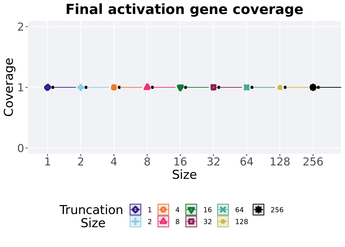
2.4.2.1 Stats
Summary statistics for the generation a satisfactory solution is found.
act_coverage = filter(over_time_df, gen == 50000 & acro == 'con')
act_coverage$acro = factor(act_coverage$acro, levels = TR_LIST)
act_coverage %>%
  group_by(T) %>%
  dplyr::summarise(
    count = n(),
    na_cnt = sum(is.na(uni_str_pos)),
    min = min(uni_str_pos, na.rm = TRUE),
    median = median(uni_str_pos, na.rm = TRUE),
    mean = mean(uni_str_pos, na.rm = TRUE),
    max = max(uni_str_pos, na.rm = TRUE),
    IQR = IQR(uni_str_pos, na.rm = TRUE)
  )
## # A tibble: 9 x 8
## T count na_cnt min median mean max IQR
## <fct> <int> <int> <int> <dbl> <dbl> <int> <dbl>
## 1 1 50 0 1 1 1 1 0
## 2 2 50 0 1 1 1 1 0
## 3 4 50 0 1 1 1 1 0
## 4 8 50 0 1 1 1 1 0
## 5 16 50 0 1 1 1 1 0
## 6 32 50 0 1 1 1 1 0
## 7 64 50 0 1 1 1 1 0
## 8 128 50 0 1 1 1 1 0
## 9 256 50 0 1 1 1 1 02.4.3 Satisfactory trait coverage over time
Satisfactory trait coverage in a population over time. Data points on the graph is the average activation gene coverage across 50 replicates every 2000 generations. Shading comes from the best and worse coverage across 50 replicates.
lines = filter(over_time_df, acro == 'con')  %>%
  group_by(T, gen) %>%
  dplyr::summarise(
    min = min(pop_uni_obj),
    mean = mean(pop_uni_obj),
    max = max(pop_uni_obj)
  )
## `summarise()` has grouped output by 'T'. You can override using the `.groups`
## argument.ggplot(lines, aes(x=gen, y=mean, group = T, fill = T, color = T, shape = T)) +
geom_ribbon(aes(ymin = min, ymax = max), alpha = 0.1) +
geom_line(size = 0.5) +
geom_point(data = filter(lines, gen %% 2000 == 0 & gen != 0), size = 1.5, stroke = 2.0, alpha = 1.0) +
scale_y_continuous(
name="Coverage",
limits=c(0, 2),
breaks=c(0,1,2)
) +
scale_x_continuous(
name="Generations",
limits=c(0, 50000),
breaks=c(0, 10000, 20000, 30000, 40000, 50000),
labels=c("0e+4", "1e+4", "2e+4", "3e+4", "4e+4", "5e+4")
) +
scale_shape_manual(values=SHAPE)+
scale_colour_manual(values = cb_palette) +
scale_fill_manual(values = cb_palette) +
ggtitle('Performance over time')+
p_theme +
guides(
shape=guide_legend(nrow=2, title.position = "left", title = 'Truncation \nSize'),
color=guide_legend(nrow=2, title.position = "left", title = 'Truncation \nSize'),
fill=guide_legend(nrow=2, title.position = "left", title = 'Truncation \nSize')
)
2.4.4 Final satisfactory trait coverage
Satisfactory trait coverage found in the final population at 50,000 generations.
plot = filter(over_time_df, gen == 50000 & acro == 'con') %>%
  ggplot(., aes(x = T, y = pop_uni_obj, color = T, fill = T, shape = T)) +
  geom_flat_violin(position = position_nudge(x = .1, y = 0), scale = 'width', alpha = 0.2, width = 1.5) +
  geom_boxplot(color = 'black', width = .07, outlier.shape = NA, alpha = 0.0, size = 1.0, position = position_nudge(x = .16, y = 0)) +
  geom_point(position = position_jitter(width = 0.03, height = 0.02), size = 2.0, alpha = 1.0) +
  scale_y_continuous(
    name="Coverage",
    limits=c(0, 2),
    breaks=c(0,1,2)
  ) +
  scale_x_discrete(
    name='Size'
  )+
  scale_shape_manual(values=SHAPE)+
  scale_colour_manual(values = cb_palette, ) +
  scale_fill_manual(values = cb_palette) +
  ggtitle('Final satisfactory trait coverage')+
  p_theme

plot_grid(
  plot +
    theme(legend.position="none"),
  legend,
  nrow=2,
  rel_heights = c(3,1)
)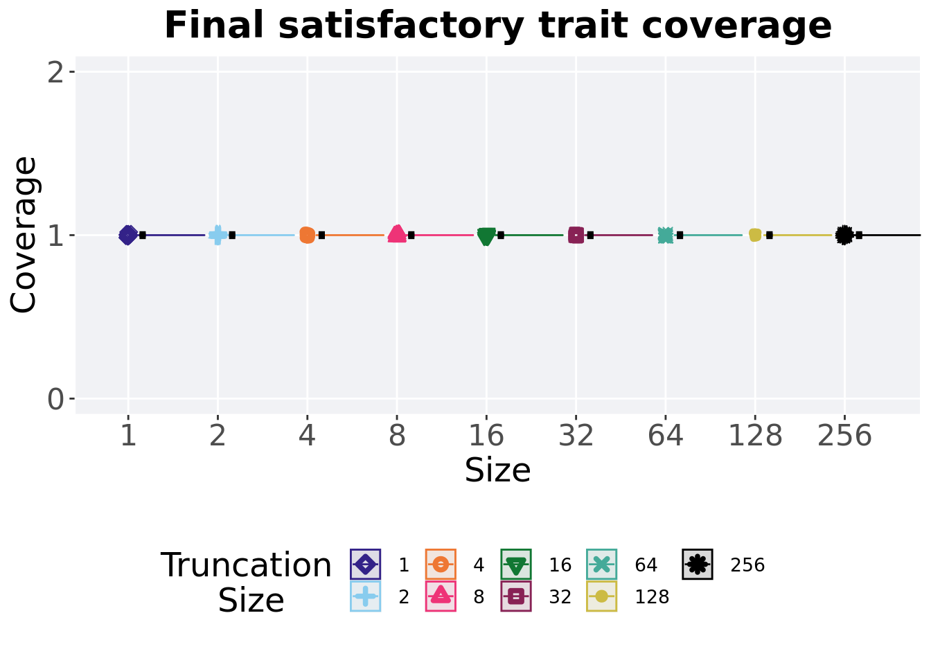
2.4.4.1 Stats
Summary statistics for the generation a satisfactory solution is found.
sat_coverage = filter(over_time_df, gen == 50000 & acro == 'con')
sat_coverage$acro = factor(sat_coverage$acro, levels = TR_LIST)
sat_coverage %>%
  group_by(T) %>%
  dplyr::summarise(
    count = n(),
    na_cnt = sum(is.na(pop_uni_obj)),
    min = min(pop_uni_obj, na.rm = TRUE),
    median = median(pop_uni_obj, na.rm = TRUE),
    mean = mean(pop_uni_obj, na.rm = TRUE),
    max = max(pop_uni_obj, na.rm = TRUE),
    IQR = IQR(pop_uni_obj, na.rm = TRUE)
  )
## # A tibble: 9 x 8
## T count na_cnt min median mean max IQR
## <fct> <int> <int> <int> <dbl> <dbl> <int> <dbl>
## 1 1 50 0 1 1 1 1 0
## 2 2 50 0 1 1 1 1 0
## 3 4 50 0 1 1 1 1 0
## 4 8 50 0 1 1 1 1 0
## 5 16 50 0 1 1 1 1 0
## 6 32 50 0 1 1 1 1 0
## 7 64 50 0 1 1 1 1 0
## 8 128 50 0 1 1 1 1 0
## 9 256 50 0 1 1 1 1 02.5 Multi-path exploration results
Here we present the results for best performances and activation gene coverage found by each selection scheme parameter on the multi-path exploration diagnostic. 50 replicates are conducted for each scheme parameter explored.
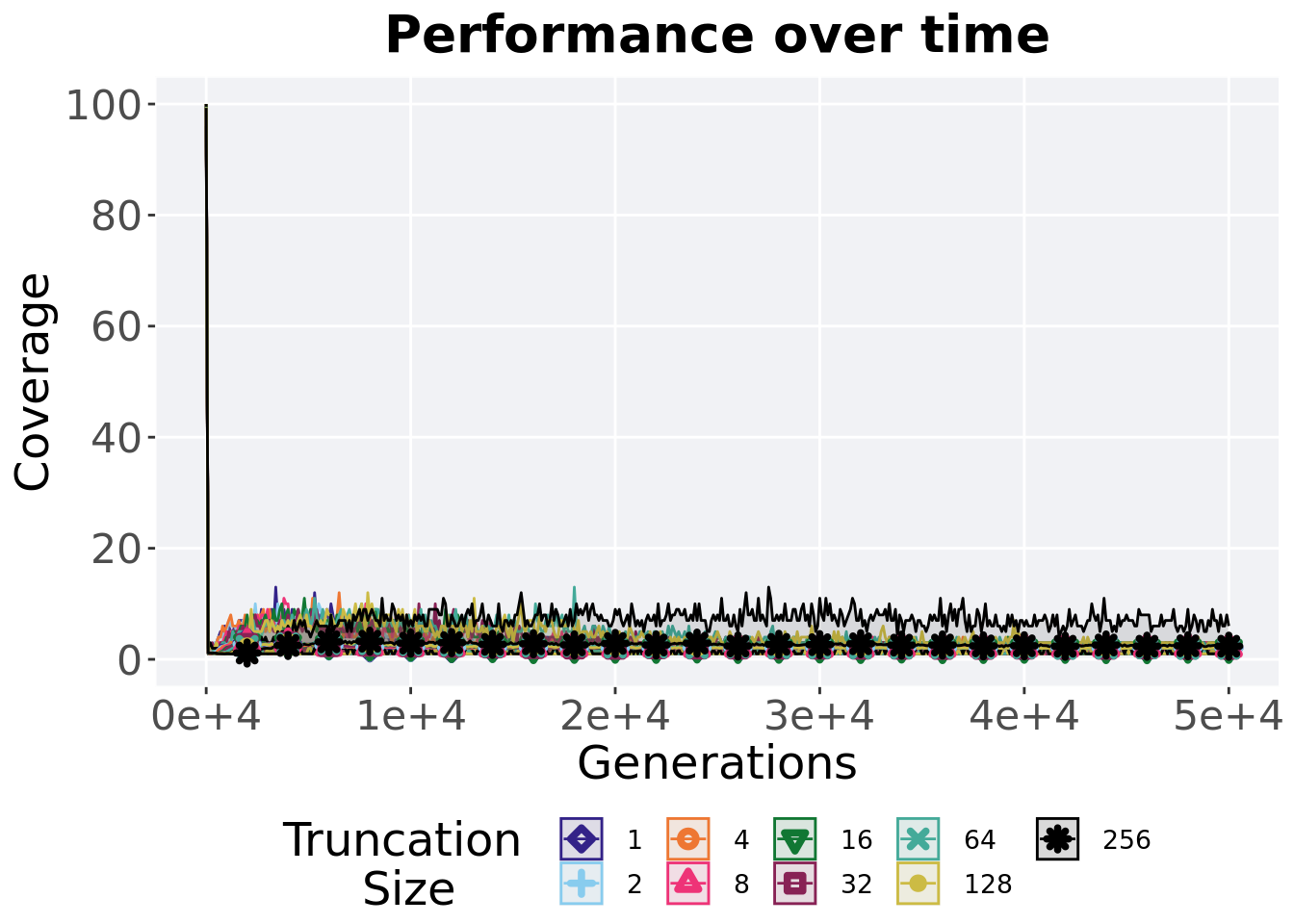
2.5.1 Activation gene coverage over time
Activation gene coverage in a population over time. Data points on the graph is the average activation gene coverage across 50 replicates every 2000 generations. Shading comes from the best and worse coverage across 50 replicates.
lines = filter(over_time_df, acro == 'mpe')  %>%
  group_by(T, gen) %>%
  dplyr::summarise(
    min = min(uni_str_pos),
    mean = mean(uni_str_pos),
    max = max(uni_str_pos)
  )
## `summarise()` has grouped output by 'T'. You can override using the `.groups`
## argument.ggplot(lines, aes(x=gen, y=mean, group = T, fill = T, color = T, shape = T)) +
geom_ribbon(aes(ymin = min, ymax = max), alpha = 0.1) +
geom_line(size = 0.5) +
geom_point(data = filter(lines, gen %% 2000 == 0 & gen != 0), size = 1.5, stroke = 2.0, alpha = 1.0) +
scale_y_continuous(
name="Coverage",
limits=c(0, 100),
breaks=seq(0,100, 20),
labels=c("0", "20", "40", "60", "80", "100")
) +
scale_x_continuous(
name="Generations",
limits=c(0, 50000),
breaks=c(0, 10000, 20000, 30000, 40000, 50000),
labels=c("0e+4", "1e+4", "2e+4", "3e+4", "4e+4", "5e+4")
) +
scale_shape_manual(values=SHAPE)+
scale_colour_manual(values = cb_palette) +
scale_fill_manual(values = cb_palette) +
ggtitle('Performance over time')+
p_theme +
guides(
shape=guide_legend(nrow=2, title.position = "left", title = 'Truncation \nSize'),
color=guide_legend(nrow=2, title.position = "left", title = 'Truncation \nSize'),
fill=guide_legend(nrow=2, title.position = "left", title = 'Truncation \nSize')
)
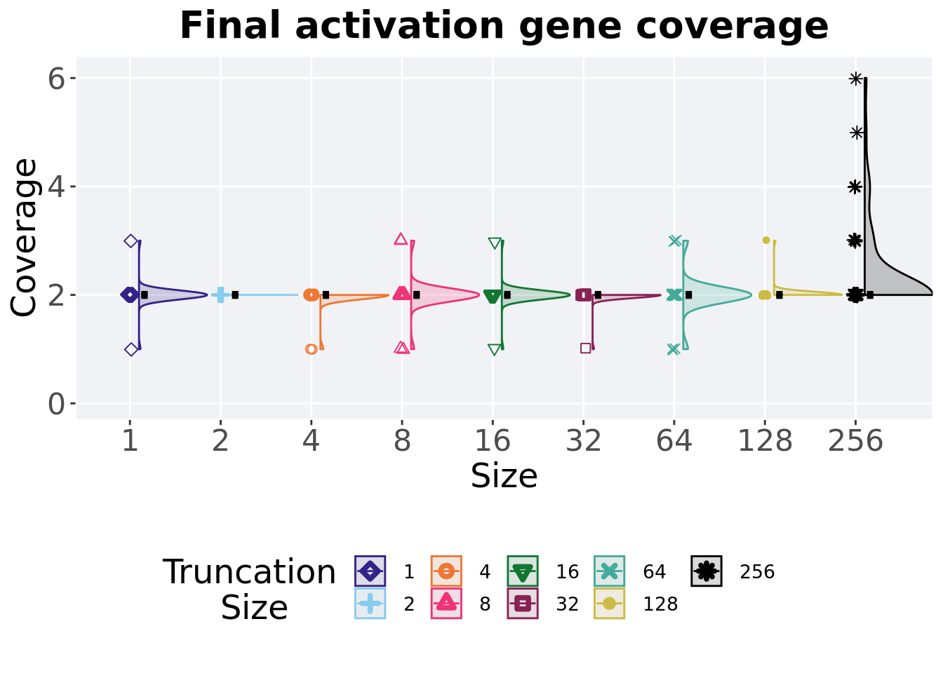
2.5.2 Final activation gene coverage
Activation gene coverage found in the final population at 50,000 generations.
plot = filter(over_time_df, gen == 50000 & acro == 'mpe') %>%
  ggplot(., aes(x = T, y = uni_str_pos, color = T, fill = T, shape = T)) +
  geom_flat_violin(position = position_nudge(x = .1, y = 0), scale = 'width', alpha = 0.2, width = 1.5) +
  geom_boxplot(color = 'black', width = .07, outlier.shape = NA, alpha = 0.0, size = 1.0, position = position_nudge(x = .16, y = 0)) +
  geom_point(position = position_jitter(width = 0.03, height = 0.02), size = 2.0, alpha = 1.0) +
  scale_y_continuous(
    name="Coverage",
    limits=c(0, 6.1),
    breaks=c(0,2,4,6)
  ) +
  scale_x_discrete(
    name='Size'
  )+
  scale_shape_manual(values=SHAPE)+
  scale_colour_manual(values = cb_palette, ) +
  scale_fill_manual(values = cb_palette) +
  ggtitle('Final activation gene coverage')+
  p_theme

plot_grid(
  plot +
    theme(legend.position="none"),
  legend,
  nrow=2,
  rel_heights = c(3,1)
)
2.5.2.1 Stats
Summary statistics for the generation a satisfactory solution is found.
act_coverage = filter(over_time_df, gen == 50000 & acro == 'mpe')
act_coverage$acro = factor(act_coverage$acro, levels = TR_LIST)
act_coverage %>%
  group_by(T) %>%
  dplyr::summarise(
    count = n(),
    na_cnt = sum(is.na(uni_str_pos)),
    min = min(uni_str_pos, na.rm = TRUE),
    median = median(uni_str_pos, na.rm = TRUE),
    mean = mean(uni_str_pos, na.rm = TRUE),
    max = max(uni_str_pos, na.rm = TRUE),
    IQR = IQR(uni_str_pos, na.rm = TRUE)
  )
## # A tibble: 9 x 8
## T count na_cnt min median mean max IQR
## <fct> <int> <int> <int> <dbl> <dbl> <int> <dbl>
## 1 1 50 0 1 2 2 3 0
## 2 2 50 0 2 2 2 2 0
## 3 4 50 0 1 2 1.96 2 0
## 4 8 50 0 1 2 2 3 0
## 5 16 50 0 1 2 2 3 0
## 6 32 50 0 1 2 1.98 2 0
## 7 64 50 0 1 2 2 3 0
## 8 128 50 0 2 2 2.02 3 0
## 9 256 50 0 2 2 2.36 6 0Kruskal–Wallis test illustrates evidence of statistical differences.
##
##  Kruskal-Wallis rank sum test
##
## data:  uni_str_pos by T
## Kruskal-Wallis chi-squared = 32.719, df = 8, p-value = 6.92e-05
Results for post-hoc Wilcoxon rank-sum test with a Bonferroni correction.
pairwise.wilcox.test(x = act_coverage$uni_str_pos, g = act_coverage$T, p.adjust.method = "bonferroni",
                     paired = FALSE, conf.int = FALSE, alternative = 't')
##
## Pairwise comparisons using Wilcoxon rank sum test with continuity correction
##
## data: act_coverage$uni_str_pos and act_coverage$T
##
## 1 2 4 8 16 32 64 128
## 2 1.000 - - - - - - -
## 4 1.000 1.000 - - - - - -
## 8 1.000 1.000 1.000 - - - - -
## 16 1.000 1.000 1.000 1.000 - - - -
## 32 1.000 1.000 1.000 1.000 1.000 - - -
## 64 1.000 1.000 1.000 1.000 1.000 1.000 - -
## 128 1.000 1.000 1.000 1.000 1.000 1.000 1.000 -
## 256 0.092 0.034 0.015 0.187 0.092 0.022 0.320 0.142
##
## P value adjustment method: bonferroni2.5.3 Performance over time
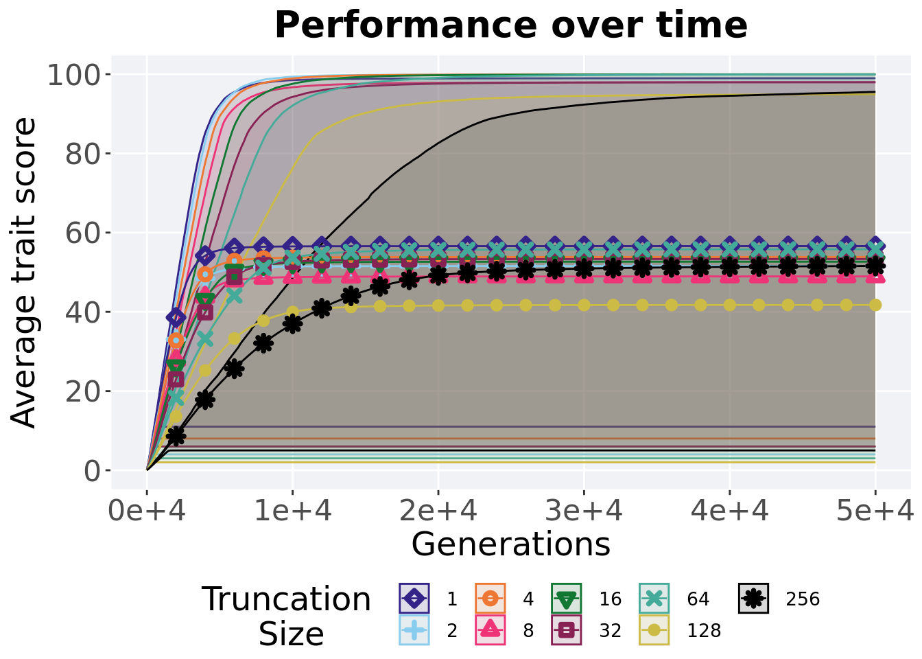
Best performance in a population over time. Data points on the graph is the average performance across 50 replicates every 2000 generations. Shading comes from the best and worse performance across 50 replicates.
lines = filter(over_time_df, acro == 'mpe') %>%
  group_by(T, gen) %>%
  dplyr::summarise(
    min = min(pop_fit_max) / DIMENSIONALITY,
    mean = mean(pop_fit_max) / DIMENSIONALITY,
    max = max(pop_fit_max) / DIMENSIONALITY
  )
## `summarise()` has grouped output by 'T'. You can override using the `.groups`
## argument.ggplot(lines, aes(x=gen, y=mean, group = T, fill = T, color = T, shape = T)) +
geom_ribbon(aes(ymin = min, ymax = max), alpha = 0.1) +
geom_line(size = 0.5) +
geom_point(data = filter(lines, gen %% 2000 == 0 & gen != 0), size = 1.5, stroke = 2.0, alpha = 1.0) +
scale_y_continuous(
name="Average trait score",
limits=c(0, 100),
breaks=seq(0,100, 20),
labels=c("0", "20", "40", "60", "80", "100")
) +
scale_x_continuous(
name="Generations",
limits=c(0, 50000),
breaks=c(0, 10000, 20000, 30000, 40000, 50000),
labels=c("0e+4", "1e+4", "2e+4", "3e+4", "4e+4", "5e+4")
) +
scale_shape_manual(values=SHAPE)+
scale_colour_manual(values = cb_palette) +
scale_fill_manual(values = cb_palette) +
ggtitle('Performance over time')+
p_theme +
guides(
shape=guide_legend(nrow=2, title.position = "left", title = 'Truncation \nSize'),
color=guide_legend(nrow=2, title.position = "left", title = 'Truncation \nSize'),
fill=guide_legend(nrow=2, title.position = "left", title = 'Truncation \nSize')
)
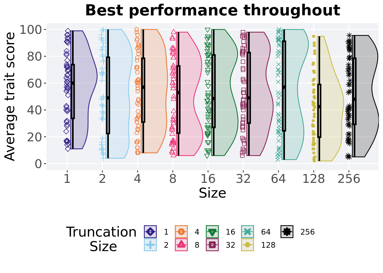
2.5.4 Best performance throughout
Best performance reached throughout 50,000 generations in a population.
plot = filter(best_df, var == 'pop_fit_max' & acro == 'mpe') %>%
  ggplot(., aes(x = T, y = val / DIMENSIONALITY, color = T, fill = T, shape = T)) +
  geom_flat_violin(position = position_nudge(x = .1, y = 0), scale = 'width', alpha = 0.2, width = 1.5) +
  geom_boxplot(color = 'black', width = .07, outlier.shape = NA, alpha = 0.0, size = 1.0, position = position_nudge(x = .16, y = 0)) +
  geom_point(position = position_jitter(width = 0.03, height = 0.02), size = 2.0, alpha = 1.0) +
  scale_y_continuous(
    name="Average trait score",
    limits=c(0, 100),
    breaks=seq(0,100, 20),
    labels=c("0", "20", "40", "60", "80", "100")
  ) +
  scale_x_discrete(
    name='Size'
  )+
  scale_shape_manual(values=SHAPE)+
  scale_colour_manual(values = cb_palette, ) +
  scale_fill_manual(values = cb_palette) +
  ggtitle('Best performance throughout')+
  p_theme

plot_grid(
  plot +
    theme(legend.position="none"),
  legend,
  nrow=2,
  rel_heights = c(3,1)
)
2.5.4.1 Stats
Summary statistics for the best performance.
performance = filter(best_df, var == 'pop_fit_max' & acro == 'mpe')
performance %>%
  group_by(T) %>%
  dplyr::summarise(
    count = n(),
    na_cnt = sum(is.na(val)),
    min = min(val / DIMENSIONALITY, na.rm = TRUE),
    median = median(val / DIMENSIONALITY, na.rm = TRUE),
    mean = mean(val / DIMENSIONALITY, na.rm = TRUE),
    max = max(val / DIMENSIONALITY, na.rm = TRUE),
    IQR = IQR(val / DIMENSIONALITY, na.rm = TRUE)
  )
## # A tibble: 9 x 8
## T count na_cnt min median mean max IQR
## <fct> <int> <int> <dbl> <dbl> <dbl> <dbl> <dbl>
## 1 1 50 0 11 60.0 56.6 99.0 40.0
## 2 2 50 0 4 49.0 51.6 100. 56.7
## 3 4 50 0 8.00 57.0 53.9 100. 47.5
## 4 8 50 0 6 53.0 48.9 98.0 50.0
## 5 16 50 0 6 48.5 52.7 100. 54.0
## 6 32 50 0 6 49.0 53.3 98.0 52.5
## 7 64 50 0 3 57.0 55.8 99.9 66.7
## 8 128 50 0 2 42.5 41.7 94.9 39.2
## 9 256 50 0 5 48.0 51.6 95.5 49.3Kruskal–Wallis test illustrates evidence of no statistical differences.
##
##  Kruskal-Wallis rank sum test
##
## data:  val by T
## Kruskal-Wallis chi-squared = 9.7113, df = 8, p-value = 0.2859