Chapter 3 Tournament selection
Results for the tournament selection parameter sweep on the diagnostics with no valleys.
3.1 Data setup
over_time_df <- read.csv(paste(DATA_DIR,'OVER-TIME/tor.csv', sep = "", collapse = NULL), header = TRUE, stringsAsFactors = FALSE)
over_time_df$T <- factor(over_time_df$T, levels = TS_LIST)

best_df <- read.csv(paste(DATA_DIR,'BEST/tor.csv', sep = "", collapse = NULL), header = TRUE, stringsAsFactors = FALSE)
best_df$T <- factor(best_df$T, levels = TS_LIST)

sati_df <- read.csv(paste(DATA_DIR,'SOL-FND/tor.csv', sep = "", collapse = NULL), header = TRUE, stringsAsFactors = FALSE)
sati_df$T <- factor(sati_df$T, levels = TS_LIST)
3.2 Exploitation rate results
Here we present the results for best performances found by each selection scheme parameter on the exploitation rate diagnostic. 50 replicates are conducted for each scheme explored.
3.2.1 Performance over time
Best performance in a population over time. Data points on the graph is the average performance across 50 replicates every 2000 generations. Shading comes from the best and worse performance across 50 replicates.
lines = filter(over_time_df, acro == 'exp') %>%
  group_by(T, gen) %>%
  dplyr::summarise(
    min = min(pop_fit_max) / DIMENSIONALITY,
    mean = mean(pop_fit_max) / DIMENSIONALITY,
    max = max(pop_fit_max) / DIMENSIONALITY
  )
## `summarise()` has grouped output by 'T'. You can override using the `.groups`
## argument.over_time_plot = ggplot(lines, aes(x=gen, y=mean, group = T, fill = T, color = T, shape = T)) +
geom_ribbon(aes(ymin = min, ymax = max), alpha = 0.1) +
geom_line(size = 0.5) +
geom_point(data = filter(lines, gen %% 2000 == 0 & gen != 0), size = 1.5, stroke = 2.0, alpha = 1.0) +
scale_y_continuous(
name="Average trait score",
limits=c(0, 100),
breaks=seq(0,100, 20),
labels=c("0", "20", "40", "60", "80", "100")
) +
scale_x_continuous(
name="Generations",
limits=c(0, 50000),
breaks=c(0, 10000, 20000, 30000, 40000, 50000),
labels=c("0e+4", "1e+4", "2e+4", "3e+4", "4e+4", "5e+4")
) +
scale_shape_manual(values=SHAPE)+
scale_colour_manual(values = cb_palette) +
scale_fill_manual(values = cb_palette) +
ggtitle('Performance over time')+
p_theme +
guides(
shape=guide_legend(nrow=2, title.position = "left", title = 'Tournament \nSize'),
color=guide_legend(nrow=2, title.position = "left", title = 'Tournament \nSize'),
fill=guide_legend(nrow=2, title.position = "left", title = 'Tournament \nSize')
)
over_time_plot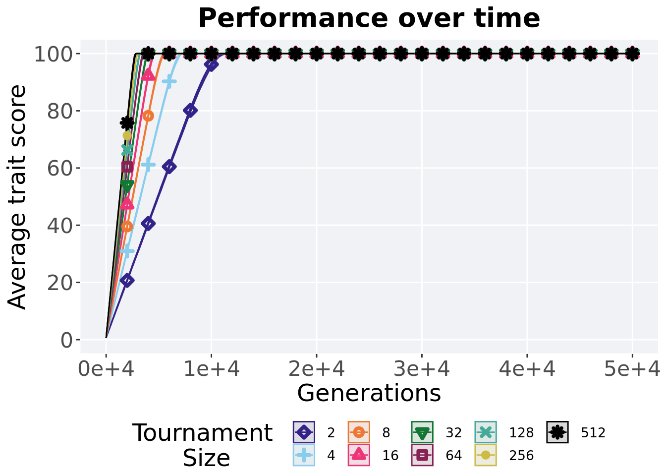
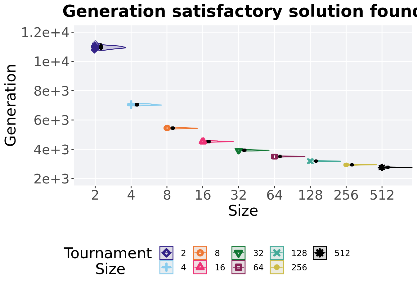
3.2.2 Generation satisfactory solution found
First generation a satisfactory solution is found throughout the 50,000 generations.
plot = filter(sati_df, acro == 'exp') %>%
  ggplot(., aes(x = T, y = gen , color = T, fill = T, shape = T)) +
  geom_flat_violin(position = position_nudge(x = .1, y = 0), scale = 'width', alpha = 0.2, width = 1.5) +
  geom_boxplot(color = 'black', width = .07, outlier.shape = NA, alpha = 0.0, size = 1.0, position = position_nudge(x = .16, y = 0)) +
  geom_point(position = position_jitter(width = 0.03, height = 0.02), size = 2.0, alpha = 1.0) +
  scale_y_continuous(
    name="Generation",
    limits=c(2000, 12000),
    breaks=c(2000, 4000, 6000, 8000, 10000, 12000),
    labels=c("2e+3", "4e+3", "6e+3", "8e+3", "1e+4", "1.2e+4")
  ) +
  scale_x_discrete(
    name="Size"
  )+
  scale_shape_manual(values=SHAPE)+
  scale_colour_manual(values = cb_palette, ) +
  scale_fill_manual(values = cb_palette) +
  ggtitle('Generation satisfactory solution found')+
  p_theme

plot_grid(
  plot +
    theme(legend.position="none"),
  legend,
  nrow=2,
  rel_heights = c(3,1)
)
3.2.2.1 Stats
Summary statistics for the generation a satisfactory solution is found.
ssf = filter(sati_df, gen <= GENERATIONS & acro == 'exp')
ssf$acro = factor(ssf$acro, levels = TS_LIST)
ssf %>%
  group_by(T) %>%
  dplyr::summarise(
    count = n(),
    na_cnt = sum(is.na(gen)),
    min = min(gen, na.rm = TRUE),
    median = median(gen, na.rm = TRUE),
    mean = mean(gen, na.rm = TRUE),
    max = max(gen, na.rm = TRUE),
    IQR = IQR(gen, na.rm = TRUE)
  )
## # A tibble: 9 x 8
## T count na_cnt min median mean max IQR
## <fct> <int> <int> <int> <dbl> <dbl> <int> <dbl>
## 1 2 50 0 10756 10958. 10960. 11232 140
## 2 4 50 0 6959 7040 7049. 7141 66
## 3 8 50 0 5387 5442 5449. 5518 45.5
## 4 16 50 0 4455 4528 4532. 4592 32.5
## 5 32 50 0 3888 3930. 3929. 3974 30.8
## 6 64 50 0 3468 3509 3510. 3545 23
## 7 128 50 0 3156 3189 3191. 3234 22.5
## 8 256 50 0 2908 2949 2948. 2985 19.5
## 9 512 50 0 2718 2764. 2766. 2801 16.8Kruskal–Wallis test illustrates evidence of statistical differences.
##
##  Kruskal-Wallis rank sum test
##
## data:  gen by T
## Kruskal-Wallis chi-squared = 443.46, df = 8, p-value < 2.2e-16
Results for post-hoc Wilcoxon rank-sum test with a Bonferroni correction.
pairwise.wilcox.test(x = ssf$gen, g = ssf$T, p.adjust.method = "bonferroni",
                     paired = FALSE, conf.int = FALSE, alternative = 'l')
##
## Pairwise comparisons using Wilcoxon rank sum test with continuity correction
##
## data: ssf$gen and ssf$T
##
## 2 4 8 16 32 64 128 256
## 4 <2e-16 - - - - - - -
## 8 <2e-16 <2e-16 - - - - - -
## 16 <2e-16 <2e-16 <2e-16 - - - - -
## 32 <2e-16 <2e-16 <2e-16 <2e-16 - - - -
## 64 <2e-16 <2e-16 <2e-16 <2e-16 <2e-16 - - -
## 128 <2e-16 <2e-16 <2e-16 <2e-16 <2e-16 <2e-16 - -
## 256 <2e-16 <2e-16 <2e-16 <2e-16 <2e-16 <2e-16 <2e-16 -
## 512 <2e-16 <2e-16 <2e-16 <2e-16 <2e-16 <2e-16 <2e-16 <2e-16
##
## P value adjustment method: bonferroni3.3 Ordered exploitation results
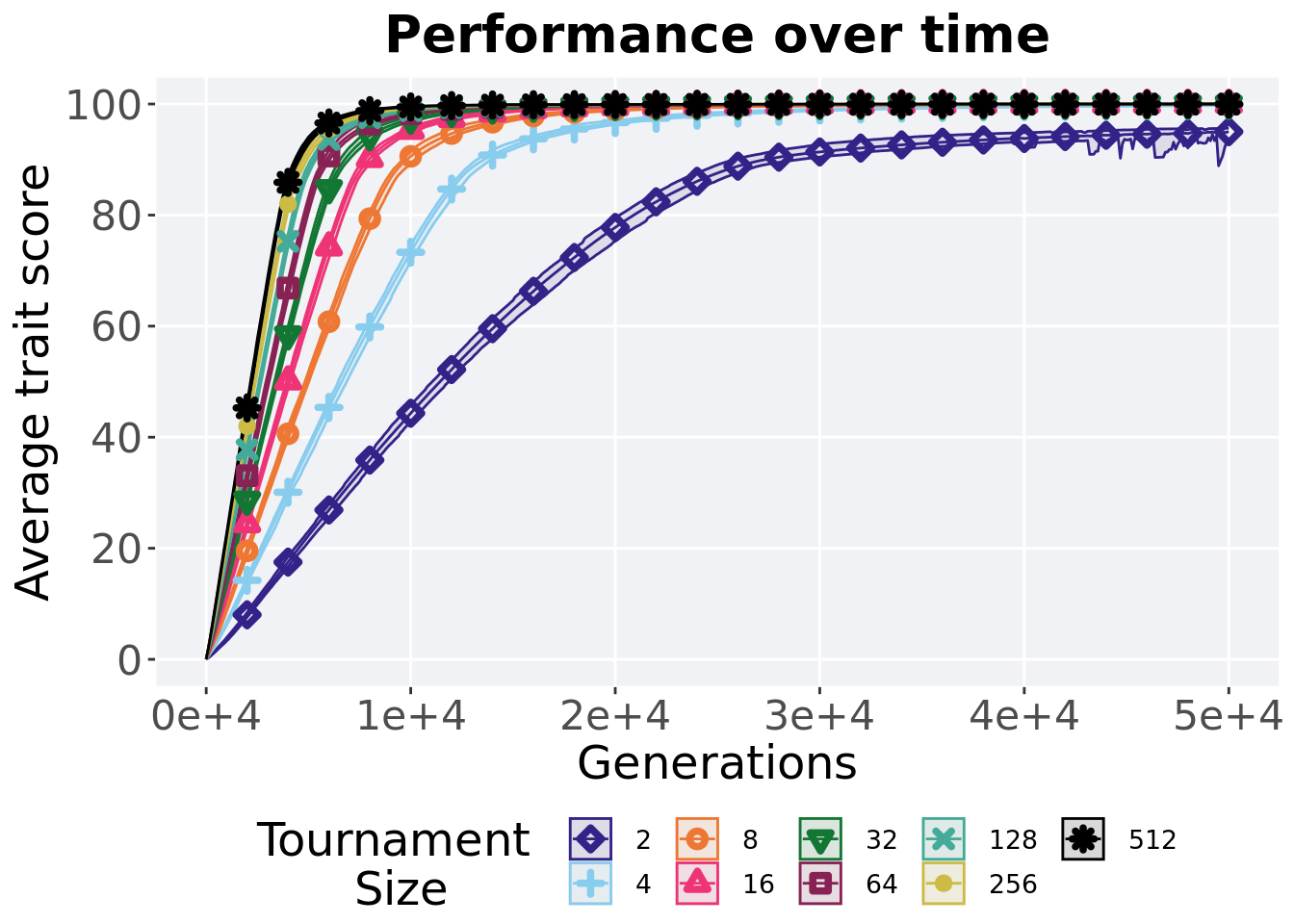
Here we present the results for best performances found by each selection scheme parameter on the exploitation rate diagnostic. 50 replicates are conducted for each scheme explored.
3.3.1 Performance over time
Best performance in a population over time. Data points on the graph is the average performance across 50 replicates every 2000 generations. Shading comes from the best and worse performance across 50 replicates.
lines = filter(over_time_df, acro == 'ord') %>%
  group_by(T, gen) %>%
  dplyr::summarise(
    min = min(pop_fit_max) / DIMENSIONALITY,
    mean = mean(pop_fit_max) / DIMENSIONALITY,
    max = max(pop_fit_max) / DIMENSIONALITY
  )
## `summarise()` has grouped output by 'T'. You can override using the `.groups`
## argument.ggplot(lines, aes(x=gen, y=mean, group = T, fill = T, color = T, shape = T)) +
geom_ribbon(aes(ymin = min, ymax = max), alpha = 0.1) +
geom_line(size = 0.5) +
geom_point(data = filter(lines, gen %% 2000 == 0 & gen != 0), size = 1.5, stroke = 2.0, alpha = 1.0) +
scale_y_continuous(
name="Average trait score",
limits=c(0, 100),
breaks=seq(0,100, 20),
labels=c("0", "20", "40", "60", "80", "100")
) +
scale_x_continuous(
name="Generations",
limits=c(0, 50000),
breaks=c(0, 10000, 20000, 30000, 40000, 50000),
labels=c("0e+4", "1e+4", "2e+4", "3e+4", "4e+4", "5e+4")
) +
scale_shape_manual(values=SHAPE)+
scale_colour_manual(values = cb_palette) +
scale_fill_manual(values = cb_palette) +
ggtitle('Performance over time')+
p_theme +
guides(
shape=guide_legend(nrow=2, title.position = "left", title = 'Tournament \nSize'),
color=guide_legend(nrow=2, title.position = "left", title = 'Tournament \nSize'),
fill=guide_legend(nrow=2, title.position = "left", title = 'Tournament \nSize')
)
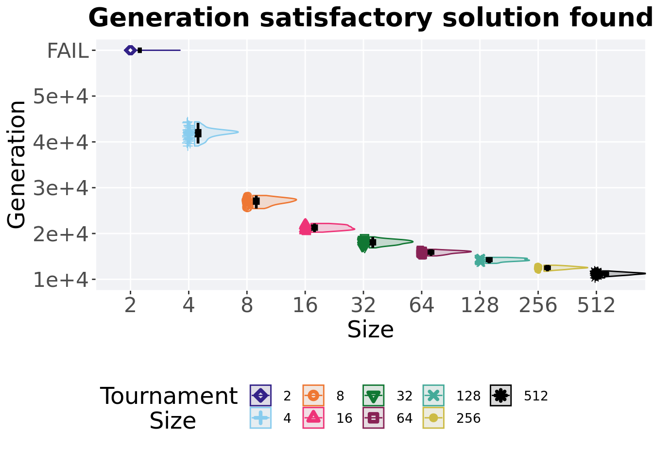
3.3.2 Generation satisfactory solution found
First generation a satisfactory solution is found throughout the 50,000 generations.
plot = filter(sati_df, acro == 'ord') %>%
  ggplot(., aes(x = T, y = gen , color = T, fill = T, shape = T)) +
  geom_flat_violin(position = position_nudge(x = .1, y = 0), scale = 'width', alpha = 0.2, width = 1.5) +
  geom_boxplot(color = 'black', width = .07, outlier.shape = NA, alpha = 0.0, size = 1.0, position = position_nudge(x = .16, y = 0)) +
  geom_point(position = position_jitter(width = 0.03, height = 0.02), size = 2.0, alpha = 1.0) +
  scale_y_continuous(
    name="Generation",
    limits=c(10000, 60000),
    breaks=c(10000, 20000, 30000, 40000,50000,60000),
    labels=c("1e+4","2e+4","3e+4","4e+4","5e+4","FAIL")
  ) +
  scale_x_discrete(
    name="Size"
  )+
  scale_shape_manual(values=SHAPE)+
  scale_colour_manual(values = cb_palette) +
  scale_fill_manual(values = cb_palette) +
  ggtitle('Generation satisfactory solution found')+
  p_theme

plot_grid(
  plot +
    theme(legend.position="none"),
  legend,
  nrow=2,
  rel_heights = c(3,1)
)
3.3.2.1 Stats
Summary statistics for the generation a satisfactory solution is found.
ssf = filter(sati_df, gen <= GENERATIONS & acro == 'ord')
ssf$acro = factor(ssf$acro, levels = TS_LIST)
ssf %>%
  group_by(T) %>%
  dplyr::summarise(
    count = n(),
    na_cnt = sum(is.na(gen)),
    min = min(gen, na.rm = TRUE),
    median = median(gen, na.rm = TRUE),
    mean = mean(gen, na.rm = TRUE),
    max = max(gen, na.rm = TRUE),
    IQR = IQR(gen, na.rm = TRUE)
  )
## # A tibble: 8 x 8
## T count na_cnt min median mean max IQR
## <fct> <int> <int> <int> <dbl> <dbl> <int> <dbl>
## 1 4 50 0 39102 42086 41858. 44378 1207.
## 2 8 50 0 25443 27089 27014. 28293 995.
## 3 16 50 0 20292 21306. 21277. 22188 786.
## 4 32 50 0 16868 18107 18085. 19256 786
## 5 64 50 0 15114 15949 15885. 16540 488
## 6 128 50 0 13487 14228. 14238. 14789 495
## 7 256 50 0 11756 12532. 12520. 13078 412.
## 8 512 50 0 10311 11221 11209. 11823 366.Kruskal–Wallis test illustrates evidence of statistical differences.
##
##  Kruskal-Wallis rank sum test
##
## data:  gen by T
## Kruskal-Wallis chi-squared = 392.76, df = 7, p-value < 2.2e-16
Results for post-hoc Wilcoxon rank-sum test with a Bonferroni correction.
pairwise.wilcox.test(x = ssf$gen, g = ssf$T, p.adjust.method = "bonferroni",
                     paired = FALSE, conf.int = FALSE, alternative = 'l')
##
## Pairwise comparisons using Wilcoxon rank sum test with continuity correction
##
## data: ssf$gen and ssf$T
##
## 4 8 16 32 64 128 256
## 8 <2e-16 - - - - - -
## 16 <2e-16 <2e-16 - - - - -
## 32 <2e-16 <2e-16 <2e-16 - - - -
## 64 <2e-16 <2e-16 <2e-16 <2e-16 - - -
## 128 <2e-16 <2e-16 <2e-16 <2e-16 <2e-16 - -
## 256 <2e-16 <2e-16 <2e-16 <2e-16 <2e-16 <2e-16 -
## 512 <2e-16 <2e-16 <2e-16 <2e-16 <2e-16 <2e-16 <2e-16
##
## P value adjustment method: bonferroni3.4 Contradictory objectives results
Here we present the results for activation gene coverage and satisfactory trait coverage found by each selection scheme parameter on the contradictory objectives diagnostic. 50 replicates are conducted for each scheme parameters explored.
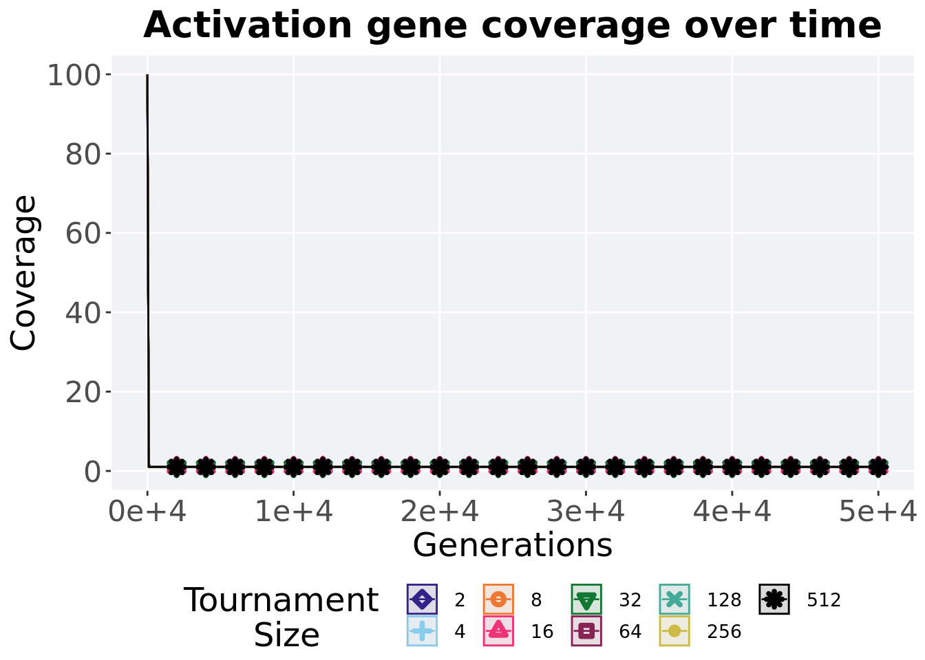
3.4.1 Activation gene coverage over time
Activation gene coverage in a population over time. Data points on the graph is the average activation gene coverage across 50 replicates every 2000 generations. Shading comes from the best and worse coverage across 50 replicates.
lines = filter(over_time_df, acro == 'con')  %>%
  group_by(T, gen) %>%
  dplyr::summarise(
    min = min(uni_str_pos),
    mean = mean(uni_str_pos),
    max = max(uni_str_pos)
  )
## `summarise()` has grouped output by 'T'. You can override using the `.groups`
## argument.ggplot(lines, aes(x=gen, y=mean, group = T, fill = T, color = T, shape = T)) +
geom_ribbon(aes(ymin = min, ymax = max), alpha = 0.1) +
geom_line(size = 0.5) +
geom_point(data = filter(lines, gen %% 2000 == 0 & gen != 0), size = 1.5, stroke = 2.0, alpha = 1.0) +
scale_y_continuous(
name="Coverage",
limits=c(0, 100),
breaks=seq(0,100, 20),
labels=c("0", "20", "40", "60", "80", "100")
) +
scale_x_continuous(
name="Generations",
limits=c(0, 50000),
breaks=c(0, 10000, 20000, 30000, 40000, 50000),
labels=c("0e+4", "1e+4", "2e+4", "3e+4", "4e+4", "5e+4")
) +
scale_shape_manual(values=SHAPE)+
scale_colour_manual(values = cb_palette) +
scale_fill_manual(values = cb_palette) +
ggtitle('Activation gene coverage over time')+
p_theme +
guides(
shape=guide_legend(nrow=2, title.position = "left", title = 'Tournament \nSize'),
color=guide_legend(nrow=2, title.position = "left", title = 'Tournament \nSize'),
fill=guide_legend(nrow=2, title.position = "left", title = 'Tournament \nSize')
)
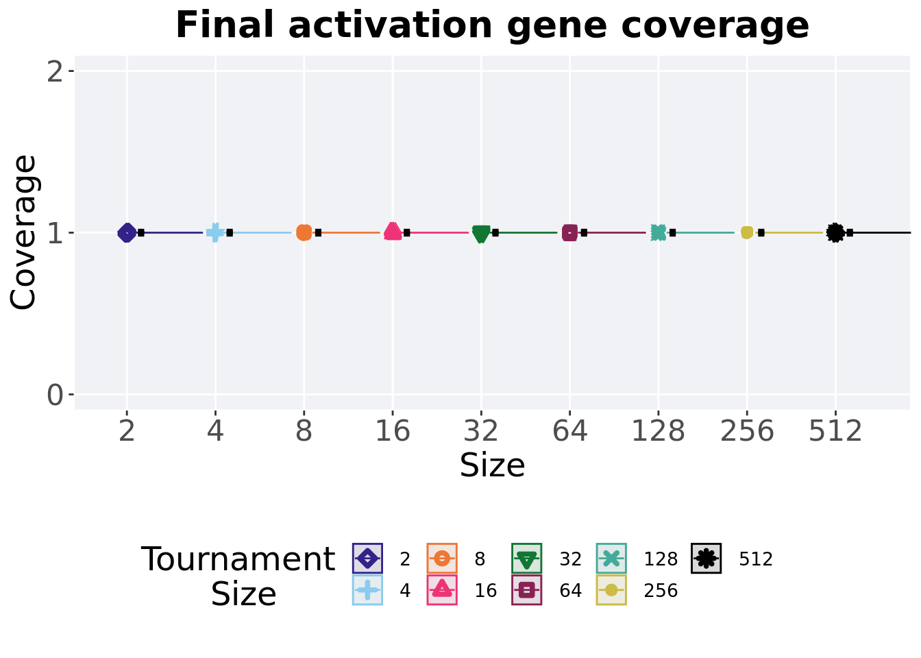
3.4.2 Final activation gene coverage
Activation gene coverage found in the final population at 50,000 generations.
plot = filter(over_time_df, gen == 50000 & acro == 'con') %>%
  ggplot(., aes(x = T, y = uni_str_pos, color = T, fill = T, shape = T)) +
  geom_flat_violin(position = position_nudge(x = .1, y = 0), scale = 'width', alpha = 0.2, width = 1.5) +
  geom_boxplot(color = 'black', width = .07, outlier.shape = NA, alpha = 0.0, size = 1.0, position = position_nudge(x = .16, y = 0)) +
  geom_point(position = position_jitter(width = 0.03, height = 0.02), size = 2.0, alpha = 1.0) +
  scale_y_continuous(
    name="Coverage",
    limits=c(0, 2),
    breaks=c(0,1,2)
  ) +
  scale_x_discrete(
    name="Size"
  )+
  scale_shape_manual(values=SHAPE)+
  scale_colour_manual(values = cb_palette, ) +
  scale_fill_manual(values = cb_palette) +
  ggtitle('Final activation gene coverage')+
  p_theme

plot_grid(
  plot +
    theme(legend.position="none"),
  legend,
  nrow=2,
  rel_heights = c(3,1)
)
3.4.2.1 Stats
Summary statistics for the generation a satisfactory solution is found.
act_coverage = filter(over_time_df, gen == 50000 & acro == 'con')
act_coverage$acro = factor(act_coverage$acro, levels = TS_LIST)
act_coverage %>%
  group_by(T) %>%
  dplyr::summarise(
    count = n(),
    na_cnt = sum(is.na(uni_str_pos)),
    min = min(uni_str_pos, na.rm = TRUE),
    median = median(uni_str_pos, na.rm = TRUE),
    mean = mean(uni_str_pos, na.rm = TRUE),
    max = max(uni_str_pos, na.rm = TRUE),
    IQR = IQR(uni_str_pos, na.rm = TRUE)
  )
## # A tibble: 9 x 8
## T count na_cnt min median mean max IQR
## <fct> <int> <int> <int> <dbl> <dbl> <int> <dbl>
## 1 2 50 0 1 1 1 1 0
## 2 4 50 0 1 1 1 1 0
## 3 8 50 0 1 1 1 1 0
## 4 16 50 0 1 1 1 1 0
## 5 32 50 0 1 1 1 1 0
## 6 64 50 0 1 1 1 1 0
## 7 128 50 0 1 1 1 1 0
## 8 256 50 0 1 1 1 1 0
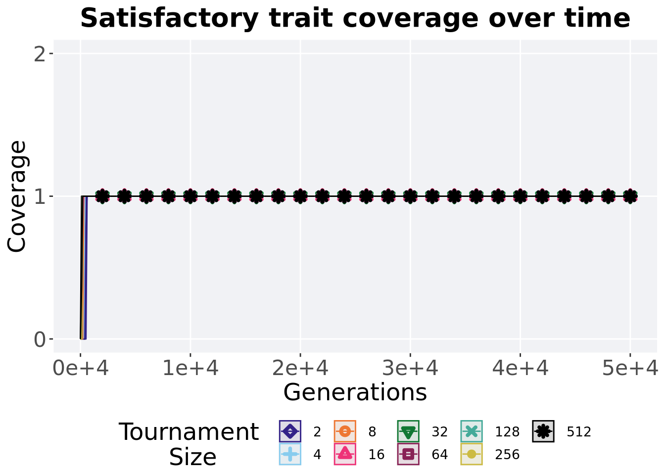
## 9 512 50 0 1 1 1 1 03.4.3 Satisfactory trait coverage over time
Satisfactory trait coverage in a population over time. Data points on the graph is the average activation gene coverage across 50 replicates every 2000 generations. Shading comes from the best and worse coverage across 50 replicates.
lines = filter(over_time_df, acro == 'con')  %>%
  group_by(T, gen) %>%
  dplyr::summarise(
    min = min(pop_uni_obj),
    mean = mean(pop_uni_obj),
    max = max(pop_uni_obj)
  )
## `summarise()` has grouped output by 'T'. You can override using the `.groups`
## argument.ggplot(lines, aes(x=gen, y=mean, group = T, fill = T, color = T, shape = T)) +
geom_ribbon(aes(ymin = min, ymax = max), alpha = 0.1) +
geom_line(size = 0.5) +
geom_point(data = filter(lines, gen %% 2000 == 0 & gen != 0), size = 1.5, stroke = 2.0, alpha = 1.0) +
scale_y_continuous(
name="Coverage",
limits=c(0, 2),
breaks=c(0,1,2)
) +
scale_x_continuous(
name="Generations",
limits=c(0, 50000),
breaks=c(0, 10000, 20000, 30000, 40000, 50000),
labels=c("0e+4", "1e+4", "2e+4", "3e+4", "4e+4", "5e+4")
) +
scale_shape_manual(values=SHAPE)+
scale_colour_manual(values = cb_palette) +
scale_fill_manual(values = cb_palette) +
ggtitle('Satisfactory trait coverage over time')+
p_theme +
guides(
shape=guide_legend(nrow=2, title.position = "left", title = 'Tournament \nSize'),
color=guide_legend(nrow=2, title.position = "left", title = 'Tournament \nSize'),
fill=guide_legend(nrow=2, title.position = "left", title = 'Tournament \nSize')
)
3.4.4 Final satisfactory trait coverage
Satisfactory trait coverage found in the final population at 50,000 generations.
plot = filter(over_time_df, gen == 50000 & acro == 'con') %>%
  ggplot(., aes(x = T, y = pop_uni_obj, color = T, fill = T, shape = T)) +
  geom_flat_violin(position = position_nudge(x = .1, y = 0), scale = 'width', alpha = 0.2, width = 1.5) +
  geom_boxplot(color = 'black', width = .07, outlier.shape = NA, alpha = 0.0, size = 1.0, position = position_nudge(x = .16, y = 0)) +
  geom_point(position = position_jitter(width = 0.03, height = 0.02), size = 2.0, alpha = 1.0) +
  scale_y_continuous(
    name="Coverage",
    limits=c(0, 2),
    breaks=c(0,1,2)
  ) +
  scale_x_discrete(
    name="Size"
  )+
  scale_shape_manual(values=SHAPE)+
  scale_colour_manual(values = cb_palette, ) +
  scale_fill_manual(values = cb_palette) +
  ggtitle('Final satisfactory trait coverage')+
  p_theme

plot_grid(
  plot +
    theme(legend.position="none"),
  legend,
  nrow=2,
  rel_heights = c(3,1)
)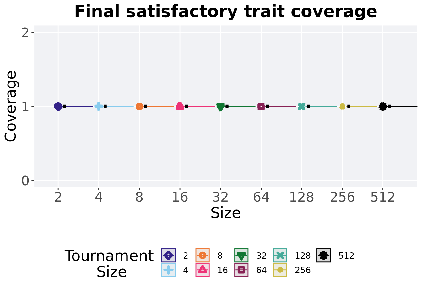
3.4.4.1 Stats
Summary statistics for the generation a satisfactory solution is found.
sat_coverage = filter(over_time_df, gen == 50000 & acro == 'con')
sat_coverage$acro = factor(sat_coverage$acro, levels = TS_LIST)
sat_coverage %>%
  group_by(T) %>%
  dplyr::summarise(
    count = n(),
    na_cnt = sum(is.na(pop_uni_obj)),
    min = min(pop_uni_obj, na.rm = TRUE),
    median = median(pop_uni_obj, na.rm = TRUE),
    mean = mean(pop_uni_obj, na.rm = TRUE),
    max = max(pop_uni_obj, na.rm = TRUE),
    IQR = IQR(pop_uni_obj, na.rm = TRUE)
  )
## # A tibble: 9 x 8
## T count na_cnt min median mean max IQR
## <fct> <int> <int> <int> <dbl> <dbl> <int> <dbl>
## 1 2 50 0 1 1 1 1 0
## 2 4 50 0 1 1 1 1 0
## 3 8 50 0 1 1 1 1 0
## 4 16 50 0 1 1 1 1 0
## 5 32 50 0 1 1 1 1 0
## 6 64 50 0 1 1 1 1 0
## 7 128 50 0 1 1 1 1 0
## 8 256 50 0 1 1 1 1 0
## 9 512 50 0 1 1 1 1 03.5 Multi-path exploration results
Here we present the results for best performances and activation gene coverage found by each selection scheme parameter on the multi-path exploration diagnostic. 50 replicates are conducted for each scheme parameter explored.
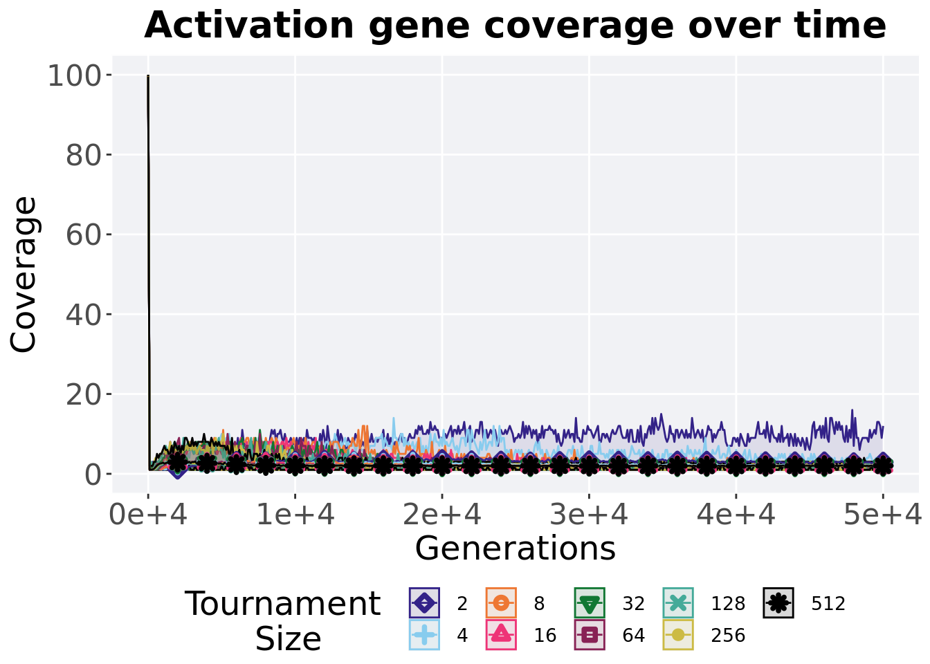
3.5.1 Activation gene coverage over time
Activation gene coverage in a population over time. Data points on the graph is the average activation gene coverage across 50 replicates every 2000 generations. Shading comes from the best and worse coverage across 50 replicates.
lines = filter(over_time_df, acro == 'mpe')  %>%
  group_by(T, gen) %>%
  dplyr::summarise(
    min = min(uni_str_pos),
    mean = mean(uni_str_pos),
    max = max(uni_str_pos)
  )
## `summarise()` has grouped output by 'T'. You can override using the `.groups`
## argument.ggplot(lines, aes(x=gen, y=mean, group = T, fill = T, color = T, shape = T)) +
geom_ribbon(aes(ymin = min, ymax = max), alpha = 0.1) +
geom_line(size = 0.5) +
geom_point(data = filter(lines, gen %% 2000 == 0 & gen != 0), size = 1.5, stroke = 2.0, alpha = 1.0) +
scale_y_continuous(
name="Coverage",
limits=c(0, 100),
breaks=seq(0,100, 20),
labels=c("0", "20", "40", "60", "80", "100")
) +
scale_x_continuous(
name="Generations",
limits=c(0, 50000),
breaks=c(0, 10000, 20000, 30000, 40000, 50000),
labels=c("0e+4", "1e+4", "2e+4", "3e+4", "4e+4", "5e+4")
) +
scale_shape_manual(values=SHAPE)+
scale_colour_manual(values = cb_palette) +
scale_fill_manual(values = cb_palette) +
ggtitle('Activation gene coverage over time')+
p_theme +
guides(
shape=guide_legend(nrow=2, title.position = "left", title = 'Tournament \nSize'),
color=guide_legend(nrow=2, title.position = "left", title = 'Tournament \nSize'),
fill=guide_legend(nrow=2, title.position = "left", title = 'Tournament \nSize')
)
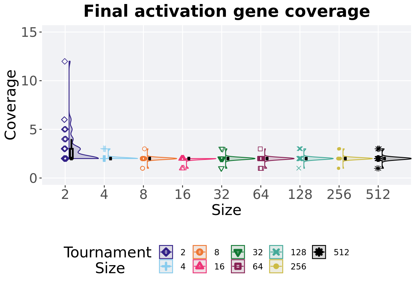
3.5.2 Final activation gene coverage
Activation gene coverage found in the final population at 50,000 generations.
plot = filter(over_time_df, gen == 50000 & acro == 'mpe') %>%
  ggplot(., aes(x = T, y = uni_str_pos, color = T, fill = T, shape = T)) +
  geom_flat_violin(position = position_nudge(x = .1, y = 0), scale = 'width', alpha = 0.2, width = 1.5) +
  geom_boxplot(color = 'black', width = .07, outlier.shape = NA, alpha = 0.0, size = 1.0, position = position_nudge(x = .16, y = 0)) +
  geom_point(position = position_jitter(width = 0.03, height = 0.02), size = 2.0, alpha = 1.0) +
  scale_y_continuous(
    name="Coverage",
    limits=c(0, 15),
    breaks=c(0,5,10,15)
  ) +
  scale_x_discrete(
    name="Size"
  )+
  scale_shape_manual(values=SHAPE)+
  scale_colour_manual(values = cb_palette, ) +
  scale_fill_manual(values = cb_palette) +
  ggtitle('Final activation gene coverage')+
  p_theme

plot_grid(
  plot +
    theme(legend.position="none"),
  legend,
  nrow=2,
  rel_heights = c(3,1)
)
3.5.2.1 Stats
Summary statistics for the generation a satisfactory solution is found.
act_coverage = filter(over_time_df, gen == 50000 & acro == 'mpe')
act_coverage$acro = factor(act_coverage$acro, levels = TS_LIST)
act_coverage %>%
  group_by(T) %>%
  dplyr::summarise(
    count = n(),
    na_cnt = sum(is.na(uni_str_pos)),
    min = min(uni_str_pos, na.rm = TRUE),
    median = median(uni_str_pos, na.rm = TRUE),
    mean = mean(uni_str_pos, na.rm = TRUE),
    max = max(uni_str_pos, na.rm = TRUE),
    IQR = IQR(uni_str_pos, na.rm = TRUE)
  )
## # A tibble: 9 x 8
## T count na_cnt min median mean max IQR
## <fct> <int> <int> <int> <dbl> <dbl> <int> <dbl>
## 1 2 50 0 2 2 2.92 12 1
## 2 4 50 0 2 2 2.06 3 0
## 3 8 50 0 1 2 1.98 3 0
## 4 16 50 0 1 2 1.94 2 0
## 5 32 50 0 1 2 2 3 0
## 6 64 50 0 1 2 1.96 3 0
## 7 128 50 0 1 2 2.04 3 0
## 8 256 50 0 1 2 2.02 3 0
## 9 512 50 0 1 2 2.02 3 0Kruskal–Wallis test illustrates evidence of statistical differences.
##
##  Kruskal-Wallis rank sum test
##
## data:  uni_str_pos by T
## Kruskal-Wallis chi-squared = 80.365, df = 8, p-value = 4.127e-14
Results for post-hoc Wilcoxon rank-sum test with a Bonferroni correction.
pairwise.wilcox.test(x = act_coverage$uni_str_pos, g = act_coverage$T, p.adjust.method = "bonferroni",
                     paired = FALSE, conf.int = FALSE, alternative = 't')
##
## Pairwise comparisons using Wilcoxon rank sum test with continuity correction
##
## data: act_coverage$uni_str_pos and act_coverage$T
##
## 2 4 8 16 32 64 128 256
## 4 0.00066 - - - - - - -
## 8 3.1e-05 1.00000 - - - - - -
## 16 6.0e-06 0.54531 1.00000 - - - - -
## 32 0.00011 1.00000 1.00000 1.00000 - - - -
## 64 2.3e-05 1.00000 1.00000 1.00000 1.00000 - - -
## 128 0.00048 1.00000 1.00000 1.00000 1.00000 1.00000 - -
## 256 0.00015 1.00000 1.00000 1.00000 1.00000 1.00000 1.00000 -
## 512 0.00035 1.00000 1.00000 1.00000 1.00000 1.00000 1.00000 1.00000
##
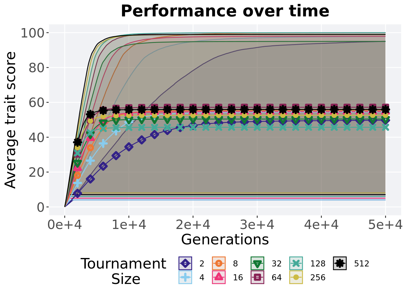
## P value adjustment method: bonferroni3.5.3 Performance over time
Best performance in a population over time. Data points on the graph is the average performance across 50 replicates every 2000 generations. Shading comes from the best and worse performance across 50 replicates.
lines = filter(over_time_df, acro == 'mpe') %>%
  group_by(T, gen) %>%
  dplyr::summarise(
    min = min(pop_fit_max) / DIMENSIONALITY,
    mean = mean(pop_fit_max) / DIMENSIONALITY,
    max = max(pop_fit_max) / DIMENSIONALITY
  )
## `summarise()` has grouped output by 'T'. You can override using the `.groups`
## argument.ggplot(lines, aes(x=gen, y=mean, group = T, fill = T, color = T, shape = T)) +
geom_ribbon(aes(ymin = min, ymax = max), alpha = 0.1) +
geom_line(size = 0.5) +
geom_point(data = filter(lines, gen %% 2000 == 0 & gen != 0), size = 1.5, stroke = 2.0, alpha = 1.0) +
scale_y_continuous(
name="Average trait score",
limits=c(0, 100),
breaks=seq(0,100, 20),
labels=c("0", "20", "40", "60", "80", "100")
) +
scale_x_continuous(
name="Generations",
limits=c(0, 50000),
breaks=c(0, 10000, 20000, 30000, 40000, 50000),
labels=c("0e+4", "1e+4", "2e+4", "3e+4", "4e+4", "5e+4")
) +
scale_shape_manual(values=SHAPE)+
scale_colour_manual(values = cb_palette) +
scale_fill_manual(values = cb_palette) +
ggtitle('Performance over time')+
p_theme +
guides(
shape=guide_legend(nrow=2, title.position = "left", title = 'Tournament \nSize'),
color=guide_legend(nrow=2, title.position = "left", title = 'Tournament \nSize'),
fill=guide_legend(nrow=2, title.position = "left", title = 'Tournament \nSize')
)
3.5.4 Best performance throughout
Best performance reached throughout 50,000 generations in a population.
plot = filter(best_df, var == 'pop_fit_max' & acro == 'mpe') %>%
  ggplot(., aes(x = T, y = val / DIMENSIONALITY, color = T, fill = T, shape = T)) +
  geom_flat_violin(position = position_nudge(x = .1, y = 0), scale = 'width', alpha = 0.2, width = 1.5) +
  geom_boxplot(color = 'black', width = .07, outlier.shape = NA, alpha = 0.0, size = 1.0, position = position_nudge(x = .16, y = 0)) +
  geom_point(position = position_jitter(width = 0.03, height = 0.02), size = 2.0, alpha = 1.0) +
  scale_y_continuous(
    name="Average trait score",
    limits=c(0, 100),
    breaks=seq(0,100, 20),
    labels=c("0", "20", "40", "60", "80", "100")
  ) +
  scale_x_discrete(
    name="Size"
  )+
  scale_shape_manual(values=SHAPE)+
  scale_colour_manual(values = cb_palette, ) +
  scale_fill_manual(values = cb_palette) +
  ggtitle('Best performance throughout')+
  p_theme

plot_grid(
  plot +
    theme(legend.position="none"),
  legend,
  nrow=2,
  rel_heights = c(3,1)
)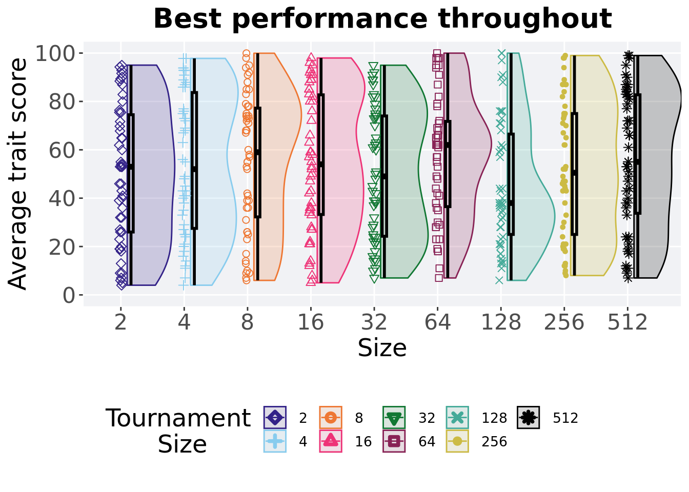
3.5.4.1 Stats
Summary statistics for the best performance.
performance = filter(best_df, var == 'pop_fit_max' & acro == 'mpe')
performance %>%
  group_by(T) %>%
  dplyr::summarise(
    count = n(),
    na_cnt = sum(is.na(val)),
    min = min(val / DIMENSIONALITY, na.rm = TRUE),
    median = median(val / DIMENSIONALITY, na.rm = TRUE),
    mean = mean(val / DIMENSIONALITY, na.rm = TRUE),
    max = max(val / DIMENSIONALITY, na.rm = TRUE),
    IQR = IQR(val / DIMENSIONALITY, na.rm = TRUE)
  )
## # A tibble: 9 x 8
## T count na_cnt min median mean max IQR
## <fct> <int> <int> <dbl> <dbl> <dbl> <dbl> <dbl>
## 1 2 50 0 4 53.0 49.7 95.0 48.5
## 2 4 50 0 4 52.0 54.4 97.8 56.2
## 3 8 50 0 6 59.0 55.5 99.9 45.0
## 4 16 50 0 5 54.0 54.7 98.0 49.5
## 5 32 50 0 7.00 49.0 50.4 95.0 49.7
## 6 64 50 0 7 62.0 57.2 100. 35.2
## 7 128 50 0 6 38.0 45.7 100. 41.5
## 8 256 50 0 8 50.5 52.6 99.0 50.0
## 9 512 50 0 7.00 55.0 55.9 99.0 49.0Kruskal–Wallis test illustrates evidence of no statistical differences.
##
##  Kruskal-Wallis rank sum test
##
## data:  val by T
## Kruskal-Wallis chi-squared = 6.8162, df = 8, p-value = 0.5566