Chapter 2 Truncation selection
Results for the truncation selection parameter sweep on the diagnostics with valleys.
2.1 Data setup
over_time_df <- read.csv(paste(DATA_DIR,'OVER-TIME-MVC/tru.csv', sep = "", collapse = NULL), header = TRUE, stringsAsFactors = FALSE)
over_time_df$T <- factor(over_time_df$T, levels = TR_LIST)

best_df <- read.csv(paste(DATA_DIR,'BEST-MVC/tru.csv', sep = "", collapse = NULL), header = TRUE, stringsAsFactors = FALSE)
best_df$T <- factor(best_df$T, levels = TR_LIST)
2.2 Exploitation rate results
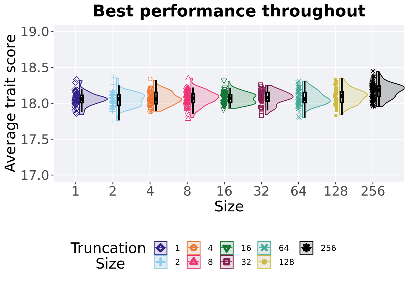
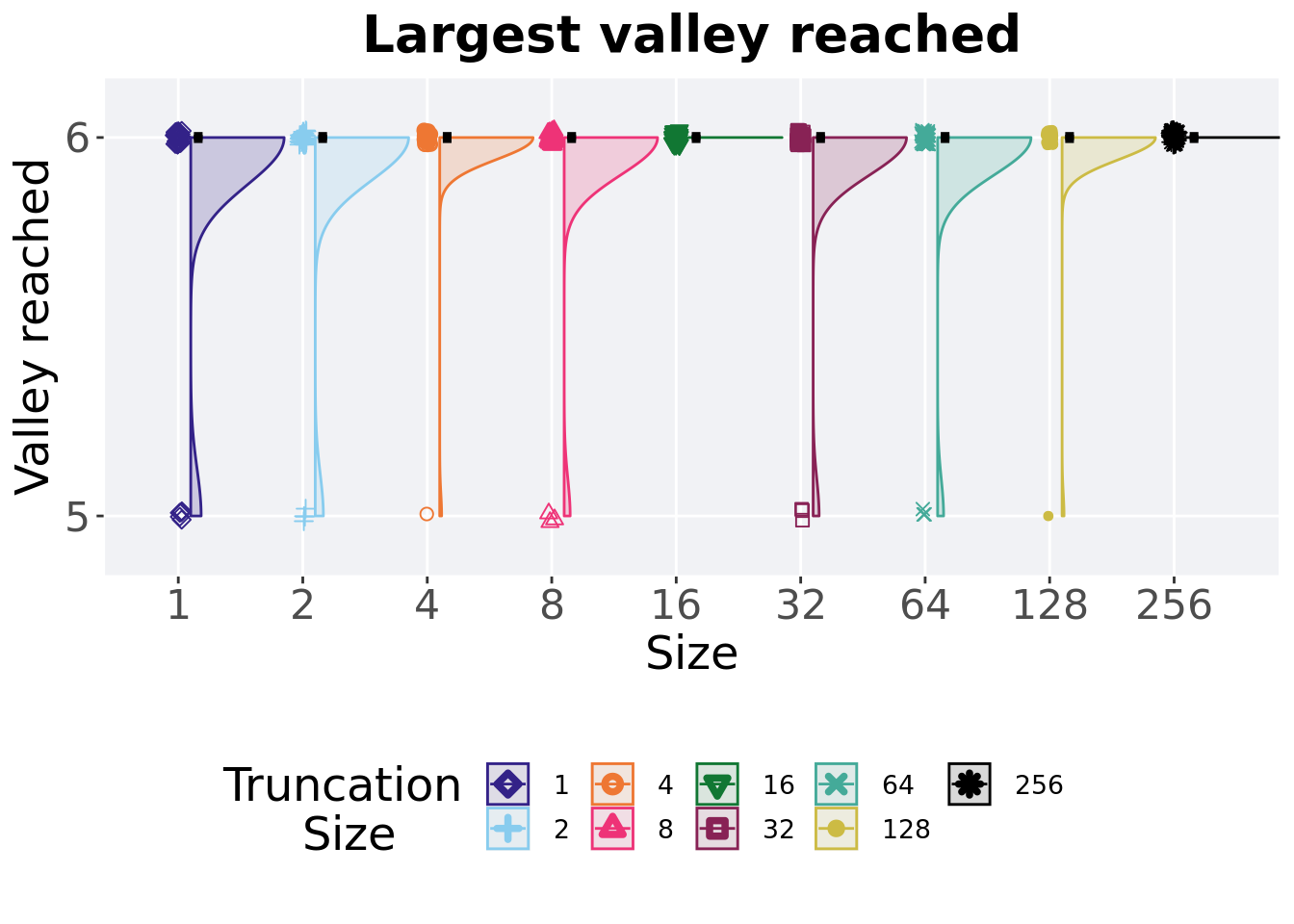
Here we present the results for best performances found by each selection scheme parameter on the exploitation rate diagnostic with valleys. 50 replicates are conducted for each scheme explored.
2.2.1 Performance over time
Best performance in a population over time. Data points on the graph is the average performance across 50 replicates every 2000 generations. Shading comes from the best and worse performance across 50 replicates.
lines = filter(over_time_df, acro == 'exp') %>%
  group_by(T, gen) %>%
  dplyr::summarise(
    min = min(pop_fit_max) / DIMENSIONALITY,
    mean = mean(pop_fit_max) / DIMENSIONALITY,
    max = max(pop_fit_max) / DIMENSIONALITY
  )
## `summarise()` has grouped output by 'T'. You can override using the `.groups`
## argument.over_time_plot = ggplot(lines, aes(x=gen, y=mean, group = T, fill = T, color = T, shape = T)) +
geom_ribbon(aes(ymin = min, ymax = max), alpha = 0.1) +
geom_line(size = 0.5) +
geom_point(data = filter(lines, gen %% 2000 == 0 & gen != 0), size = 1.5, stroke = 2.0, alpha = 1.0) +
scale_y_continuous(
name="Average trait score",
limits=c(0, 20)
) +
scale_x_continuous(
name="Generations",
limits=c(0, 50000),
breaks=c(0, 10000, 20000, 30000, 40000, 50000),
labels=c("0e+4", "1e+4", "2e+4", "3e+4", "4e+4", "5e+4")
) +
scale_shape_manual(values=SHAPE)+
scale_colour_manual(values = cb_palette) +
scale_fill_manual(values = cb_palette) +
ggtitle('Performance over time')+
p_theme +
guides(
shape=guide_legend(nrow=2, title.position = "left", title = 'Truncation \nSize'),
color=guide_legend(nrow=2, title.position = "left", title = 'Truncation \nSize'),
fill=guide_legend(nrow=2, title.position = "left", title = 'Truncation \nSize')
)
over_time_plot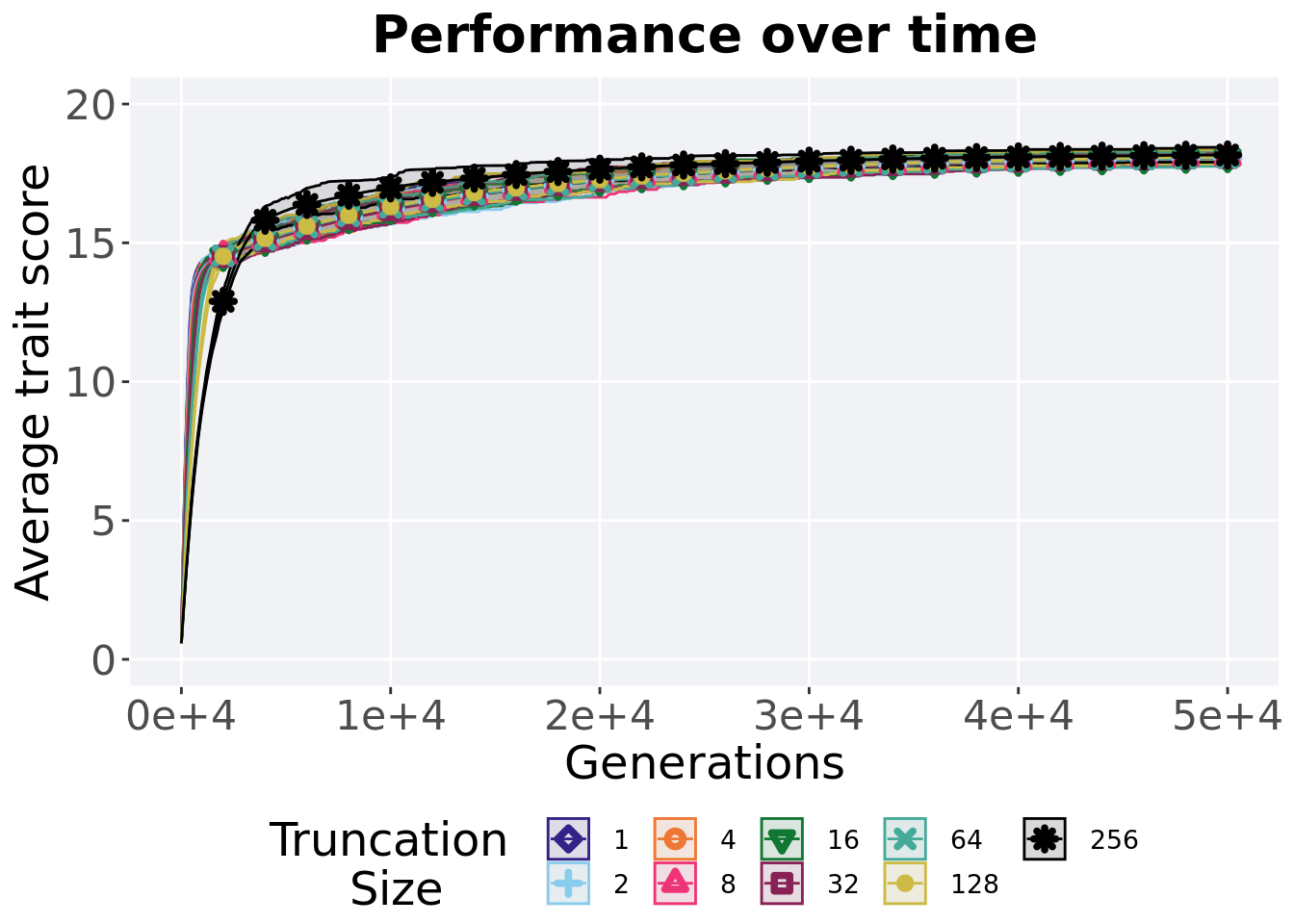
2.2.2 Best performance throughout
Best performance reached throughout 50,000 generations in a population.
plot = filter(best_df, acro == 'exp' &  var == 'pop_fit_max') %>%
  ggplot(., aes(x = T, y = val / DIMENSIONALITY, color = T, fill = T, shape = T)) +
  geom_flat_violin(position = position_nudge(x = .1, y = 0), scale = 'width', alpha = 0.2, width = 1.5) +
  geom_boxplot(color = 'black', width = .07, outlier.shape = NA, alpha = 0.0, size = 1.0, position = position_nudge(x = .16, y = 0)) +
  geom_point(position = position_jitter(width = 0.03, height = 0.02), size = 2.0, alpha = 1.0) +
  scale_y_continuous(
    name="Average trait score",
    limits=c(17, 19)
  ) +
  scale_x_discrete(
    name="Size"
  )+
  scale_shape_manual(values=SHAPE)+
  scale_colour_manual(values = cb_palette, ) +
  scale_fill_manual(values = cb_palette) +
  ggtitle('Best performance throughout')+
  p_theme

plot_grid(
  plot +
    theme(legend.position="none"),
  legend,
  nrow=2,
  rel_heights = c(3,1)
)
2.2.2.1 Stats
Summary statistics for the best performance.
performance = filter(best_df, acro == 'exp' &  var == 'pop_fit_max')
performance$T = factor(performance$T, levels = TR_LIST)
performance %>%
  group_by(T) %>%
  dplyr::summarise(
    count = n(),
    na_cnt = sum(is.na(val)),
    min = min(val / DIMENSIONALITY, na.rm = TRUE),
    median = median(val / DIMENSIONALITY, na.rm = TRUE),
    mean = mean(val / DIMENSIONALITY, na.rm = TRUE),
    max = max(val / DIMENSIONALITY, na.rm = TRUE),
    IQR = IQR(val / DIMENSIONALITY, na.rm = TRUE)
  )
## # A tibble: 9 x 8
## T count na_cnt min median mean max IQR
## <fct> <int> <int> <dbl> <dbl> <dbl> <dbl> <dbl>
## 1 1 50 0 17.8 18.1 18.1 18.3 0.0999
## 2 2 50 0 17.8 18.1 18.1 18.3 0.150
## 3 4 50 0 17.9 18.1 18.1 18.3 0.155
## 4 8 50 0 17.8 18.1 18.1 18.3 0.117
## 5 16 50 0 17.9 18.1 18.1 18.3 0.107
## 6 32 50 0 17.8 18.1 18.1 18.2 0.122
## 7 64 50 0 17.8 18.1 18.1 18.3 0.140
## 8 128 50 0 17.8 18.1 18.1 18.3 0.147
## 9 256 50 0 18.0 18.2 18.2 18.4 0.144Kruskal–Wallis test illustrates evidence of statistical differences.
##
##  Kruskal-Wallis rank sum test
##
## data:  val by T
## Kruskal-Wallis chi-squared = 40.639, df = 8, p-value = 2.435e-06
Results for post-hoc Wilcoxon rank-sum test with a Bonferroni correction.
pairwise.wilcox.test(x = performance$val, g = performance$T, p.adjust.method = "bonferroni",
                     paired = FALSE, conf.int = FALSE, alternative = 't')
##
## Pairwise comparisons using Wilcoxon rank sum test with continuity correction
##
## data: performance$val and performance$T
##
## 1 2 4 8 16 32 64 128
## 2 1.00000 - - - - - - -
## 4 1.00000 1.00000 - - - - - -
## 8 1.00000 1.00000 1.00000 - - - - -
## 16 1.00000 1.00000 1.00000 1.00000 - - - -
## 32 1.00000 1.00000 1.00000 1.00000 1.00000 - - -
## 64 1.00000 1.00000 1.00000 1.00000 1.00000 1.00000 - -
## 128 1.00000 1.00000 1.00000 1.00000 1.00000 1.00000 1.00000 -
## 256 1.7e-05 1.6e-05 0.00018 0.00043 0.00023 0.00104 0.00114 0.03366
##
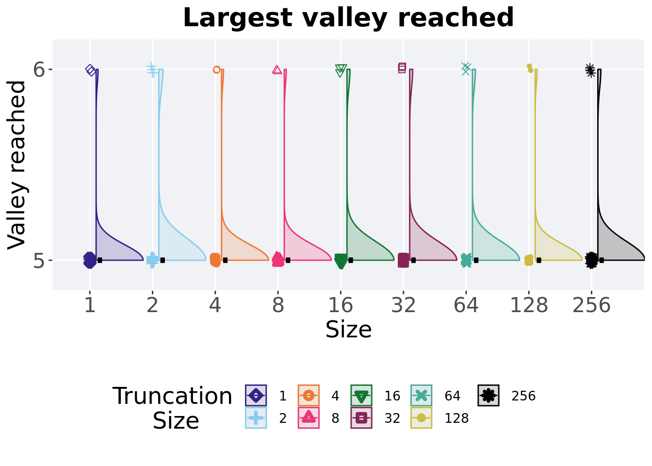
## P value adjustment method: bonferroni2.2.3 Largest valley reached throughout
The largest valley reached in a single trait throughout an entire evolutionary run. To collect this value, we look through all the best-performing solutions each generation and find the largest valley reached.
plot = filter(best_df, acro == 'exp' & var == 'ele_big_peak') %>%
  ggplot(., aes(x = T, y = val, color = T, fill = T, shape = T)) +
  geom_flat_violin(position = position_nudge(x = .1, y = 0), scale = 'width', alpha = 0.2, width = 1.5) +
  geom_boxplot(color = 'black', width = .07, outlier.shape = NA, alpha = 0.0, size = 1.0, position = position_nudge(x = .16, y = 0)) +
  geom_point(position = position_jitter(width = 0.03, height = 0.02), size = 2.0, alpha = 1.0) +
  scale_y_continuous(
    name="Valley reached",
    limits=c(4.9,6.1),
    breaks = c(5,6)
  ) +
  scale_x_discrete(
    name="Size"
  )+
  scale_shape_manual(values=SHAPE)+
  scale_colour_manual(values = cb_palette, ) +
  scale_fill_manual(values = cb_palette) +
  ggtitle('Largest valley reached')+
  p_theme

plot_grid(
  plot +
    theme(legend.position="none"),
  legend,
  nrow=2,
  rel_heights = c(3,1)
)
2.2.3.1 Stats
Summary statistics for the largest valley crossed.
valleys = filter(best_df,acro == 'exp' &  var == 'ele_big_peak')
valleys$T = factor(valleys$T, levels = TR_LIST)
valleys %>%
  group_by(T) %>%
  dplyr::summarise(
    count = n(),
    na_cnt = sum(is.na(val)),
    min = min(val, na.rm = TRUE),
    median = median(val, na.rm = TRUE),
    mean = mean(val, na.rm = TRUE),
    max = max(val, na.rm = TRUE),
    IQR = IQR(val, na.rm = TRUE)
  )
## # A tibble: 9 x 8
## T count na_cnt min median mean max IQR
## <fct> <int> <int> <dbl> <dbl> <dbl> <dbl> <dbl>
## 1 1 50 0 5 6 5.9 6 0
## 2 2 50 0 5 6 5.92 6 0
## 3 4 50 0 5 6 5.98 6 0
## 4 8 50 0 5 6 5.94 6 0
## 5 16 50 0 6 6 6 6 0
## 6 32 50 0 5 6 5.94 6 0
## 7 64 50 0 5 6 5.94 6 0
## 8 128 50 0 5 6 5.98 6 0
## 9 256 50 0 6 6 6 6 0Kruskal–Wallis test illustrates evidence of no statistical differences.
##
##  Kruskal-Wallis rank sum test
##
## data:  val by T
## Kruskal-Wallis chi-squared = 12.008, df = 8, p-value = 0.1508
2.3 Ordered exploitation results
Here we present the results for best performances found by each selection scheme parameter on the ordered exploitation diagnostic with valleys. 50 replicates are conducted for each scheme explored.
2.3.1 Performance over time
Best performance in a population over time. Data points on the graph is the average performance across 50 replicates every 2000 generations. Shading comes from the best and worse performance across 50 replicates.
lines = filter(over_time_df, acro == 'ord') %>%
  group_by(T, gen) %>%
  dplyr::summarise(
    min = min(pop_fit_max) / DIMENSIONALITY,
    mean = mean(pop_fit_max) / DIMENSIONALITY,
    max = max(pop_fit_max) / DIMENSIONALITY
  )
## `summarise()` has grouped output by 'T'. You can override using the `.groups`
## argument.over_time_plot = ggplot(lines, aes(x=gen, y=mean, group = T, fill = T, color = T, shape = T)) +
geom_ribbon(aes(ymin = min, ymax = max), alpha = 0.1) +
geom_line(size = 0.5) +
geom_point(data = filter(lines, gen %% 2000 == 0 & gen != 0), size = 1.5, stroke = 2.0, alpha = 1.0) +
scale_y_continuous(
name="Average trait score",
limits=c(0, 10)
) +
scale_x_continuous(
name="Generations",
limits=c(0, 50000),
breaks=c(0, 10000, 20000, 30000, 40000, 50000),
labels=c("0e+4", "1e+4", "2e+4", "3e+4", "4e+4", "5e+4")
) +
scale_shape_manual(values=SHAPE)+
scale_colour_manual(values = cb_palette) +
scale_fill_manual(values = cb_palette) +
ggtitle('Performance over time')+
p_theme +
guides(
shape=guide_legend(nrow=2, title.position = "left", title = 'Truncation \nSize'),
color=guide_legend(nrow=2, title.position = "left", title = 'Truncation \nSize'),
fill=guide_legend(nrow=2, title.position = "left", title = 'Truncation \nSize')
)
over_time_plot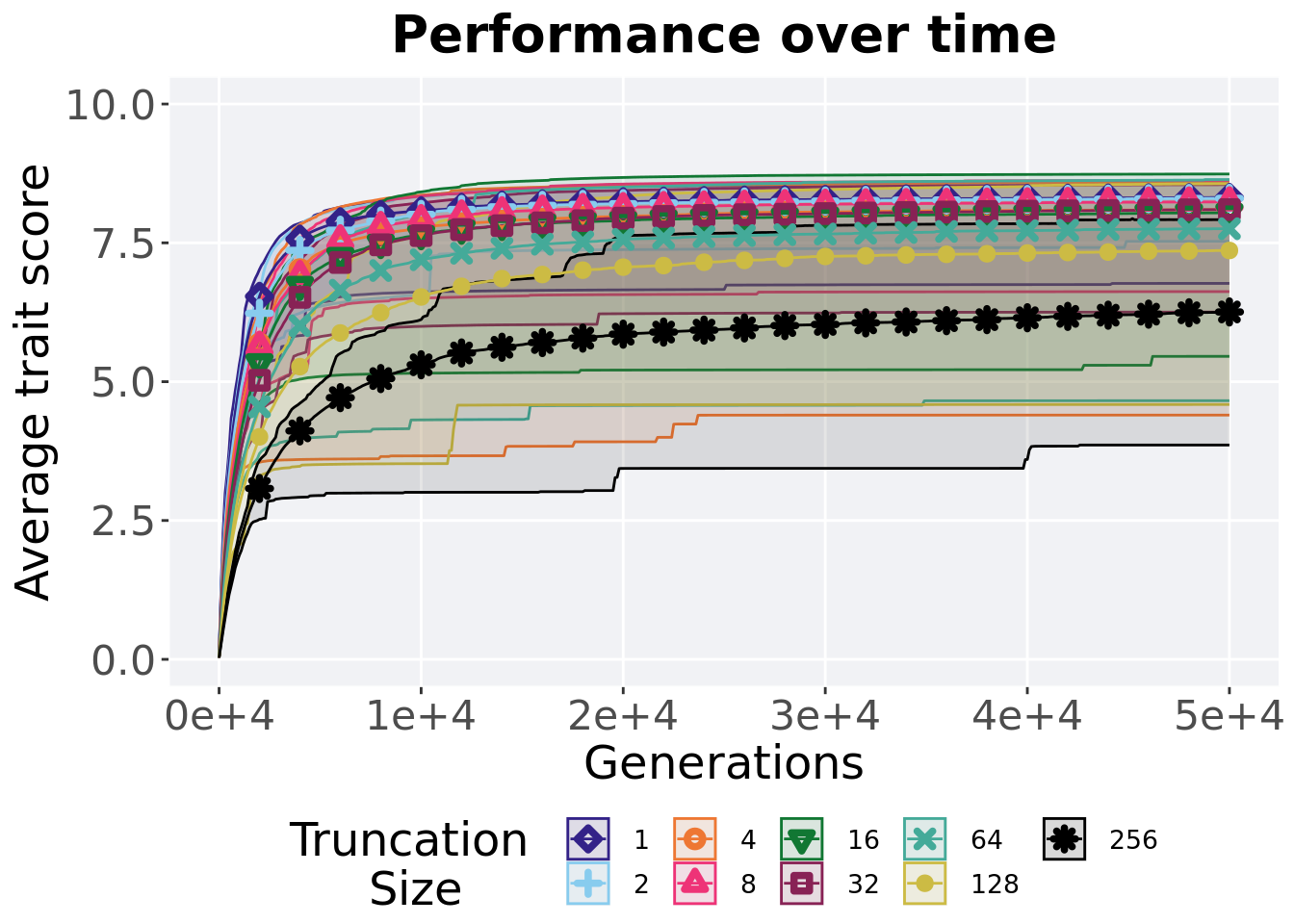
2.3.2 Best performance throughout
Best performance reached throughout 50,000 generations in a population.
plot = filter(best_df, acro == 'ord' &  var == 'pop_fit_max') %>%
  ggplot(., aes(x = T, y = val / DIMENSIONALITY, color = T, fill = T, shape = T)) +
  geom_flat_violin(position = position_nudge(x = .1, y = 0), scale = 'width', alpha = 0.2, width = 1.5) +
  geom_boxplot(color = 'black', width = .07, outlier.shape = NA, alpha = 0.0, size = 1.0, position = position_nudge(x = .16, y = 0)) +
  geom_point(position = position_jitter(width = 0.03, height = 0.02), size = 2.0, alpha = 1.0) +
  scale_y_continuous(
    name="Average trait score",
    limits=c(4, 10)
  ) +
  scale_x_discrete(
    name="Size"
  )+
  scale_shape_manual(values=SHAPE)+
  scale_colour_manual(values = cb_palette, ) +
  scale_fill_manual(values = cb_palette) +
  ggtitle('Best performance throughout')+
  p_theme

plot_grid(
  plot +
    theme(legend.position="none"),
  legend,
  nrow=2,
  rel_heights = c(3,1)
)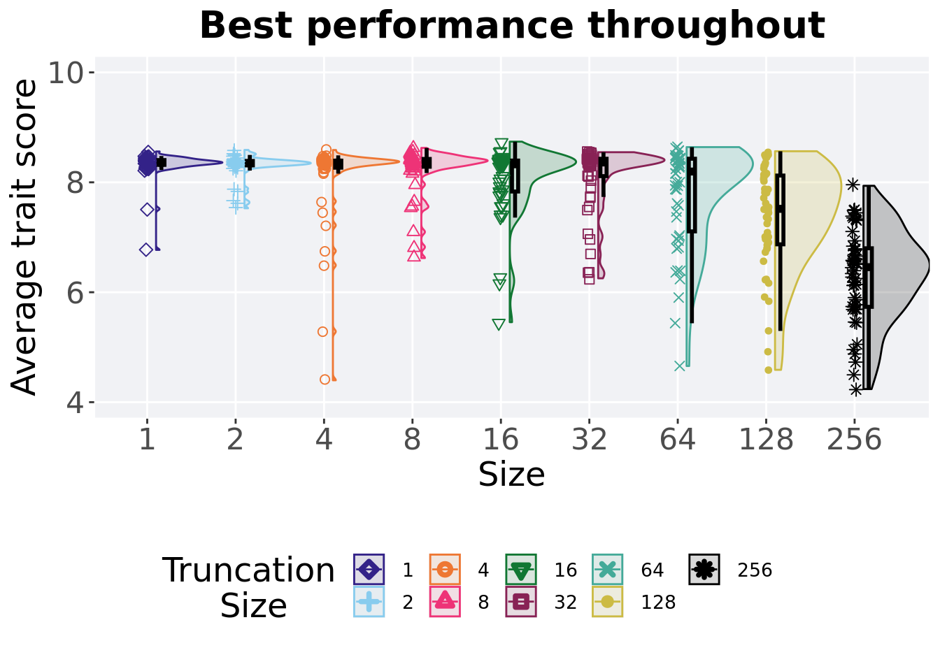
2.3.2.1 Stats
Summary statistics for the best performance.
performance = filter(best_df, acro == 'ord' &  var == 'pop_fit_max')
performance$T = factor(performance$T, levels = TR_LIST)
performance %>%
  group_by(T) %>%
  dplyr::summarise(
    count = n(),
    na_cnt = sum(is.na(val)),
    min = min(val / DIMENSIONALITY, na.rm = TRUE),
    median = median(val / DIMENSIONALITY, na.rm = TRUE),
    mean = mean(val / DIMENSIONALITY, na.rm = TRUE),
    max = max(val / DIMENSIONALITY, na.rm = TRUE),
    IQR = IQR(val / DIMENSIONALITY, na.rm = TRUE)
  )
## # A tibble: 9 x 8
## T count na_cnt min median mean max IQR
## <fct> <int> <int> <dbl> <dbl> <dbl> <dbl> <dbl>
## 1 1 50 0 6.77 8.36 8.32 8.56 0.0867
## 2 2 50 0 7.53 8.35 8.30 8.59 0.0808
## 3 4 50 0 4.40 8.36 8.10 8.59 0.128
## 4 8 50 0 6.62 8.37 8.24 8.63 0.142
## 5 16 50 0 5.46 8.33 8.05 8.74 0.563
## 6 32 50 0 6.25 8.36 8.10 8.55 0.316
## 7 64 50 0 4.66 8.20 7.75 8.64 1.32
## 8 128 50 0 4.59 7.52 7.36 8.57 1.25
## 9 256 50 0 3.86 6.42 6.26 7.94 1.06Kruskal–Wallis test illustrates evidence of statistical differences.
##
##  Kruskal-Wallis rank sum test
##
## data:  val by T
## Kruskal-Wallis chi-squared = 148.77, df = 8, p-value < 2.2e-16
Results for post-hoc Wilcoxon rank-sum test with a Bonferroni correction.
pairwise.wilcox.test(x = performance$val, g = performance$T, p.adjust.method = "bonferroni",
                     paired = FALSE, conf.int = FALSE, alternative = 't')
##
## Pairwise comparisons using Wilcoxon rank sum test with continuity correction
##
## data: performance$val and performance$T
##
## 1 2 4 8 16 32 64 128
## 2 1.00000 - - - - - - -
## 4 1.00000 1.00000 - - - - - -
## 8 1.00000 1.00000 1.00000 - - - - -
## 16 1.00000 1.00000 1.00000 1.00000 - - - -
## 32 1.00000 1.00000 1.00000 1.00000 1.00000 - - -
## 64 0.91020 1.00000 1.00000 0.95152 1.00000 1.00000 - -
## 128 6.0e-08 8.7e-08 3.7e-05 1.3e-06 0.00104 0.00013 0.34001 -
## 256 6.6e-16 3.4e-16 8.6e-13 2.9e-15 2.9e-13 2.9e-13 2.9e-09 1.7e-06
##
## P value adjustment method: bonferroni2.3.3 Largest valley reached throughout
The largest valley reached in a single trait throughout an entire evolutionary run. To collect this value, we look through all the best-performing solutions each generation and find the largest valley reached.
plot = filter(best_df, acro == 'ord' & var == 'ele_big_peak') %>%
  ggplot(., aes(x = T, y = val, color = T, fill = T, shape = T)) +
  geom_flat_violin(position = position_nudge(x = .1, y = 0), scale = 'width', alpha = 0.2, width = 1.5) +
  geom_boxplot(color = 'black', width = .07, outlier.shape = NA, alpha = 0.0, size = 1.0, position = position_nudge(x = .16, y = 0)) +
  geom_point(position = position_jitter(width = 0.03, height = 0.02), size = 2.0, alpha = 1.0) +
  scale_y_continuous(
    name="Valley reached",
    limits=c(3.9,6.1),
    breaks = c(4,5,6)
  ) +
  scale_x_discrete(
    name="Size"
  )+
  scale_shape_manual(values=SHAPE)+
  scale_colour_manual(values = cb_palette, ) +
  scale_fill_manual(values = cb_palette) +
  ggtitle('Largest valley reached')+
  p_theme

plot_grid(
  plot +
    theme(legend.position="none"),
  legend,
  nrow=2,
  rel_heights = c(3,1)
)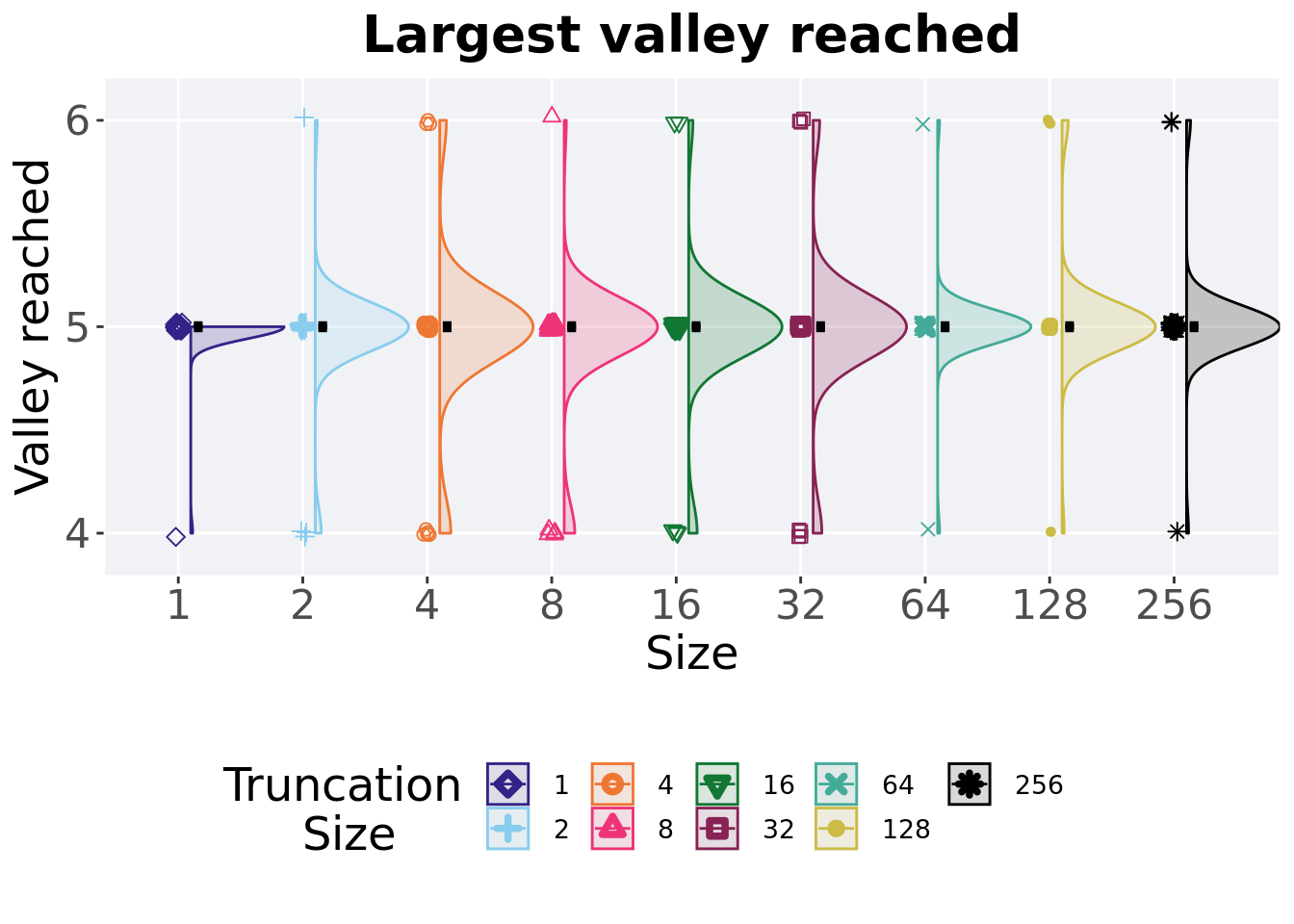
2.3.3.1 Stats
Summary statistics for the largest valley crossed.
valleys = filter(best_df, acro == 'ord' & var == 'ele_big_peak')
valleys$T = factor(valleys$T, levels = TR_LIST)
valleys %>%
  group_by(T) %>%
  dplyr::summarise(
    count = n(),
    na_cnt = sum(is.na(val)),
    min = min(val, na.rm = TRUE),
    median = median(val, na.rm = TRUE),
    mean = mean(val, na.rm = TRUE),
    max = max(val, na.rm = TRUE),
    IQR = IQR(val, na.rm = TRUE)
  )
## # A tibble: 9 x 8
## T count na_cnt min median mean max IQR
## <fct> <int> <int> <dbl> <dbl> <dbl> <dbl> <dbl>
## 1 1 50 0 4 5 4.98 5 0
## 2 2 50 0 4 5 4.96 6 0
## 3 4 50 0 4 5 4.96 6 0
## 4 8 50 0 4 5 4.92 6 0
## 5 16 50 0 4 5 4.96 6 0
## 6 32 50 0 4 5 4.98 6 0
## 7 64 50 0 4 5 5 6 0
## 8 128 50 0 4 5 5.04 6 0
## 9 256 50 0 4 5 5.02 6 0Kruskal–Wallis test illustrates evidence of no statistical differences.
##
##  Kruskal-Wallis rank sum test
##
## data:  val by T
## Kruskal-Wallis chi-squared = 5.7698, df = 8, p-value = 0.673
2.4 Contradictory objectives resutls
Here we present the results for activation gene coverage and satisfactory trait coverage found by each selection scheme parameter on the contradictory objectives diagnostic with valleys. 50 replicates are conducted for each scheme parameters explored.
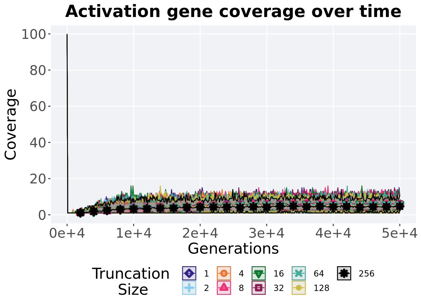
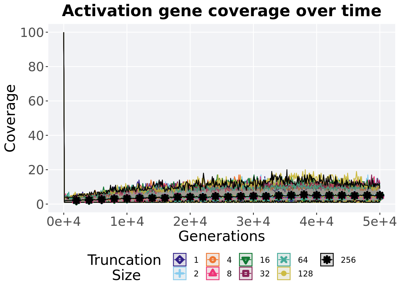
2.4.1 Activation gene coverage over time
Activation gene coverage in a population over time. Data points on the graph is the average activation gene coverage across 50 replicates every 2000 generations. Shading comes from the best and worse coverage across 50 replicates.
lines = filter(over_time_df, acro == 'con')  %>%
  group_by(T, gen) %>%
  dplyr::summarise(
    min = min(uni_str_pos),
    mean = mean(uni_str_pos),
    max = max(uni_str_pos)
  )
## `summarise()` has grouped output by 'T'. You can override using the `.groups`
## argument.ggplot(lines, aes(x=gen, y=mean, group = T, fill = T, color = T, shape = T)) +
geom_ribbon(aes(ymin = min, ymax = max), alpha = 0.1) +
geom_line(size = 0.5) +
geom_point(data = filter(lines, gen %% 2000 == 0 & gen != 0), size = 1.5, stroke = 2.0, alpha = 1.0) +
scale_y_continuous(
name="Coverage",
limits=c(0, 100),
breaks=seq(0,100, 20),
labels=c("0", "20", "40", "60", "80", "100")
) +
scale_x_continuous(
name="Generations",
limits=c(0, 50000),
breaks=c(0, 10000, 20000, 30000, 40000, 50000),
labels=c("0e+4", "1e+4", "2e+4", "3e+4", "4e+4", "5e+4")
) +
scale_shape_manual(values=SHAPE)+
scale_colour_manual(values = cb_palette) +
scale_fill_manual(values = cb_palette) +
ggtitle('Activation gene coverage over time')+
p_theme +
guides(
shape=guide_legend(nrow=2, title.position = "left", title = 'Truncation \nSize'),
color=guide_legend(nrow=2, title.position = "left", title = 'Truncation \nSize'),
fill=guide_legend(nrow=2, title.position = "left", title = 'Truncation \nSize')
)
2.4.2 Final activation gene coverage
Activation gene coverage found in the final population at 50,000 generations.
plot = filter(over_time_df, gen == 50000 & acro == 'con') %>%
  ggplot(., aes(x = T, y = uni_str_pos, color = T, fill = T, shape = T)) +
  geom_flat_violin(position = position_nudge(x = .1, y = 0), scale = 'width', alpha = 0.2, width = 1.5) +
  geom_boxplot(color = 'black', width = .07, outlier.shape = NA, alpha = 0.0, size = 1.0, position = position_nudge(x = .16, y = 0)) +
  geom_point(position = position_jitter(width = 0.03, height = 0.02), size = 2.0, alpha = 1.0) +
  scale_y_continuous(
    name="Coverage",
    limits=c(0, 12.1),
    breaks=seq(0,12,2)
  ) +
  scale_x_discrete(
    name="Trunation size"
  )+
  scale_shape_manual(values=SHAPE)+
  scale_colour_manual(values = cb_palette, ) +
  scale_fill_manual(values = cb_palette) +
  ggtitle('Final activation gene coverage')+
  p_theme

plot_grid(
  plot +
    theme(legend.position="none"),
  legend,
  nrow=2,
  rel_heights = c(3,1)
)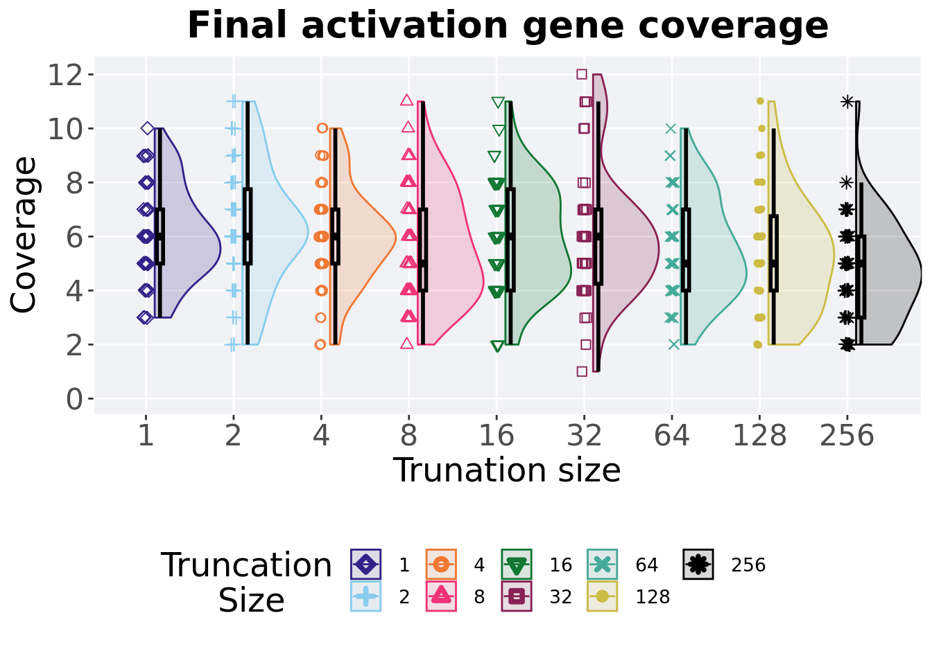
2.4.2.1 Stats
Summary statistics for the generation a satisfactory solution is found.
act_coverage = filter(over_time_df, gen == 50000 & acro == 'con')
act_coverage$T = factor(act_coverage$T, levels = TR_LIST)
act_coverage %>%
  group_by(T) %>%
  dplyr::summarise(
    count = n(),
    na_cnt = sum(is.na(uni_str_pos)),
    min = min(uni_str_pos, na.rm = TRUE),
    median = median(uni_str_pos, na.rm = TRUE),
    mean = mean(uni_str_pos, na.rm = TRUE),
    max = max(uni_str_pos, na.rm = TRUE),
    IQR = IQR(uni_str_pos, na.rm = TRUE)
  )
## # A tibble: 9 x 8
## T count na_cnt min median mean max IQR
## <fct> <int> <int> <int> <dbl> <dbl> <int> <dbl>
## 1 1 50 0 3 6 6.1 10 2
## 2 2 50 0 2 6 6.28 11 2.75
## 3 4 50 0 2 6 5.98 10 2
## 4 8 50 0 2 5 5.68 11 3
## 5 16 50 0 2 6 5.94 11 3.75
## 6 32 50 0 1 6 5.96 12 2.75
## 7 64 50 0 2 5 5.54 10 3
## 8 128 50 0 2 5 5.28 11 2.75
## 9 256 50 0 2 5 4.66 11 3Kruskal–Wallis test illustrates evidence of statistical differences.
##
##  Kruskal-Wallis rank sum test
##
## data:  uni_str_pos by T
## Kruskal-Wallis chi-squared = 24.29, df = 8, p-value = 0.002049
Results for post-hoc Wilcoxon rank-sum test with a Bonferroni correction.
pairwise.wilcox.test(x = act_coverage$uni_str_pos, g = act_coverage$T, p.adjust.method = "bonferroni",
                     paired = FALSE, conf.int = FALSE, alternative = 't')
##
## Pairwise comparisons using Wilcoxon rank sum test with continuity correction
##
## data: act_coverage$uni_str_pos and act_coverage$T
##
## 1 2 4 8 16 32 64 128
## 2 1.0000 - - - - - - -
## 4 1.0000 1.0000 - - - - - -
## 8 1.0000 1.0000 1.0000 - - - - -
## 16 1.0000 1.0000 1.0000 1.0000 - - - -
## 32 1.0000 1.0000 1.0000 1.0000 1.0000 - - -
## 64 1.0000 1.0000 1.0000 1.0000 1.0000 1.0000 - -
## 128 1.0000 0.8123 1.0000 1.0000 1.0000 1.0000 1.0000 -
## 256 0.0053 0.0079 0.0194 0.6738 0.0578 0.1290 0.8827 1.0000
##
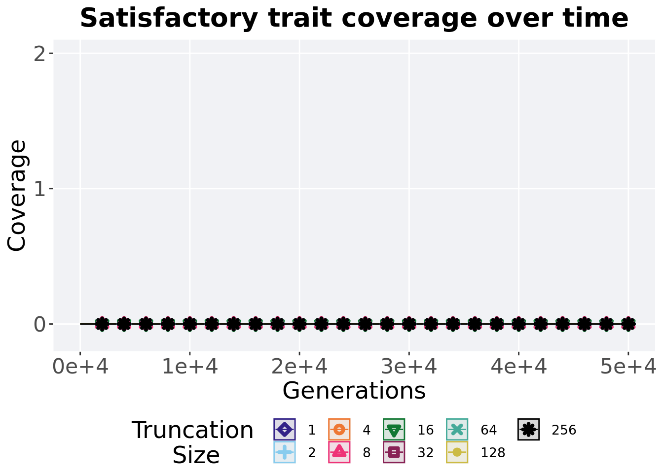
## P value adjustment method: bonferroni2.4.3 Satisfactory trait coverage over time
Satisfactory trait coverage in a population over time. Data points on the graph is the average activation gene coverage across 50 replicates every 2000 generations. Shading comes from the best and worse coverage across 50 replicates.
lines = filter(over_time_df, acro == 'con')  %>%
  group_by(T, gen) %>%
  dplyr::summarise(
    min = min(pop_uni_obj),
    mean = mean(pop_uni_obj),
    max = max(pop_uni_obj)
  )
## `summarise()` has grouped output by 'T'. You can override using the `.groups`
## argument.ggplot(lines, aes(x=gen, y=mean, group = T, fill = T, color = T, shape = T)) +
geom_ribbon(aes(ymin = min, ymax = max), alpha = 0.1) +
geom_line(size = 0.5) +
geom_point(data = filter(lines, gen %% 2000 == 0 & gen != 0), size = 1.5, stroke = 2.0, alpha = 1.0) +
scale_y_continuous(
name="Coverage",
limits=c(-0.1, 2),
breaks=c(0,1,2)
) +
scale_x_continuous(
name="Generations",
limits=c(0, 50000),
breaks=c(0, 10000, 20000, 30000, 40000, 50000),
labels=c("0e+4", "1e+4", "2e+4", "3e+4", "4e+4", "5e+4")
) +
scale_shape_manual(values=SHAPE)+
scale_colour_manual(values = cb_palette) +
scale_fill_manual(values = cb_palette) +
ggtitle('Satisfactory trait coverage over time')+
p_theme +
guides(
shape=guide_legend(nrow=2, title.position = "left", title = 'Truncation \nSize'),
color=guide_legend(nrow=2, title.position = "left", title = 'Truncation \nSize'),
fill=guide_legend(nrow=2, title.position = "left", title = 'Truncation \nSize')
)
2.4.4 Final satisfactory trait coverage
Satisfactory trait coverage found in the final population at 50,000 generations.
plot = filter(over_time_df, gen == 50000 & acro == 'con') %>%
  ggplot(., aes(x = T, y = pop_uni_obj, color = T, fill = T, shape = T)) +
  geom_flat_violin(position = position_nudge(x = .1, y = 0), scale = 'width', alpha = 0.2, width = 1.5) +
  geom_boxplot(color = 'black', width = .07, outlier.shape = NA, alpha = 0.0, size = 1.0, position = position_nudge(x = .16, y = 0)) +
  geom_point(position = position_jitter(width = 0.03, height = 0.02), size = 2.0, alpha = 1.0) +
  scale_y_continuous(
    name="Coverage",
    limits=c(0, 2),
    breaks=c(0,1,2)
  ) +
  scale_x_discrete(
    name="Trunation size"
  )+
  scale_shape_manual(values=SHAPE)+
  scale_colour_manual(values = cb_palette, ) +
  scale_fill_manual(values = cb_palette) +
  ggtitle('Final satisfactory trait coverage')+
  p_theme

plot_grid(
  plot +
    theme(legend.position="none"),
  legend,
  nrow=2,
  rel_heights = c(3,1)
)
## Warning: Removed 237 rows containing missing values (`geom_point()`).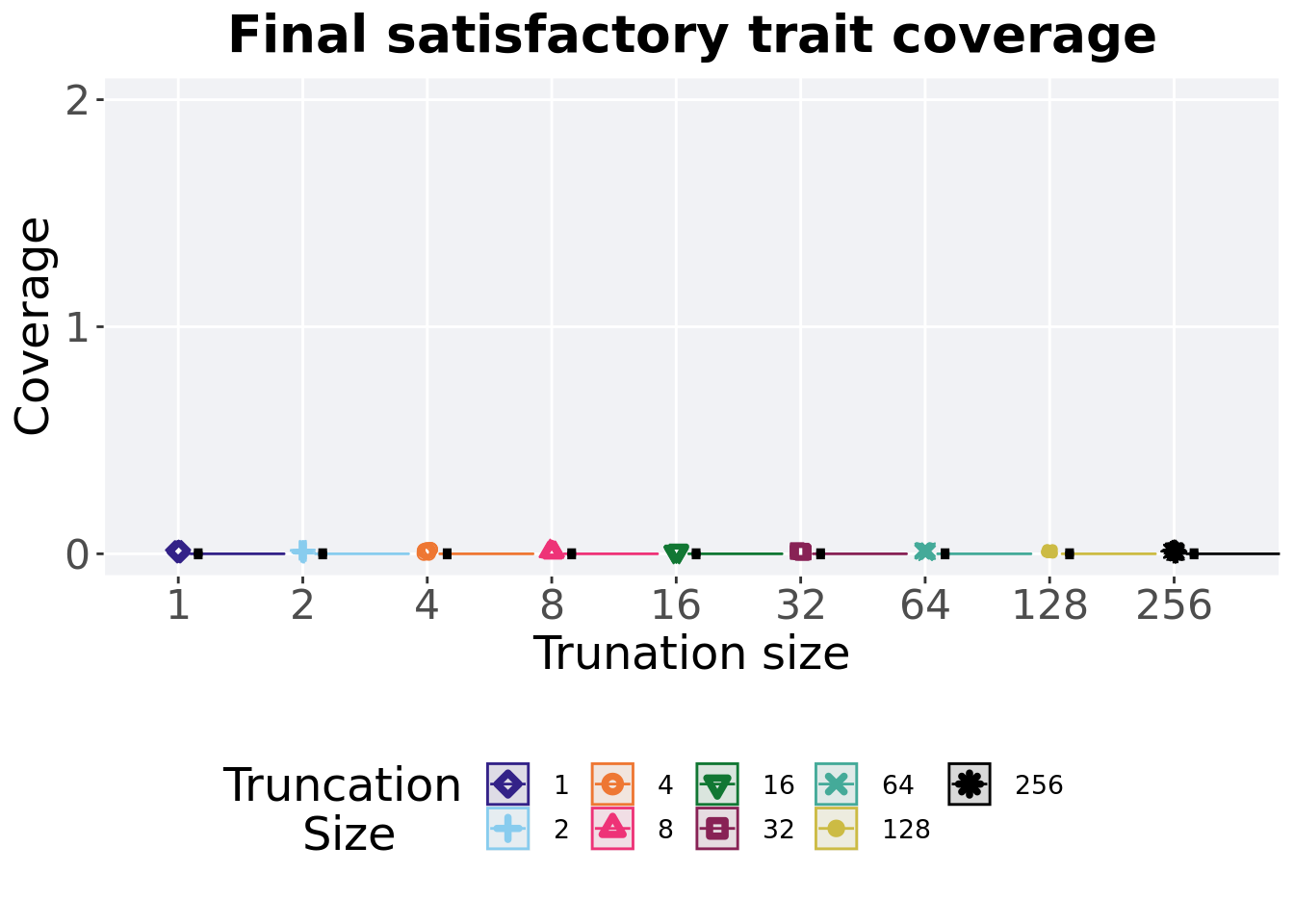
2.4.4.1 Stats
Summary statistics for the generation a satisfactory solution is found.
sat_coverage = filter(over_time_df, gen == 50000 & acro == 'con')
sat_coverage$T = factor(sat_coverage$T, levels = TR_LIST)
sat_coverage %>%
  group_by(T) %>%
  dplyr::summarise(
    count = n(),
    na_cnt = sum(is.na(pop_uni_obj)),
    min = min(pop_uni_obj, na.rm = TRUE),
    median = median(pop_uni_obj, na.rm = TRUE),
    mean = mean(pop_uni_obj, na.rm = TRUE),
    max = max(pop_uni_obj, na.rm = TRUE),
    IQR = IQR(pop_uni_obj, na.rm = TRUE)
  )
## # A tibble: 9 x 8
## T count na_cnt min median mean max IQR
## <fct> <int> <int> <int> <dbl> <dbl> <int> <dbl>
## 1 1 50 0 0 0 0 0 0
## 2 2 50 0 0 0 0 0 0
## 3 4 50 0 0 0 0 0 0
## 4 8 50 0 0 0 0 0 0
## 5 16 50 0 0 0 0 0 0
## 6 32 50 0 0 0 0 0 0
## 7 64 50 0 0 0 0 0 0
## 8 128 50 0 0 0 0 0 0
## 9 256 50 0 0 0 0 0 02.4.5 Largest valley reached throughout
The largest valley reached in a single trait throughout an entire evolutionary run. To collect this value, we look through all the best-performing solutions each generation and find the largest valley reached.
plot = filter(best_df, acro == 'con' & var == 'ele_big_peak') %>%
  ggplot(., aes(x = T, y = val, color = T, fill = T, shape = T)) +
  geom_flat_violin(position = position_nudge(x = .1, y = 0), scale = 'width', alpha = 0.2, width = 1.5) +
  geom_boxplot(color = 'black', width = .07, outlier.shape = NA, alpha = 0.0, size = 1.0, position = position_nudge(x = .16, y = 0)) +
  geom_point(position = position_jitter(width = 0.03, height = 0.02), size = 2.0, alpha = 1.0) +
  scale_y_continuous(
    name="Valley reached",
    limits=c(4.9,6.1),
    breaks = c(5,6)
  ) +
  scale_x_discrete(
    name="Size"
  )+
  scale_shape_manual(values=SHAPE)+
  scale_colour_manual(values = cb_palette, ) +
  scale_fill_manual(values = cb_palette) +
  ggtitle('Largest valley reached')+
  p_theme

plot_grid(
  plot +
    theme(legend.position="none"),
  legend,
  nrow=2,
  rel_heights = c(3,1)
)
2.4.5.1 Stats
Summary statistics for the largest valley crossed.
valleys = filter(best_df, acro == 'con' & var == 'ele_big_peak')
valleys$T = factor(valleys$T, levels = TR_LIST)
valleys %>%
  group_by(T) %>%
  dplyr::summarise(
    count = n(),
    na_cnt = sum(is.na(val)),
    min = min(val, na.rm = TRUE),
    median = median(val, na.rm = TRUE),
    mean = mean(val, na.rm = TRUE),
    max = max(val, na.rm = TRUE),
    IQR = IQR(val, na.rm = TRUE)
  )
## # A tibble: 9 x 8
## T count na_cnt min median mean max IQR
## <fct> <int> <int> <dbl> <dbl> <dbl> <dbl> <dbl>
## 1 1 50 0 5 5 5.04 6 0
## 2 2 50 0 5 5 5.08 6 0
## 3 4 50 0 5 5 5.04 6 0
## 4 8 50 0 5 5 5.04 6 0
## 5 16 50 0 5 5 5.06 6 0
## 6 32 50 0 5 5 5.06 6 0
## 7 64 50 0 5 5 5.06 6 0
## 8 128 50 0 5 5 5.04 6 0
## 9 256 50 0 5 5 5.06 6 0Kruskal–Wallis test illustrates evidence of no statistical differences.
##
##  Kruskal-Wallis rank sum test
##
## data:  val by T
## Kruskal-Wallis chi-squared = 1.581, df = 8, p-value = 0.9913
2.5 Multi-path exploration results
Here we present the results for best performances and activation gene coverage found by each selection scheme parameter on the multi-path exploration diagnostic with valleys. 50 replicates are conducted for each scheme parameter explored.
2.5.1 Activation gene coverage over time
Activation gene coverage in a population over time. Data points on the graph is the average activation gene coverage across 50 replicates every 2000 generations. Shading comes from the best and worse coverage across 50 replicates.
lines = filter(over_time_df, acro == 'mpe')  %>%
  group_by(T, gen) %>%
  dplyr::summarise(
    min = min(uni_str_pos),
    mean = mean(uni_str_pos),
    max = max(uni_str_pos)
  )
## `summarise()` has grouped output by 'T'. You can override using the `.groups`
## argument.ggplot(lines, aes(x=gen, y=mean, group = T, fill = T, color = T, shape = T)) +
geom_ribbon(aes(ymin = min, ymax = max), alpha = 0.1) +
geom_line(size = 0.5) +
geom_point(data = filter(lines, gen %% 2000 == 0 & gen != 0), size = 1.5, stroke = 2.0, alpha = 1.0) +
scale_y_continuous(
name="Coverage",
limits=c(0, 100),
breaks=seq(0,100, 20),
labels=c("0", "20", "40", "60", "80", "100")
) +
scale_x_continuous(
name="Generations",
limits=c(0, 50000),
breaks=c(0, 10000, 20000, 30000, 40000, 50000),
labels=c("0e+4", "1e+4", "2e+4", "3e+4", "4e+4", "5e+4")
) +
scale_shape_manual(values=SHAPE)+
scale_colour_manual(values = cb_palette) +
scale_fill_manual(values = cb_palette) +
ggtitle('Activation gene coverage over time')+
p_theme +
guides(
shape=guide_legend(nrow=2, title.position = "left", title = 'Truncation \nSize'),
color=guide_legend(nrow=2, title.position = "left", title = 'Truncation \nSize'),
fill=guide_legend(nrow=2, title.position = "left", title = 'Truncation \nSize')
)
2.5.2 Final activation gene coverage
Activation gene coverage found in the final population at 50,000 generations.
plot = filter(over_time_df, gen == 50000 & acro == 'mpe') %>%
  ggplot(., aes(x = T, y = uni_str_pos, color = T, fill = T, shape = T)) +
  geom_flat_violin(position = position_nudge(x = .1, y = 0), scale = 'width', alpha = 0.2, width = 1.5) +
  geom_boxplot(color = 'black', width = .07, outlier.shape = NA, alpha = 0.0, size = 1.0, position = position_nudge(x = .16, y = 0)) +
  geom_point(position = position_jitter(width = 0.03, height = 0.02), size = 2.0, alpha = 1.0) +
  scale_y_continuous(
    name="Coverage",
    limits=c(0, 12.1),
    breaks=seq(0,12,2)
  ) +
  scale_x_discrete(
    name="Trunation size"
  )+
  scale_shape_manual(values=SHAPE)+
  scale_colour_manual(values = cb_palette, ) +
  scale_fill_manual(values = cb_palette) +
  ggtitle('Final activation gene coverage')+
  p_theme

plot_grid(
  plot +
    theme(legend.position="none"),
  legend,
  nrow=2,
  rel_heights = c(3,1)
)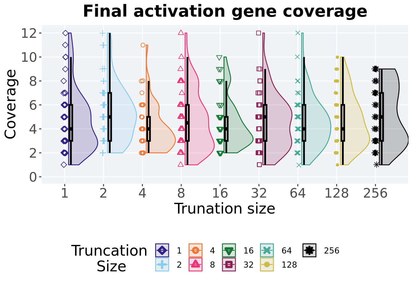
2.5.2.1 Stats
Summary statistics for the generation a satisfactory solution is found.
act_coverage = filter(over_time_df, gen == 50000 & acro == 'mpe')
act_coverage$T = factor(act_coverage$T, levels = TR_LIST)
act_coverage %>%
  group_by(T) %>%
  dplyr::summarise(
    count = n(),
    na_cnt = sum(is.na(uni_str_pos)),
    min = min(uni_str_pos, na.rm = TRUE),
    median = median(uni_str_pos, na.rm = TRUE),
    mean = mean(uni_str_pos, na.rm = TRUE),
    max = max(uni_str_pos, na.rm = TRUE),
    IQR = IQR(uni_str_pos, na.rm = TRUE)
  )
## # A tibble: 9 x 8
## T count na_cnt min median mean max IQR
## <fct> <int> <int> <int> <dbl> <dbl> <int> <dbl>
## 1 1 50 0 1 4 4.68 12 3
## 2 2 50 0 2 5 5.34 12 4
## 3 4 50 0 2 4 4.04 11 2
## 4 8 50 0 1 4.5 4.7 12 3
## 5 16 50 0 2 4 4.46 10 2
## 6 32 50 0 1 5 4.58 12 3
## 7 64 50 0 1 4 4.64 12 3
## 8 128 50 0 1 4 4.66 10 3
## 9 256 50 0 1 5 5.12 9 4Kruskal–Wallis test illustrates evidence of no statistical differences.
##
##  Kruskal-Wallis rank sum test
##
## data:  uni_str_pos by T
## Kruskal-Wallis chi-squared = 10.094, df = 8, p-value = 0.2585
2.5.3 Performance over time
Best performance in a population over time. Data points on the graph is the average performance across 50 replicates every 2000 generations. Shading comes from the best and worse performance across 50 replicates.
lines = filter(over_time_df, acro == 'mpe') %>%
  group_by(T, gen) %>%
  dplyr::summarise(
    min = min(pop_fit_max) / DIMENSIONALITY,
    mean = mean(pop_fit_max) / DIMENSIONALITY,
    max = max(pop_fit_max) / DIMENSIONALITY
  )
## `summarise()` has grouped output by 'T'. You can override using the `.groups`
## argument.over_time_plot = ggplot(lines, aes(x=gen, y=mean, group = T, fill = T, color = T, shape = T)) +
geom_ribbon(aes(ymin = min, ymax = max), alpha = 0.1) +
geom_line(size = 0.5) +
geom_point(data = filter(lines, gen %% 2000 == 0 & gen != 0), size = 1.5, stroke = 2.0, alpha = 1.0) +
scale_y_continuous(
name="Average trait score",
limits=c(0, 10)
) +
scale_x_continuous(
name="Generations",
limits=c(0, 50000),
breaks=c(0, 10000, 20000, 30000, 40000, 50000),
labels=c("0e+4", "1e+4", "2e+4", "3e+4", "4e+4", "5e+4")
) +
scale_shape_manual(values=SHAPE)+
scale_colour_manual(values = cb_palette) +
scale_fill_manual(values = cb_palette) +
ggtitle('Performance over time')+
p_theme +
guides(
shape=guide_legend(nrow=2, title.position = "left", title = 'Truncation \nSize'),
color=guide_legend(nrow=2, title.position = "left", title = 'Truncation \nSize'),
fill=guide_legend(nrow=2, title.position = "left", title = 'Truncation \nSize')
)
over_time_plot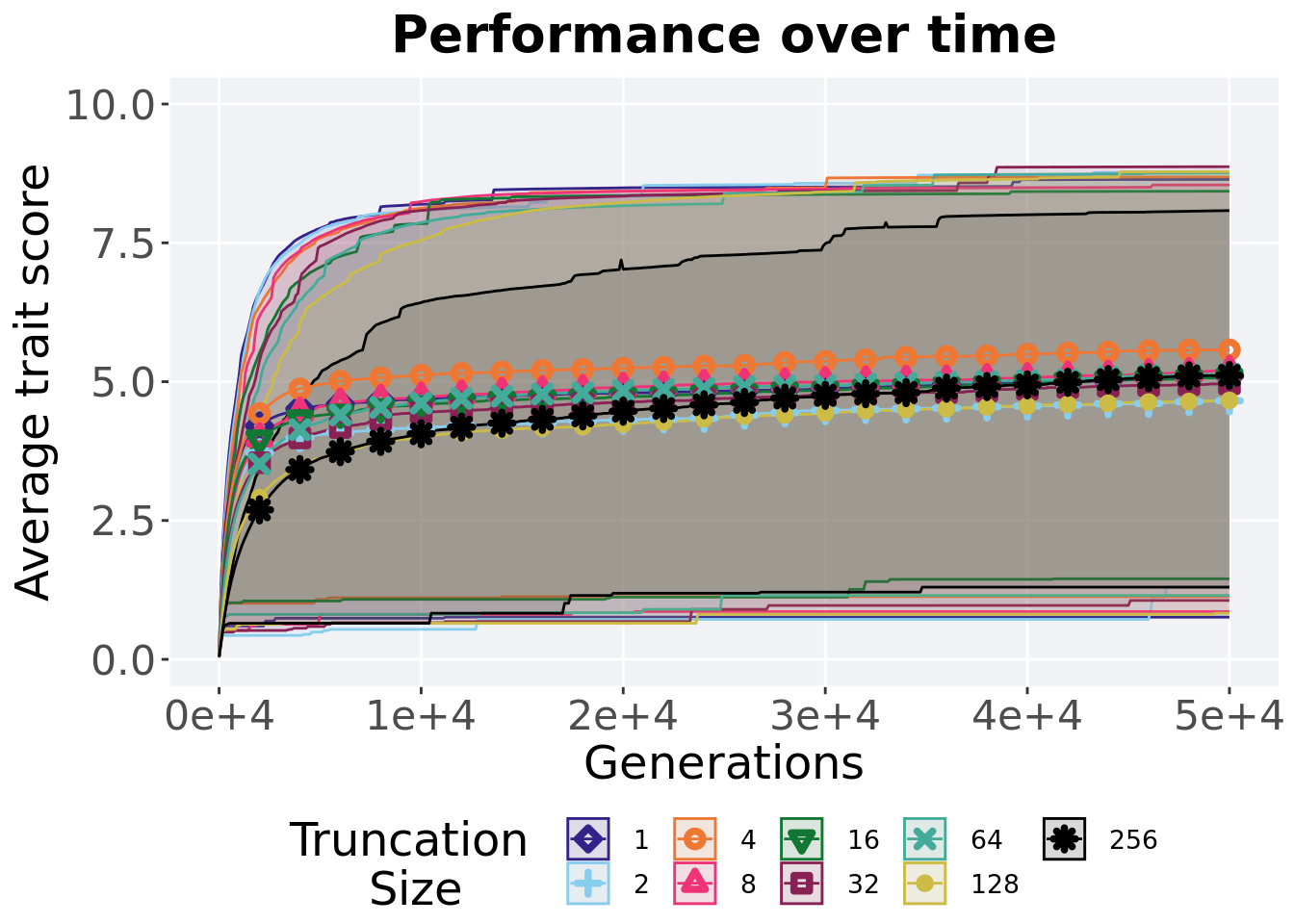
2.5.4 Best performance throughout
Best performance reached throughout 50,000 generations in a population.
plot = filter(best_df, acro == 'mpe' &  var == 'pop_fit_max') %>%
  ggplot(., aes(x = T, y = val / DIMENSIONALITY, color = T, fill = T, shape = T)) +
  geom_flat_violin(position = position_nudge(x = .1, y = 0), scale = 'width', alpha = 0.2, width = 1.5) +
  geom_boxplot(color = 'black', width = .07, outlier.shape = NA, alpha = 0.0, size = 1.0, position = position_nudge(x = .16, y = 0)) +
  geom_point(position = position_jitter(width = 0.03, height = 0.02), size = 2.0, alpha = 1.0) +
  scale_y_continuous(
    name="Average trait score",
    limits=c(0, 10)
  ) +
  scale_x_discrete(
    name="Size"
  )+
  scale_shape_manual(values=SHAPE)+
  scale_colour_manual(values = cb_palette, ) +
  scale_fill_manual(values = cb_palette) +
  ggtitle('Best performance throughout')+
  p_theme

plot_grid(
  plot +
    theme(legend.position="none"),
  legend,
  nrow=2,
  rel_heights = c(3,1)
)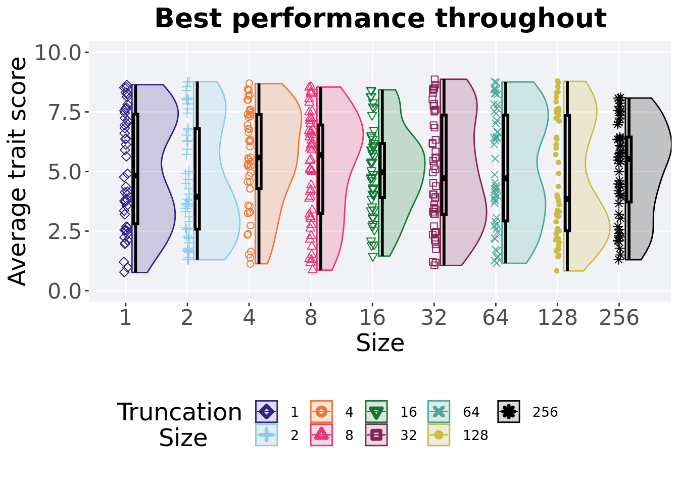
2.5.4.1 Stats
Summary statistics for the best performance.
performance = filter(best_df, acro == 'mpe' &  var == 'pop_fit_max')
performance$T = factor(performance$T, levels = TR_LIST)
performance %>%
  group_by(T) %>%
  dplyr::summarise(
    count = n(),
    na_cnt = sum(is.na(val)),
    min = min(val / DIMENSIONALITY, na.rm = TRUE),
    median = median(val / DIMENSIONALITY, na.rm = TRUE),
    mean = mean(val / DIMENSIONALITY, na.rm = TRUE),
    max = max(val / DIMENSIONALITY, na.rm = TRUE),
    IQR = IQR(val / DIMENSIONALITY, na.rm = TRUE)
  )
## # A tibble: 9 x 8
## T count na_cnt min median mean max IQR
## <fct> <int> <int> <dbl> <dbl> <dbl> <dbl> <dbl>
## 1 1 50 0 0.760 4.83 5.09 8.64 4.60
## 2 2 50 0 1.30 3.94 4.66 8.77 4.22
## 3 4 50 0 1.13 5.59 5.57 8.69 3.11
## 4 8 50 0 0.860 5.69 5.20 8.54 3.70
## 5 16 50 0 1.45 4.97 5.08 8.43 2.27
## 6 32 50 0 1.06 4.72 4.96 8.87 4.17
## 7 64 50 0 1.15 4.71 5.13 8.76 4.44
## 8 128 50 0 0.830 3.85 4.66 8.78 4.83
## 9 256 50 0 1.3 5.54 5.12 8.08 2.72Kruskal–Wallis test illustrates evidence of no statistical differences.
##
##  Kruskal-Wallis rank sum test
##
## data:  val by T
## Kruskal-Wallis chi-squared = 5.6719, df = 8, p-value = 0.6839
2.5.5 Largest valley reached throughout
The largest valley reached in a single trait throughout an entire evolutionary run. To collect this value, we look through all the best-performing solutions each generation and find the largest valley reached.
plot = filter(best_df, acro == 'mpe' & var == 'ele_big_peak') %>%
  ggplot(., aes(x = T, y = val, color = T, fill = T, shape = T)) +
  geom_flat_violin(position = position_nudge(x = .1, y = 0), scale = 'width', alpha = 0.2, width = 1.5) +
  geom_boxplot(color = 'black', width = .07, outlier.shape = NA, alpha = 0.0, size = 1.0, position = position_nudge(x = .16, y = 0)) +
  geom_point(position = position_jitter(width = 0.03, height = 0.02), size = 2.0, alpha = 1.0) +
  scale_y_continuous(
    name="Valley reached",
    limits=c(3.9,6.1),
    breaks = c(4,5,6)
  ) +
  scale_x_discrete(
    name="Size"
  )+
  scale_shape_manual(values=SHAPE)+
  scale_colour_manual(values = cb_palette, ) +
  scale_fill_manual(values = cb_palette) +
  ggtitle('Largest valley reached')+
  p_theme

plot_grid(
  plot +
    theme(legend.position="none"),
  legend,
  nrow=2,
  rel_heights = c(3,1)
)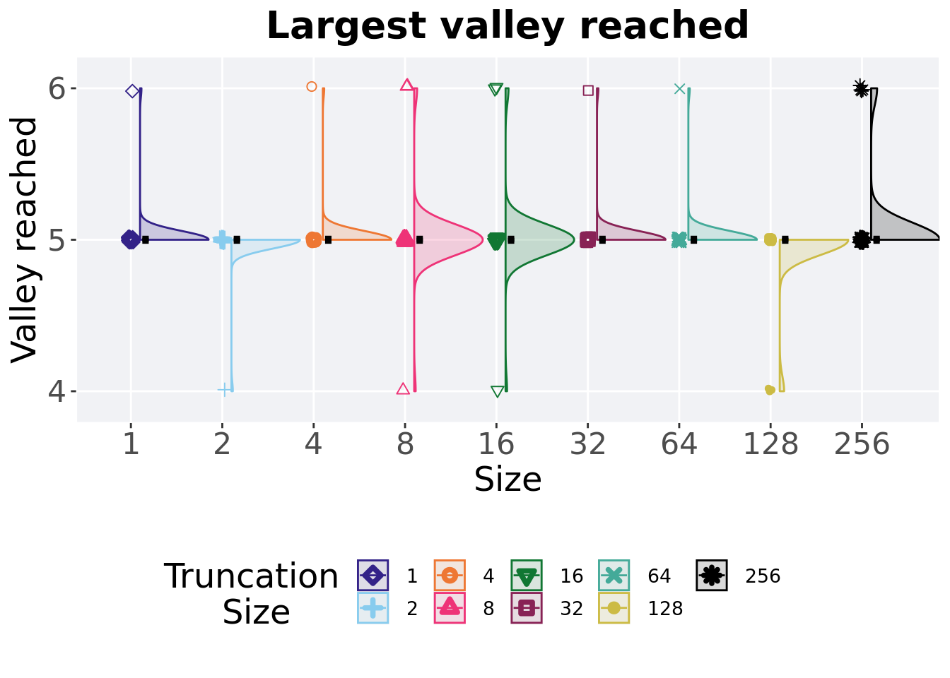
2.5.5.1 Stats
Summary statistics for the largest valley crossed.
valleys = filter(best_df, acro == 'mpe' & var == 'ele_big_peak')
valleys$T = factor(valleys$T, levels = TR_LIST)
valleys %>%
  group_by(T) %>%
  dplyr::summarise(
    count = n(),
    na_cnt = sum(is.na(val)),
    min = min(val, na.rm = TRUE),
    median = median(val, na.rm = TRUE),
    mean = mean(val, na.rm = TRUE),
    max = max(val, na.rm = TRUE),
    IQR = IQR(val, na.rm = TRUE)
  )
## # A tibble: 9 x 8
## T count na_cnt min median mean max IQR
## <fct> <int> <int> <dbl> <dbl> <dbl> <dbl> <dbl>
## 1 1 50 0 5 5 5.02 6 0
## 2 2 50 0 4 5 4.98 5 0
## 3 4 50 0 5 5 5.02 6 0
## 4 8 50 0 4 5 5.02 6 0
## 5 16 50 0 4 5 5.02 6 0
## 6 32 50 0 5 5 5.02 6 0
## 7 64 50 0 5 5 5.02 6 0
## 8 128 50 0 4 5 4.94 5 0
## 9 256 50 0 5 5 5.08 6 0Kruskal–Wallis test illustrates evidence of no statistical differences.
##
##  Kruskal-Wallis rank sum test
##
## data:  val by T
## Kruskal-Wallis chi-squared = 13.997, df = 8, p-value = 0.08184